

I know how overwhelming it can be to choose the right paint color, especially when you’re considering something bold like Sherwin-Williams Gale Force.
I’ve helped homeowners with color decisions for over a decade, and this deep blue-grey always stands out as both dramatic and tricky. It’s not the kind of shade you can just throw on any wall and hope for the best.
That’s why I created this guide based on real-life experience, not just color charts. I’ll walk you through how Gale Force looks in different lighting, where it works best, what it pairs well with, and how others have used it successfully. By the end, you’ll have everything you need to decide if it’s right for your space.
Understanding Gale Force Paint Color Features
Let me break down the technical side of SW Gale Force, so you know exactly what you’re working with.
Technical Specifications
The numbers tell an important story about this colour:
Light Reflectance Value (LRV): 6 – This is extremely low light reflection. Your room will absorb most light rather than bounce it back.
RGB values: Red: 53, Green: 69, Blue: 78
Hex code: #35454e
Hue family: Blue with 202-degree classification
These specs matter when you’re planning your space. That low LRV means you’ll need good lighting to keep rooms from feeling too dark.
Visual Characteristics and Appearance
Here’s what I see when I look at Gale Force in real spaces:
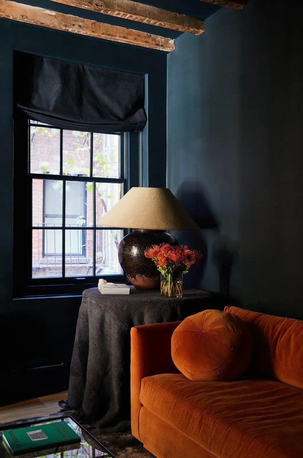
Deep, moody blue with rich saturation that changes throughout the day. The colour has impressive depth with soothing qualities that make rooms feel calm.
You get a sense of luxury combined with natural organic undertones. This isn’t your typical navy blue.
The distinction comes from Sherwin-Williams’ unique formulation. Most navy paints lean heavily toward blue or black. Gale Force sits perfectly between both, creating something more sophisticated.
I’ve watched this colour transform rooms from ordinary to striking.
Color Temperature and Undertones
Understanding Gale Force’s temperature and undertones helps you make smart design choices.
Cool-Toned Classification
This is a cool-toned paint colour with that 202-degree hue value I mentioned earlier.
Cool colours like this create a calming and stately appearance in any room. They naturally make spaces feel more relaxed.
Here’s where it gets practical: Gale Force works perfectly for balancing warm elements in your room. Do you have warm wood floors or brass fixtures? This colour will cool things down beautifully.
Undertone Composition
Let me explain what’s happening under the surface.
Primary blue undertones dominate, but you’ll also catch grey and green secondary notes. These undertones work together in interesting ways.
The grey undertones provide balance – they keep the blue from being too bright or overwhelming.
Green undertones create that natural, earthy connection I love about this colour. It feels organic rather than artificial.
This combination is exactly how undertones distinguish Gale Force from traditional marine blues. Most navy paints stick to pure blue with black undertones.
Gale Force is more complex.
I’ve seen it shift from blue-grey in the morning light to deep teal in the evening hours. Those mixed undertones create this beautiful colour movement.
Lighting Effects and Performance
Light changes everything with Gale Force. I’ve seen this colour look completely different depending on your room’s exposure.
North-facing rooms emphasise the bluish notes and make the colour appear cooler. It can feel almost grey-blue in these spaces.
South-facing rooms tell a different story. That warm, natural light brings out hidden earthy tinges you might not expect.
East and west-facing rooms create the most dramatic shifts. Morning light in the east rooms shows cooler tones. West rooms get warmer and richer looks in the afternoon sun.
For artificial lighting, I recommend warm LED bulbs around 2700K-3000K. Cool white bulbs make Gale Force look flat and lifeless.
Large room applications need extra attention.
Use multiple light sources at different heights.
One overhead light won’t cut it with this dark colour. Table lamps, floor lamps, and wall sconces help create depth and prevent the space from feeling like a cave.
Trust me on the lighting – it makes or breaks this colour.
Key Color Comparisons
Let me show you how Gale Force stacks up against similar colours. This helps you make the right choice.
Close Sherwin-Williams Alternatives
Naval SW 6244 is the traditional navy with grey undertones. It’s more predictable than Gale Force but lacks those interesting green notes.
Sea Serpent SW 7615 shares similar green undertones. However, it leans more toward pure blue-green territory.
Outerspace SW 6251 offers grey-blue undertones as a lighter option. Choose this if Gale Force feels too dark for your space.
Each has its place, but none match Gale Force’s unique complexity.
Closest Cross-Brand Match
Benjamin Moore Miramichi CC-752 comes nearest to matching Gale Force.
The key difference? Miramichi has a stronger green undertone. It pulls more toward teal in certain lighting conditions.
I’ve used both colours in similar projects. Gale Force stays more balanced between blue and grey, while Miramichi tips toward the green side.
Both work beautifully – it depends on your preference.
Coordinating Colors and Design Palettes
Finding the right colours to pair with Gale Force makes all the difference. I’ve tested these combinations in real homes.
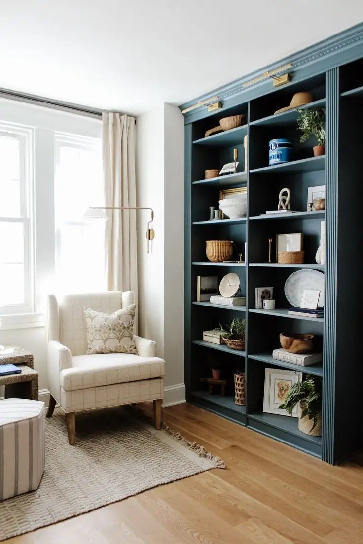
Best White and Neutral Pairings
Extra White SW 7006 gives you the truest white for maximum contrast. It’s my go-to when you want Gale Force to pop.
Shiitake SW 9173 works as the top greige paint colour option. The warm grey tones complement Gale Force’s cool nature perfectly.
Utaupeia SW 9088 offers a warm grey-cream blend that softens the overall look.
For off-white alternatives, try Greek Villa or Alabaster. Both add warmth without competing.
Accent and Complementary Colors
Here’s where things get interesting.
Meditative SW 6227 provides a mid-tone pastel blue that creates beautiful depth alongside Gale Force.
Mulberry Silk SW 0001 brings in a rose-biased clay tone. This unexpected pairing works amazingly well.
Ruskin Room Green SW 0042 adds creamy yellow-green notes that highlight Gale Force’s hidden green undertones.
Rice Paddy SW 6414 introduces light yellow with cream undertones for a fresh, natural feel.
Recommended Trim Colors
Shoji White SW 7042 gives you a greige-cream blend that feels sophisticated.
Zurich White SW 7626 offers a clean, greige option without being too stark.
White Duck SW 7010 works as the most versatile neutral hybrid. I use this when clients want something safe but not boring.
These combinations create rooms that feel balanced and intentional.
Interior Design Applications
Gale Force works in more spaces than you might think. Let me show you where I’ve used it successfully.
Living Room and Common Areas
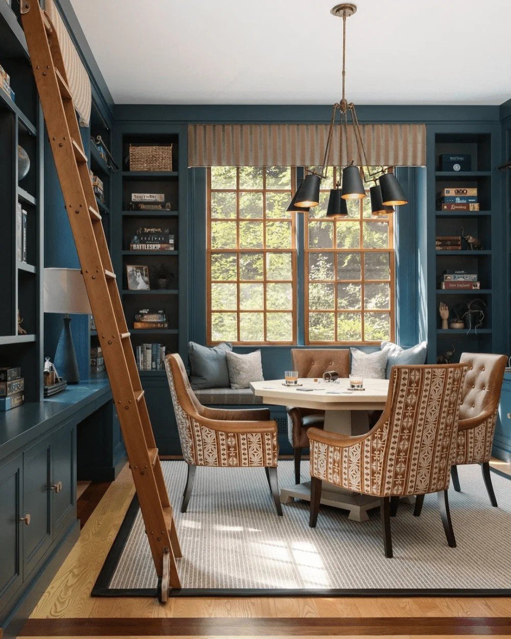
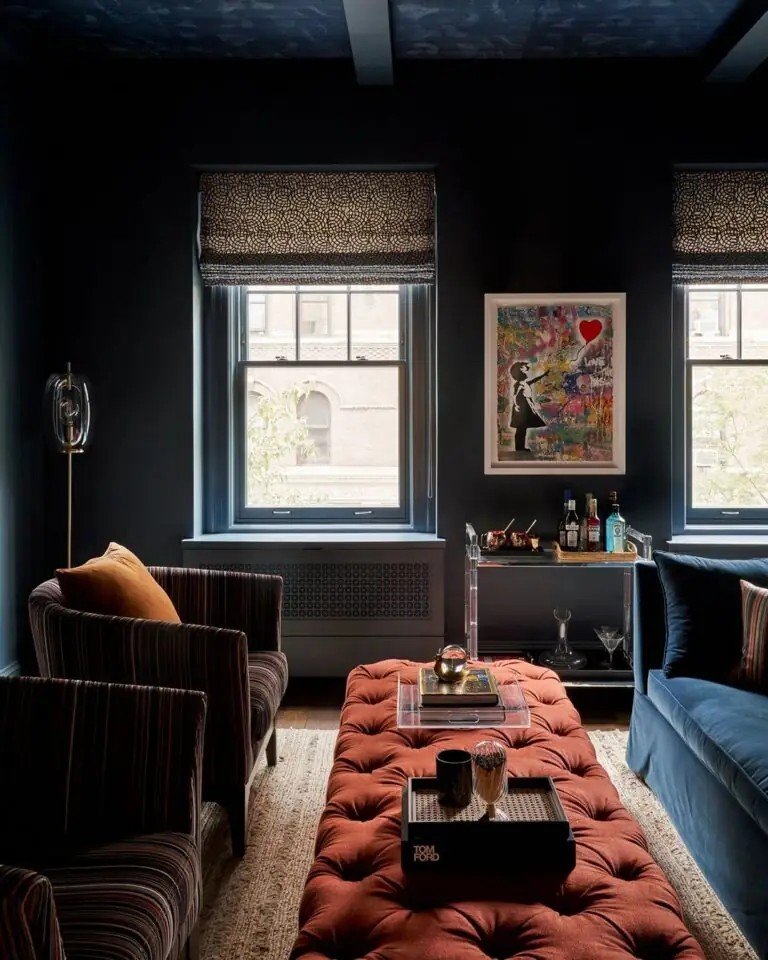
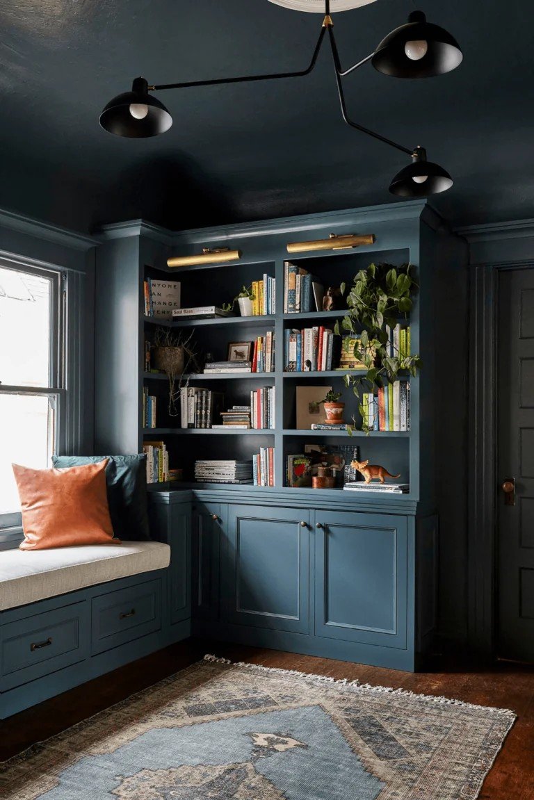
This colour excels at moody design concept implementation. I love using it as an accent wall behind bookshelves – it makes your books and decor stand out.
For the all-over wall colour, Gale Force creates a dramatic effect without feeling overwhelming. The key is good lighting and lighter furniture.
Creating intimate atmospheres comes naturally with this colour. Your living room becomes a cosy retreat instead of just another space.
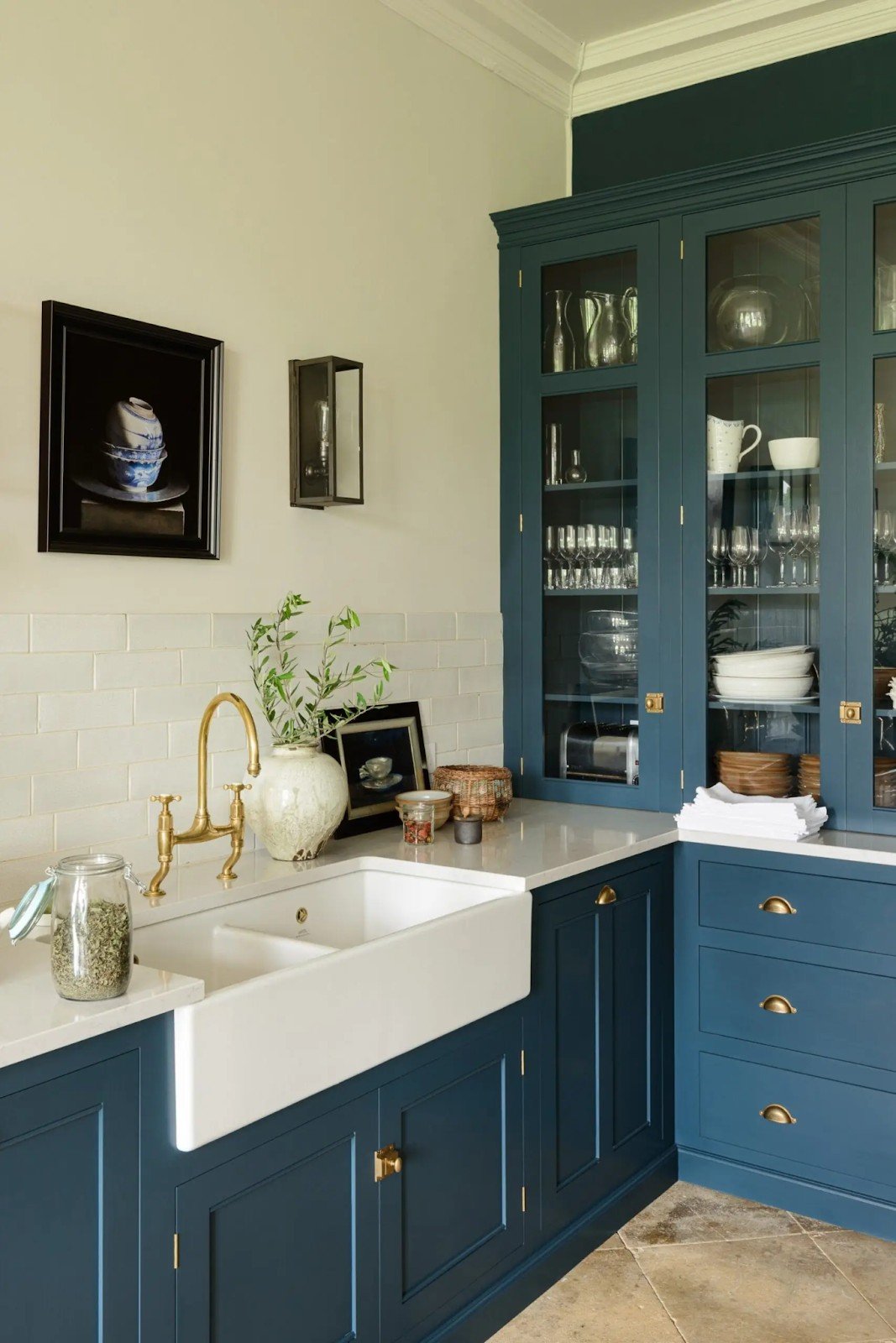
Kitchen Design Integration
Cabinet colour applications work beautifully in both modern and traditional styles. I’ve painted kitchen islands, lower cabinets, and even full kitchen sets.
As a trendy kitchen colour choice, Gale Force offers serious benefits. It hides fingerprints better than lighter colours and feels timeless.
Pairing with white countertops and wooden elements creates a perfect balance. The contrast makes everything pop.
This colour enhances marble, gold, and glassware like nothing else. Your kitchen accessories suddenly look more expensive.
Bedroom and Private Spaces
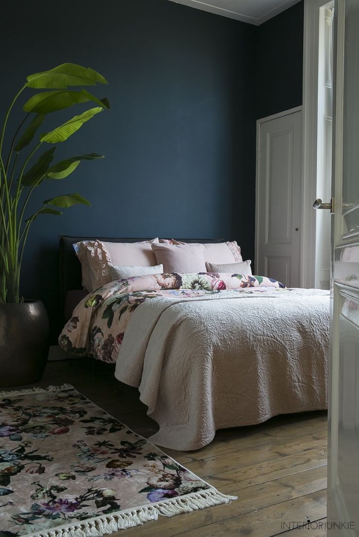
Contemporary dark colour scheme trends favour colours like Gale Force. It feels current without being trendy.
For home office formal applications, this colour commands respect. Video calls look more professional against this backdrop.
Panelling applications add texture and interest. I’ve used it on accent walls and wainscoting with great results.
Creating a cosy, comfortable ambience happens naturally. Bedrooms feel like real retreats.
Bathroom Applications
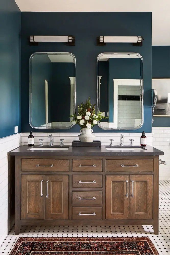
Vintage and modern bathroom design options both work well. The colour adapts to your style.
Texture and metal accent combinations shine here. Brass fixtures, white tile, and natural wood all look amazing against Gale Force.
Small bathrooms feel luxurious instead of cramped.
Exterior Applications
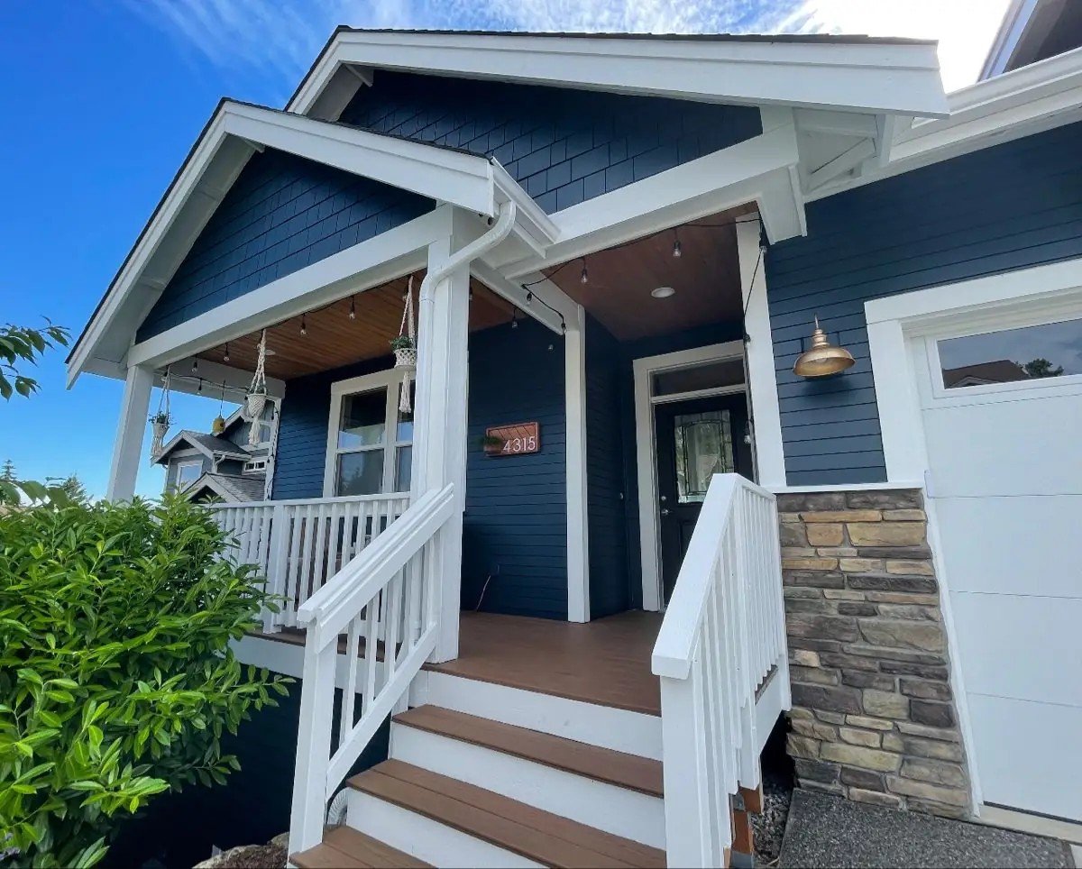
Gale Force makes a striking statement on your home’s exterior. I’ve used it in several outdoor projects with excellent results.
Front door applications create instant curb appeal. The colour feels welcoming yet sophisticated against the lighter siding.
For siding and shutter applications, this colour holds up beautifully. It maintains its rich depth without fading quickly.
Colour preservation under direct sunlight is solid. Sherwin-Williams formulation resists chalking and colour shift better than many dark blues.
The natural surroundings’ harmony comes from those green undertones. Your home feels connected to landscaping and trees.
Various architectural styles work well, from modern farmhouses to colonial. The colour adapts to your home’s character.
Brick and wood tone complementary effects are outstanding. Red brick, natural cedar, and stone all look amazing with Gale Force.
Your home stands out without looking overdone.
Conclusion and Final Recommendations
SW Gale Force by Sherwin-Williams offers the perfect balance of sophistication and versatility for your next paint project. This deep blue-grey brings luxury to any space while working beautifully with multiple design styles.
You now have all the information needed to use this colour confidently. From understanding its cool undertones to knowing which rooms work best, you’re ready to make the right choice for your home.
The technical specs, lighting considerations, and coordinating colours we covered give you a complete roadmap for success.
Ready to transform your space? Start with a sample in your room to see how the light affects this beautiful colour throughout the day.
Have questions about using Gale Force in your specific project? Leave a comment below – I’d love to help you create the perfect colour scheme.
Frequently Asked Questions
What undertones does SW Gale Force have?
Gale Force has primary blue undertones with secondary grey and green notes. These mixed undertones create a sophisticated blue-grey that shifts from cool to earthy depending on lighting conditions.
Is SW Gale Force too dark for small rooms?
With its LRV of 6, Gale Force absorbs most light. Small rooms can work if you add multiple light sources and pair them with lighter furniture and trim colours.
What colours pair best with SW Gale Force?
Extra White, Shiitake greige, and Shoji White work beautifully. For accents, try Meditative blue, Mulberry Silk clay, or Rice Paddy yellow cream for balanced, sophisticated palettes.
Can I use SW Gale Force on kitchen cabinets?
Yes, Gale Force works excellently on both modern and traditional kitchen cabinets. It pairs beautifully with white countertops and wooden elements and enhances marble and gold accents.
How does lighting affect SW Gale Force?
North rooms emphasise blue tones, and south rooms reveal earthy undertones. Use warm LED bulbs (2700K-3000K) and multiple light sources for the best results with this dark colour.