
When I first tested Benjamin Moore Iron Ore (2124-30), I wasn’t expecting so much depth from a charcoal-black. With an LRV of 6, it absorbs light beautifully, giving any room that cozy, dramatic feel without feeling flat or harsh.
What surprised me was how much it changed with lighting. In my north-facing hallway, it looked cooler and slightly gray. But in our south-facing living room, those subtle brown and violet undertones warmed everything up.
Under LEDs, it felt balanced and modern. Incandescents made it moodier, perfect for evening ambiance. It’s not as stark as Tricorn Black or Wrought Iron, and that’s what I love most. It’s bold but approachable, refined but full of character.
If you’re looking for a dark shade that shifts with the light and adds real personality to your space, Iron Ore is worth considering.
Understanding Benjamin Moore Iron Ore: Complete Color Profile
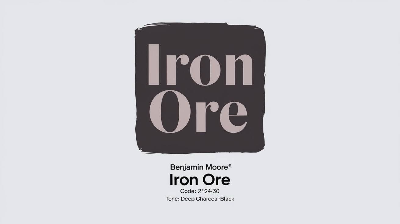
Benjamin Moore Iron Ore (2124-30) is classified as a deep charcoal-black paint color. It sits right between dark gray and true black on the color spectrum.
The Light Reflectance Value (LRV) is 6. This means it absorbs most light rather than reflecting it. For comparison, pure white has an LRV of 100, while true black sits at 0.
ere’s what makes Iron Ore special:
Warm undertones – You’ll notice subtle brown and purple hints. Cool undertones – Sometimes, gray-blue notes appear instead. Neutral base – Neither too warm nor too cool overall.
But here’s the thing
The undertones change based on your lighting. In north-facing rooms, Iron Ore looks cooler and more gray. South-facing spaces bring out the warmer brown notes.
Artificial lighting matters, too. LED bulbs make it appear more neutral. Incandescent bulbs emphasize the warm undertones.
Iron Ore isn’t pure black like Tricorn Black or Wrought Iron. It has more character and depth. Think of it as black with personality – sophisticated but not harsh.
This complexity is exactly why it works so well in modern homes.
Color Comparisons and Alternatives
Exploring similar shades helps you see how Benjamin Moore Iron Ore differs from other muted greens, ensuring the perfect match for your space.
Benjamin Moore Iron Ore vs. Sherwin-Williams Iron Ore
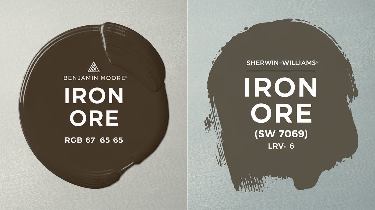
Don’t get confused – these are completely different colors despite sharing the same name.
Benjamin Moore Iron Ore has an LRV of 6 with neutral-warm undertones. Sherwin-Williams Iron Ore sits at LRV 4 and leans much cooler with gray-blue undertones.
In natural light, the Benjamin Moore version appears softer and more balanced. The Sherwin-Williams version looks harsher and more industrial.
Here’s what I’ve noticed in real homes
Benjamin Moore’s version works better in residential spaces. It feels more inviting. The Sherwin-Williams option can feel cold in living areas.
Benjamin Moore Wrought Iron: The Closest Alternative
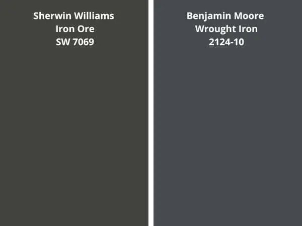
Wrought Iron (2124-10) is practically Iron Ore’s twin brother. The LRV difference is tiny – 6.16 vs 6.0.
Both colors share similar undertones and behavior in different lighting. Wrought Iron appears slightly warmer in some conditions.
When to choose Wrought Iron over Iron Ore:
You want a touch more warmth. Your room gets limited natural light. You prefer a slightly softer contrast.
When Iron Ore wins:
You want the most neutral option. Your space has great natural light. You’re matching existing Iron Ore elsewhere.
Other Notable Dark Color Comparisons
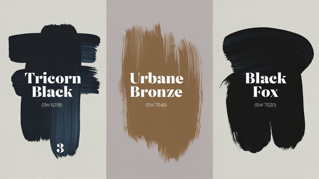
Tricorn Black (SW 6258) – True black with LRV 3. Choose this if you want pure drama without undertones.
Urbane Bronze (SW 7048) – Warmer alternative with brown undertones. LRV 12 makes it lighter than Iron Ore.
Black Fox (SW 7020) – Rich brown-black with LRV 8. Perfect if you love brown undertones but want depth.
Each serves different needs and preferences.
What Makes This Color Stand Out?
Benjamin Moore Iron Ore stands out for its rich depth, dramatic presence, and versatility across modern and classic spaces.
Unique Visual Properties
Iron Ore is a chameleon. In bright daylight, it reads as deep charcoal. At dusk, it transforms into near-black.
This shifting quality makes rooms feel alive and dynamic. You get multiple colors for the price of one.
The balance is what sets it apart. Bold enough to make a statement but livable sufficient for everyday life. It never feels overwhelming or oppressive.
And here’s the best part
Iron Ore works across all design styles. Modern farmhouse, traditional colonial, contemporary loft – it adapts to everything.
Design Impact and Emotional Response
Iron Ore creates instant sophistication. Walk into a room painted in this color, and you immediately feel the difference.
It grounds busy spaces beautifully. If your room has bright colors, patterns, or lots of activity, Iron Ore provides calm balance.
The color has staying power. While trendy colors come and go, this deep charcoal remains relevant year after year.
Architectural Enhancement
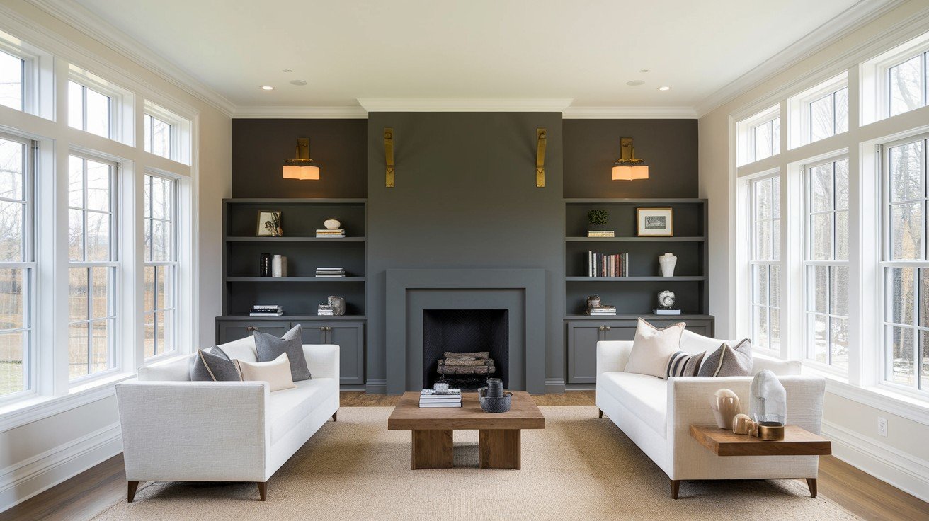
Iron Ore acts like a spotlight for your home’s best features. Crown molding, built-ins, and trim work all pop against this dark backdrop.
It creates natural depth in flat walls. Rooms appear larger and more dimensional.
Think of it as a built-in picture frame. Artwork, mirrors, and windows stand out dramatically against Iron Ore walls.
Kitchen cabinets become sculptural elements. The color emphasizes their shape and craftsmanship.
Fireplaces turn into focal points. The dark color draws attention to these architectural features naturally.
Even simple doorways and windows gain importance when framed by Iron Ore walls.
This color doesn’t just sit on your walls – it actively improves your space.
Strategic Applications for Maximum Impact
Use bold shades like Iron Ore on accent walls, cabinetry, or exteriors to create depth, contrast, and architectural drama instantly.
Interior Showstoppers
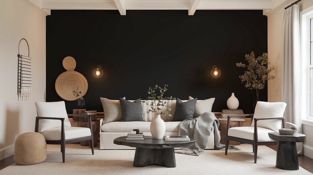
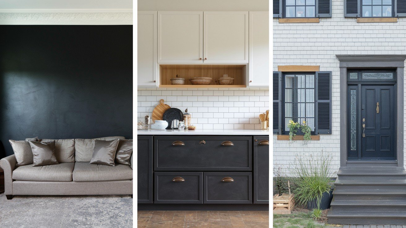
Accent walls work perfectly with Iron Ore.. Choose the wall behind your bed or sofa for instant drama without overwhelming the space.
Kitchen islands painted in Iron Ore create a stunning contrast against white or light cabinets. The dark color grounds the space and adds sophistication.
In office spaces, Iron Ore reduces eye strain from computer screens. It helps you focus better than bright white walls.
Bathroom vanities in this color feel like luxury spa retreats. The dark tone makes white fixtures and gold hardware pop.
Exterior Bold Statements
Your front door becomes an instant focal point in Iron Ore. It pairs beautifully with brick, stone, or white siding.
Shutters and trim in this color add architectural definition. Even simple homes look more custom and expensive.
Want to go all in?
Whole-house exterior applications work especially well for modern farmhouse styles. The color looks fresh yet timeless.
Unexpected Applications
Ceiling treatments in Iron Ore create intimate, cozy atmospheres. Perfect for dining rooms or reading nooks.
Built-in bookcases painted in this color make books and decor items stand out like museum displays.
Fireplace surrounds become natural gathering spots when painted in Iron Ore. The color enhances the cozy factor.
Powder room walls feel dramatic and sophisticated in this color. Small spaces can handle bold choices better than large rooms.
Each application serves a different purpose but delivers the same sophisticated impact.
Color Combinations That Make It Shine
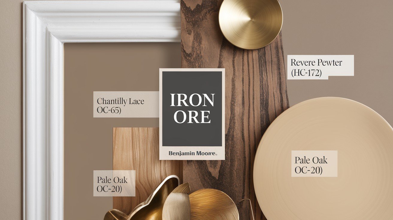
Pair Iron Ore with soft whites, warm woods, or brass accents to highlight its richness and create a balanced, striking look.
Classic White Pairings
Benjamin Moore Simply White creates a crisp, modern contrast with Iron Ore.. This pairing feels fresh and contemporary in any space.
Alabaster offers a warmer white option. It softens Iron Ore’s intensity while maintaining sophistication.
Pure White delivers clean architectural lines. Perfect for trim work and built-ins against Iron Ore walls.
Sophisticated Neutral Schemes
Light grays and greiges balance Iron Ore beautifully. Colors like Classic Gray or Revere Pewter add warmth without competing.
Natural wood tones bring organic richness to Iron Ore spaces. Think white oak, walnut, or cedar accents.
Here’s what I love about this combination
Cream and beige tones create traditional comfort. Iron Ore grounds these softer colors and prevents them from feeling bland.
Bold Designer Combinations
Deep navy blues pair surprisingly well with Iron Ore.. Both colors share similar depth and sophistication.
Rich forest greens create natural harmony. This combination feels grounded and organic.
Metallic accents add instant luxury. Brass, copper, and matte black hardware all shine against Iron Ore.
Gold fixtures warm up the space beautifully. Chrome and silver keep things cool and modern.
The key is choosing colors that complement Iron Ore’s neutral undertones rather than fighting them.
How to Use This Color Successfully
Applying Iron Ore with purpose, on focal points, balanced by lighter tones, creates bold, sophisticated spaces without overwhelming the room.
Lighting Requirements and Solutions
Natural light matters hugely with Iron Ore.. North-facing rooms make it appear cooler and grayer. South-facing spaces bring out warmer undertones.
An artificial lighting strategy is key. Use warm LED bulbs (2700K-3000K) to balance the color’s depth.
Layered lighting works best: overhead fixtures, table lamps, and accent lights. This prevents the color from feeling flat or one-dimensional.
Room and Space Considerations
Ceiling height affects impact. Rooms with 9+ foot ceilings handle Iron Ore beautifully. Lower ceilings can feel cramped.
Open floor plans benefit from Iron Ore accent walls. The color creates natural room divisions without actual walls.
But here’s the catch
Small spaces need careful planning. Use Iron Ore on one wall maximum in rooms under 100 square feet.
Testing and Sampling
Sample peel-and-stick samples give you the most accurate preview. Paint small samples directly on your wall.
Test in different lighting conditions. Check morning light, afternoon sun, and evening artificial light.
Give it time. Live with samples for at least a week. Colors look different as your eyes adjust.
Move samples around the room. The same color appears differently on various walls.
This testing step prevents expensive mistakes.
Conclusion
Benjamin Moore Iron Ore offers the perfect balance of bold sophistication and everyday livability. You now know exactly how this versatile charcoal-black works in different spaces and lighting conditions.
The color comparisons, pairing suggestions, and application strategies we covered give you everything needed to use Iron Ore successfully in your home. No more guessing or second-guessing your paint choices.
Remember to test samples in your actual space before committing. Every room is different, and you want to see how the color behaves in your specific lighting.
Have you used Benjamin Moore Iron Ore in your home? I’d love to hear about your experience in the comments below. Share which rooms you chose and how the color transformed your space.
Your bold color choice awaits.
Frequently Asked Questions
What color is Benjamin Moore’s Iron Ore?
Benjamin Moore Iron Ore (2124-30) is a deep charcoal-black paint color with an LRV of 6. It has neutral undertones that shift between warm brown and cool gray depending on lighting conditions.
Is Benjamin Moore’s Iron Ore a true black?
No, Iron Ore is not a true black. It’s a sophisticated charcoal that sits between dark gray and black, offering more depth and character than pure black colors.
What colors go well with Benjamin Moore’s Iron Ore?
Iron Ore pairs beautifully with crisp whites like Simply White, warm neutrals like Alabaster, natural wood tones, and metallic accents in brass or chrome.
Can I use Benjamin Moore Iron Ore in small rooms?
Yes, but use it strategically. Try one accent wall or built-ins rather than all walls. Small spaces under 100 square feet work best with limited Iron Ore applications.
How do I test Benjamin Moore’s Iron Ore before painting?
Use Samplize peel-and-stick samples or paint small test patches directly on your wall. Observe the color in different lighting conditions for at least one week before deciding.