

I’ve spent way too many afternoons surrounded by paint swatches, unsure which shade would look good once it hit the wall. If that sounds familiar, you’re in the right place. Warm neutral paint colours have become my go-to. They’re inviting, timeless, and surprisingly versatile.
After testing dozens of options in real homes, I’ve found that Sherwin-Williams offers some of the most reliable warm neutrals out there. In this post, I’m sharing 11 shades I’ve personally seen work wonders in different spaces and lighting.
Each one includes tips on where it works best, so you can skip the guesswork and pick with confidence. Whether you’re repainting a single room or your entire home, there’s a warm neutral here that’s just right for your style.
What Makes Sherwin-Williams Warm Neutrals Special
Warm neutrals aren’t just beige. They contain subtle hints of yellow, red, or brown. These undertones create depth and richness.
I’ve watched these colours work in countless homes. They never look dated. Traditional furniture? They work. Modern pieces? Perfect match.
Here’s what makes them amazing:
Light reflection – They bounce natural light around your room. Your space feels brighter without losing that cosy feeling. Design flexibility – Farmhouse style, contemporary, or classic decor all look great with warm neutrals.
But here’s the catch. You must test samples first.
I can’t stress this enough. The paint looks different in every room. Morning light versus evening light changes everything. Order samples and paint large swatches on your walls.
Live with them for a few days. Watch how they change throughout the day. This simple step saves you from expensive repainting mistakes.
The 11 Best Warm Neutral Paint Colors from Sherwin-Williams
These handpicked warm neutrals offer timeless elegance, cozy undertones, and versatile appeal for any room in your home.
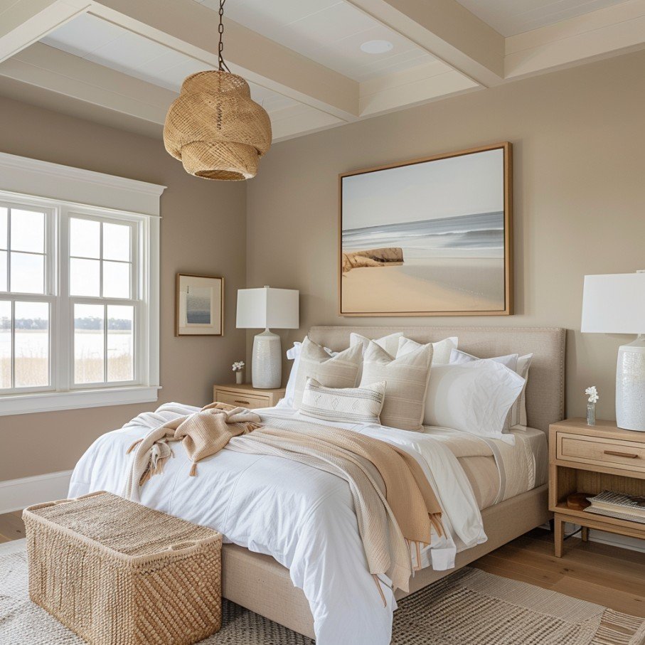
Accessible Beige (SW 7036)
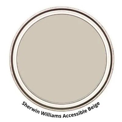
This colour changed my mind about beige completely. It’s not your grandmother’s beige.
Accessible Beige blends are beige and grey perfectly. The subtle warmth prevents that cold, sterile feeling. No yellow undertones to worry about, either.
- LRV (Light Reflectance Value): 58
- VOC (Volatile Organic Compounds): <50 g/L (low VOC)
- RGB: 209, 199, 184
I recommend it for Living rooms where families gather, Bedrooms that need calming vibes, and Open floor plans connecting multiple spaces.
Modern furniture loves this colour. Traditional pieces work, too. It’s that perfect middle ground that makes decorating easier.
You won’t regret choosing this one. It’s consistently rated as a top neutral for good reason.
Alabaster (SW 7008)
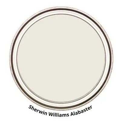
Here’s a white that feels warm. Most whites make rooms feel like hospitals. Not Alabaster.
This creamy white was the Color of the Year in 2016. It’s still popular today because it works everywhere.
- LRV (Light Reflectance Value): 82
- VOC (Volatile Organic Compounds): <50 g/L (low VOC)
- RGB: 237, 234, 224
Perfect applications: Spaces needing brightness without harshness, Trim work that pops against wall colours, Ceilings that feel too low, Full rooms craving clean warmth
I’ve used this in tiny powder rooms and large family rooms. Both looked amazing. It reflects light beautifully while maintaining that cosy feeling you want at home.
Trust me on this one. Alabaster delivers every time.
Agreeable Gray (SW 7029)
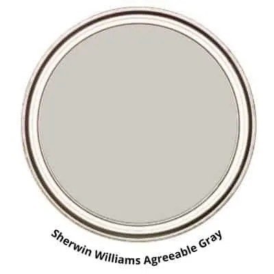
“Greige” isn’t just a trendy word. It’s the perfect description for this colour.
Agreeable Gray balances grey and beige flawlessly. It adapts to your lighting like a chameleon. Morning sun, evening lamps – it looks good in both.
- LRV (Light Reflectance Value): 60
- VOC (Volatile Organic Compounds): <50 g/L (low VOC)
- RGB: 209, 203, 193
Why I love it: Bedrooms feel serene and restful. Hallways appear larger and brighter. Works with any accent colour you choose
Hot pink pillows? Great. Navy blue curtains? Perfect. This colour plays well with everything.
I’ve painted more bedrooms with Agreeable Gray than any other colour. Clients always thank me later because it creates such peaceful spaces.
Balanced Beige (SW 7037)
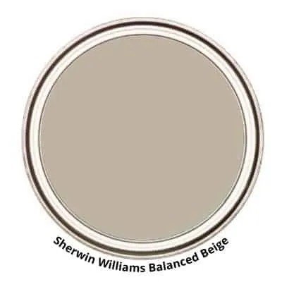
Want more drama than Accessible Beige? This is your answer.
Balanced Beige goes deeper and richer. It creates real visual interest without being bold. The perfect middle ground between warm and cool tones.
- LRV (Light Reflectance Value): 46
- VOC (Volatile Organic Compounds): <50 g/L (low VOC)
- RGB: 191, 178, 162
I use this in Dining rooms that need sophistication, Spaces requiring more personality, and Areas where guests spend time.
It grounds a room beautifully. Your furniture looks more expensive against this backdrop. The colour adds weight and importance to any space.
This isn’t basic beige. It’s beige with confidence. You’ll feel the difference the moment you walk into a room painted with Balanced Beige.
Wool Skein (SW 6148)
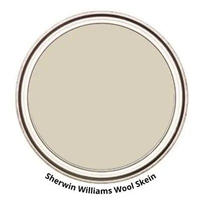
Imagine wrapping yourself in a soft wool blanket. That’s this colour.
Wool Skein brings gentle yellow hints without looking dated. It feels natural and comfortable, like bringing the outdoors inside.
- LRV (Light Reflectance Value): 63
- VOC (Volatile Organic Compounds): <50 g/L (low VOC)
- RGB: 223, 216, 199
Perfect for: Bedrooms that need calming energy, Living rooms with lots of natural light, Spaces filled with plants and wood
Natural materials love this colour. Wicker baskets, wooden furniture, linen curtains – everything looks better. It creates that organic, lived-in feeling we all crave.
I’ve used this in master bedrooms countless times. Clients say it helps them sleep better. There’s something about this soft, natural tone that promotes relaxation.
Canvas Tan (SW 7531)
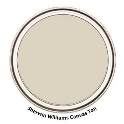
Clean lines meet warm comfort here.
Canvas Tan offers subtle peach undertones that most people miss. But your eye notices the warmth immediately. It’s sophisticated without trying too hard.
- LRV (Light Reflectance Value): 64
- VOC (Volatile Organic Compounds): <50 g/L (low VOC)
- RGB: 226, 216, 199
This colour shines with Natural wood furniture pieces, Brass light fixtures and hardware, Minimalist decorating styles, and Spaces needing understated elegance.
I recommend this for people who want simple beauty. No complicated colour schemes are needed. Canvas Tan does the work for you.
It’s particularly stunning in modern farmhouse homes. The peach undertones complement both vintage and contemporary pieces perfectly.
Latte (SW 6108)
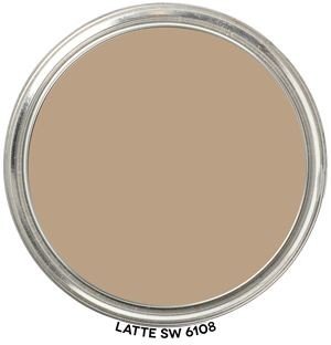
Think of your favourite coffee shop. That warm, inviting feeling? That’s Latte.
This rich beige has serious brown undertones. It’s deeper than most neutrals but still friendly and approachable.
- LRV (Light Reflectance Value): 38
- VOC (Volatile Organic Compounds): <50 g/L (low VOC)
- RGB: 183, 155, 130
Best uses: Accent walls that need impact, Cozy dining rooms for family meals, Living rooms where people gather, Intimate spaces like reading nooks
I love using Latte when clients want something bolder than basic beige. It creates instant cosiness without overwhelming the room.
Your guests will feel welcomed immediately. There’s something about this coffee-inspired colour that makes people want to sit down and stay awhile.
Natural Tan (SW 7567)
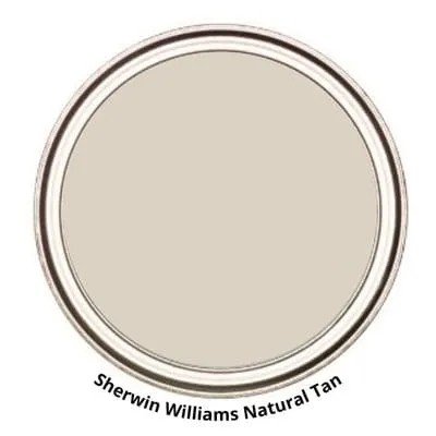
Here’s your true neutral champion.
Natural Tan doesn’t pick sides. It’s not too warm, not too cool. Perfect balance for people who can’t decide between beige and grey.
- LRV (Light Reflectance Value): 65
- VOC (Volatile Organic Compounds): <50 g/L (low VOC)
- RGB: 222, 211, 195
The light taupe undertones work everywhere: Modern homes needing subtle warmth, Spaces with mixed furniture styles, Rooms with challenging lighting, and Areas requiring calm, peaceful vibes.
I recommend this when clients feel overwhelmed by colour choices. Natural Tan plays well with everything. Bold artwork, colourful pillows, dark furniture – it all works.
This colour won’t fight with your decorating decisions. It supports whatever style you choose.
Kilim Beige (SW 6106)
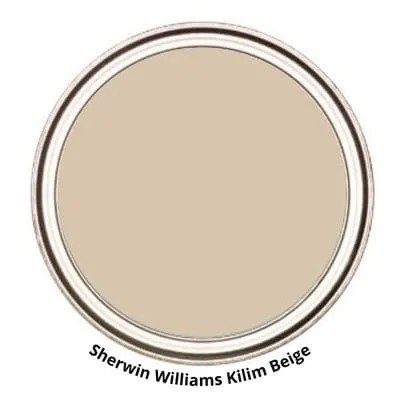
Sunshine in paint form.
Kilim Beige brings those distinctive peach undertones that make rooms feel happy. It’s like having permanent golden-hour lighting.
- LRV (Light Reflectance Value): 57
- VOC (Volatile Organic Compounds): <50 g/L (low VOC)
- RGB: 214, 198, 177
Perfect applications: Family rooms where kids play, Kitchens needing cheerful energy, Spaces facing north that need warmth, Rooms with lots of natural wood
The red undertones work magic with Green plants and natural materials, Wooden furniture and floors, and Brass and gold accents.
I’ve used this in so many family homes. Parents love how it makes their space feel sunny, even on cloudy days. It’s particularly beautiful in rooms with lots of windows.
Nomadic Desert (SW 6107)
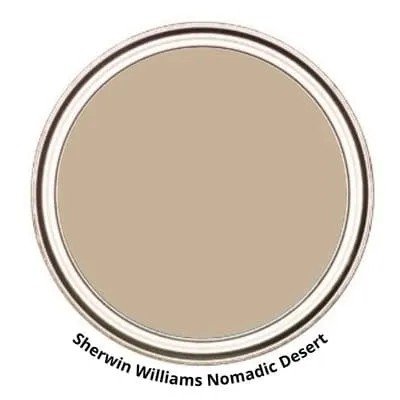
This isn’t your typical safe beige.
Nomadic Desert brings real personality to your walls. It’s bold enough to make a statement but earthy enough to feel comfortable. Medium-toned perfection for spaces that can handle more colour.
- LRV (Light Reflectance Value): 50
- VOC (Volatile Organic Compounds): <50 g/L (low VOC)
- RGB: 202, 181, 158
Great for: Large living rooms needing character, Open spaces that feel too empty, Rooms where you want people to linger, Areas with high ceilings
It wraps around you like a warm hug. The rich tone creates that grounded feeling we all crave at home. Your space will feel substantial and important.
I use this when clients are ready to move beyond basic neutrals but still want something livable.
Bungalow Beige (SW 7511)
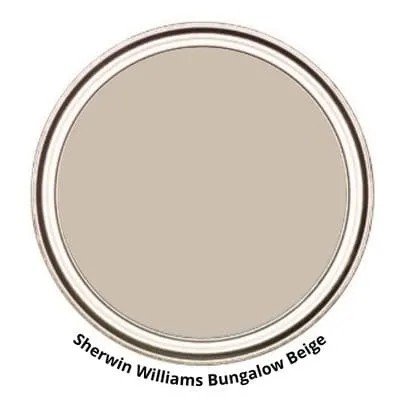
Rich meets refined here.
Bungalow Beige adds that hint of taupe that makes everything look more expensive. It’s deeper than most beige but still warm and inviting.
- LRV (Light Reflectance Value): 53
- VOC (Volatile Organic Compounds): <50 g/L (low VOC)
- RGB: 205, 190, 171
This colour loves Warm wood furniture and floors, Gold and brass light fixtures, Natural textures like jute and linen, and Spaces needing sophisticated warmth.
I’ve painted countless master bedrooms with this colour. Clients say it feels like a luxury hotel but still homey. The deeper tone creates that serene, restful atmosphere perfect for winding down.
It’s particularly stunning with white trim. The contrast makes both colours look richer and more.
Intentional.
Colour Coordination and Pairing Tips
Here’s my foolproof coordination trick. Use colours from the same paint strip. Sherwin-Williams organises its colours this way for a reason.
Pick your main warm neutral. Then, choose a lighter or darker shade from that same strip. Instant coordination is guaranteed.
These accent colours work magic with warm neutrals: Soft sage greens for natural vibes, Muted navy blues for sophistication, Deep charcoals for dramatic contrast, and Warm whites for clean brightness.
Contrast creates visual interest. Dark furniture against light walls pops beautifully. Light accessories against deeper walls add balance.
For trim colours, I recommend Pure White (SW 7005) with the most warm neutrals and Alabaster when you want a softer contrast. It is the same colour as the walls but lighter for subtle elegance.
Ceilings should usually match your trim. This keeps things simple and makes rooms feel taller. Sometimes, I use the wall colour at 50% strength for extra cosiness.
Conclusion
You now have 11 proven warm-neutral options that work in real homes. These best warm, neutral paint colours Sherwin-Williams offers will create the cosy, timeless spaces you want.
No more second-guessing paint choices. Each colour on this list has been tested and loved by countless homeowners. From the versatility of Agreeable Gray to the richness of Bungalow Beige, you have options for every room and style.
Remember to test samples first. Your lighting makes all the difference.
Start with one room. See how the colour transforms your space. You’ll be amazed at what the right warm neutral can do.
Which colour caught your eye? I’d love to hear about your painting projects in the comments below.
Frequently Asked Questions
What are the most popular warm neutral paint colours from Sherwin-Williams?
The top choices include Agreeable Gray, Accessible Beige, and Alabaster. These colours consistently rank highest for their versatility, timeless appeal, and ability to work with various design styles and lighting conditions.
How do I choose between beige and greige warm neutrals?
Consider your existing furniture and lighting. Beige works better with warm wood tones and traditional styles. Greige complements both warm and cool accents, making it ideal for modern or mixed decorating styles.
Should I test paint samples before choosing a warm neutral?
Absolutely. Paint samples on large swatches and observe them throughout the day. Lighting dramatically affects how warm neutrals appear. Live with samples for several days before making your final decision.
What trim colours work best with Sherwin-Williams warm neutrals?
Pure White (SW 7005) creates a crisp contrast with most warm neutrals. Alabaster offers a softer contrast for a cohesive look. Some prefer using the same wall colour in a lighter shade for subtle elegance.
Can warm neutrals work in small spaces?
Yes, warm neutrals are perfect for small spaces. Lighter options like Alabaster and Canvas Tan reflect light while adding warmth. They make rooms feel larger without the cold, sterile feeling of stark whites.