

When you’re staring at paint swatches, feeling overwhelmed by endless blue and grey options, Carolina Gull by Benjamin Moore might just be the answer you’ve been searching for.
This isn’t another overhyped paint colour that looks nothing like the sample once it’s on your walls. Carolina Gull has earned its reputation the hard way – through real homes, real projects, and real results that homeowners love living with.
Here’s what we’ll cover in this article:
Why interior designers consistently choose this specific shade, how it performs in different lighting conditions, which rooms work best with Carolina Gull, coordinating colours that complement it, and honest insights about potential drawbacks you should know before buying.
I’ve spent years testing paint colours in actual homes, not just showrooms. My goal is simple – give you the straight facts about Carolina Gull so you can make a confident decision for your space.
Let’s see if this coastal-inspired hue deserves a spot on your walls.
Carolina Gull’s Designer-Focused Properties
Color Science That Appeals to Professionals
I’ve watched designers reach for Carolina Gull again and again. There’s real science behind their choice.
The Light Reflectance Value sits at 27.41 – right in that sweet spot where it’s not too dark, not too light. This mid-tone range means you can use it almost anywhere without worrying about it overwhelming your space.
Here’s what makes it special:
The hue is a true green with sophisticated grey complexity. It’s not muddy or confusing like some green-greys can be. The temperature appeal leans warm, which makes rooms feel welcoming instead of cold.
But here’s the kicker – it looks completely different on actual walls than it does on those tiny paint swatches. In real spaces, Carolina Gull comes alive with visual depth you can’t see in samples.
Lighting Adaptability for Design Success
This colour changes throughout the day, and that’s exactly what designers want.
Natural light responsiveness means it works in any room orientation. You don’t have to worry about north-facing versus south-facing challenges.
Morning exposure makes it feel fresh and airy in east-facing rooms. You wake up to something that feels clean and peaceful.
Afternoon warmth brings out its cosy side in west-facing spaces. The warmth develops gradually as the day progresses.
Even artificial lighting works well with the Carolina Gull. LED bulbs, incandescent fixtures, warm white – they all complement this colour instead of fighting against it.
That’s professional-level adaptability in one paint can.
Carolina Gull in Professional Design Applications
Interior Design Showcase
I see Carolina Gull working magic in real homes every day.
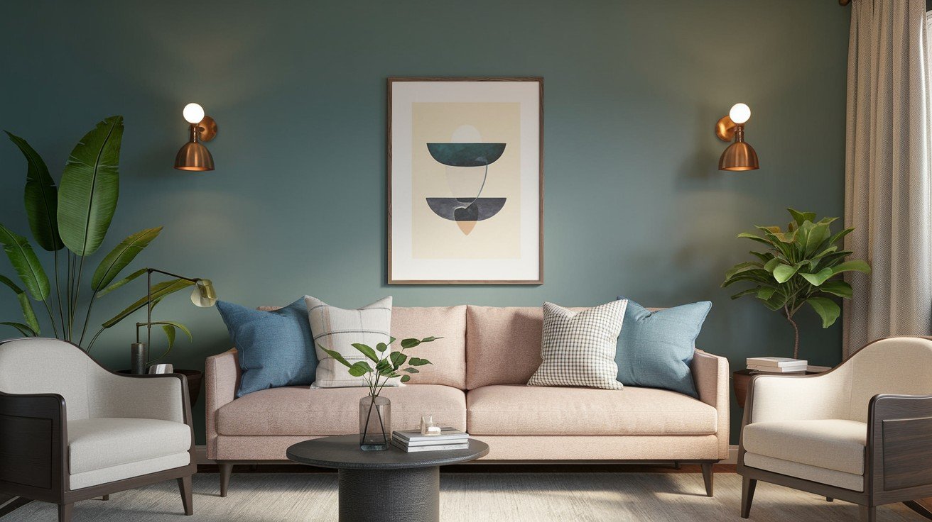
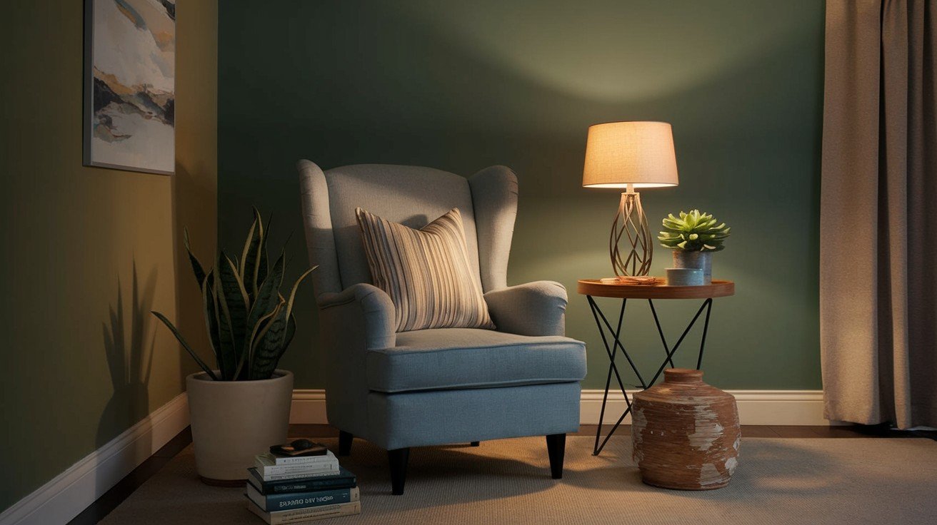
Living room built-ins painted in Carolina Gull create instant sophistication. Add navy blue accents through pillows or artwork, and you’ve got a combination that feels both classic and current.
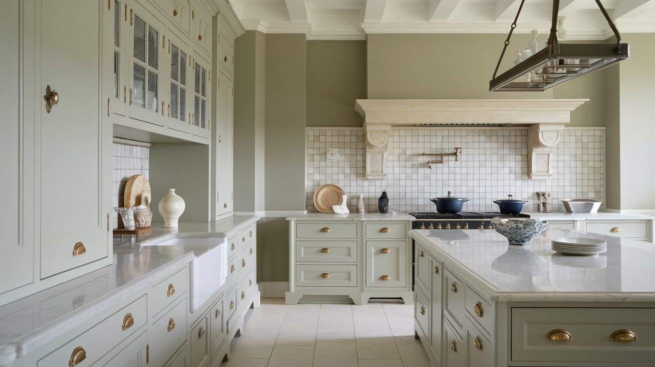
Kitchen cabinets are where this colour shines. It pairs beautifully with warm butcher block countertops and sleek modern hardware. The result? A kitchen that feels grounded but not heavy.
Accent walls get the biggest impact without making your room feel smaller. One wall in Carolina Gull can transform an entire space while keeping things balanced.
The best part? Style flexibility means it works with any design approach. Traditional homes love their historical roots. Contemporary spaces appreciate their clean sophistication.
You’re not locked into one specific look.
Exterior Design Applications
Outside, Carolina Gull holds its own against harsh sunlight. The curb appeal advantage is real – this colour stays rich and deep instead of washing out as some greens do.
This shade has classic Victorian heritage but feels completely modern in today’s homes. That’s architectural relevance that works across decades.
Got brick? Carolina Gull is your friend. It complements red brick beautifully without clashing or competing for attention.
Trim colours become easy decisions. Dark trim creates drama, and light trim keeps things fresh. Both options work perfectly with Carolina Gull’s balanced undertones.
You can’t go wrong with either choice. That’s the kind of flexibility designers need.
Designer-Preferred Color Combinations
Professional Trim and Accent Pairings
I’ve tested dozens of white trim options with Carolina Gull. Some work perfectly, others fall flat.
Benjamin Moore Simply White creates the most sophisticated look. This warm white doesn’t compete with Carolina Gull’s green undertones – it supports them.
Benjamin Moore Chantilly Lace brings subtle harmony to the mix. It has just enough green in it to make the whole combination feel intentional rather than accidental.
Want drama? Deep charcoal options like Benjamin Moore Wrought Iron deliver a serious impact. This creates a stunning contrast without being too harsh or overwhelming.
Benjamin Moore Hale Navy gives you that classic coastal combination. The Navy and green-grey have been working together for decades, and they’re not stopping now.
Coordinating Color Schemes, Designers Love
Benjamin Moore Pale Oak is trending right now for good reason. This warm neutral makes Carolina Gull feel modern and fresh without competing for attention.
Benjamin Moore’s Black Forest Green adds richness when you need serious depth. Use it sparingly for maximum impact – a little goes a long way.
Benjamin Moore Gray Owl adapts to any lighting situation. It’s the safe choice that always works, no matter what your room throws at it.
Natural material compatibility is where Carolina Gull shines. Dark wood looks rich against it. Honey oak feels warm and inviting. Natural stone finishes complement its earthy undertones perfectly.
The key is balance – let Carolina Gull be the star while these colours support its performance.
How Carolina Gull Compares to Popular Alternatives
I get asked about these comparisons constantly. Here’s the honest breakdown.
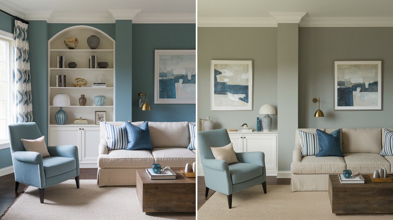
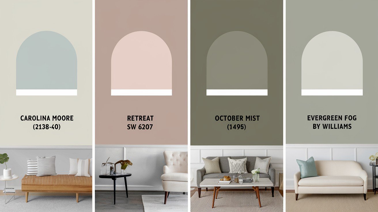
Carolina Gull versus Sherwin-Williams Retreat comes down to flexibility. Retreat feels heavier in most rooms. Carolina Gull’s lighter tone adapts better to different spaces and lighting conditions.
Against Benjamin Moore’s October Mist, Carolina Gull wins on sophistication. October Mist can look muddy in certain light. Carolina Gull’s grey undertones stay clean and refined.
Sherwin-Williams Evergreen Fog is everywhere right now. The problem? It shifts dramatically between rooms. Carolina Gull delivers consistent colour whether you’re painting one wall or an entire house.
The real advantage? Carolina Gull gives you that contemporary green-grey look without being the same colour everyone else is using.
You won’t walk into three different homes and see the same shade. It’s current but not oversaturated in the market.
That’s exactly what smart designers want – something fresh that won’t feel dated in two years.
Why Carolina Gull Remains a Designer Secret
The Professional Advantage
I love colours that haven’t been done to death. Carolina Gull is exactly that.
Low market saturation means your home won’t look like every other house on Pinterest. You get the trending green-grey aesthetic without walking into someone else’s exact colour choice.
Designers choose Carolina Gull because it sets their projects apart from the crowd. Clients want something current but unique. This colour delivers both without compromise.
Client differentiation becomes effortless when you’re working with a colour that achieves the popular green trend while maintaining complete originality.
You’re investing in quality when you choose Carolina Gull. It won’t feel dated next year because it’s not a flash-in-the-pan trend colour that everyone’s using right now.
Strategic Design Benefits
Your project stands out from all those Evergreen Fog and Retreat rooms flooding social media feeds daily.
Carolina Gull works in living rooms, bedrooms, kitchens, and exteriors. Application flexibility like this is rare in paint colours – most have limitations.
When you choose this colour, you demonstrate sophisticated colour knowledge that goes beyond mainstream options. That’s professional credibility in action.
Here’s my prediction: Carolina Gull will gain broader recognition in the next few years as more people tire of oversaturated choices.
Getting ahead of that curve means your space feels ahead of the trend instead of behind it. That’s a future-proof selection at its finest.
Smart designers know this secret. Now you do, too.
Conclusion:
Carolina Gull Benjamin Moore earned its designer reputation through real performance, not marketing hype. This sophisticated green-grey delivers the trending aesthetic you want while avoiding the oversaturation of more common choices.
You now have the facts about its lighting adaptability, professional colour pairings, and why it outperforms popular alternatives. Your paint colour confusion is solved.
The technical details, real-world applications, and honest comparisons give you everything needed to decide if Carolina Gull fits your project.
Ready to see it in your space? Grab a sample and test it in your actual lighting conditions.
Have questions about Carolina Gull or other paint colours? Drop a comment below – I’d love to help you make the perfect choice for your home.
Your walls are waiting for the right colour. This might just be it.
Frequently Asked Questions
What type of colour is Carolina Gull Benjamin Moore?
Carolina Gull is a sophisticated green-grey paint colour with warm undertones. It has an LRV of 27.41, making it a versatile mid-tone that works well in various lighting conditions and complements both traditional and contemporary design styles.
What colours go well with Carolina Gull Benjamin Moore?
Carolina Gull pairs beautifully with Benjamin Moore Simply White or Chantilly Lace for trim, Hale Navy for classic contrast, and Pale Oak for modern coordination. It also complements natural materials like dark wood and honey oak finishes.
Is Carolina Gull Benjamin Moore good for exteriors?
Yes, Carolina Gull maintains its rich colour depth in direct sunlight without washing out. It’s particularly stunning on homes with brick exteriors and works well with both dark and light trim options for excellent curb appeal.
How does Carolina Gull compare to Sherwin-Williams Evergreen Fog?
Carolina Gull offers better colour consistency across different rooms and lighting conditions. While Evergreen Fog is more widely used, Carolina Gull provides the same trending green-grey aesthetic with less market saturation and more sophistication.
What rooms work best with Carolina Gull Benjamin Moore?
Carolina Gull works exceptionally well in living rooms, kitchens, bedrooms, and as accent walls. Its lighting adaptability makes it suitable for both east-facing rooms (serene morning light) and west-facing spaces (cosy afternoon warmth).