

Are you looking for the perfect grey paint that works in any room? Coventry Gray by Benjamin Moore might be exactly what you need.
This popular shade has helped countless homeowners create spaces they love living in. But choosing paint can feel overwhelming when you’re staring at dozens of grey samples that all look the same.
Here’s what we’ll cover to make your decision easier: the exact paint code you need, real tips from people who’ve used it, and practical ideas for different rooms. We’ll also show you which colors work best with Coventry Gray.
I’ve spent years helping people choose paint colors that they won’t regret six months later. Trust me – the right information upfront saves you time, money, and that sinking feeling when the color looks wrong on your walls.
By the end of this guide, you’ll know if Coventry Gray fits your space and exactly how to use it successfully.
What is Benjamin Moore Coventry Gray?
Benjamin Moore calls Coventry Gray “a steadfast medium gray with relatively neutral undertones.” That’s fancy talk for a reliable grey that won’t clash with your stuff.
This color belongs to Benjamin Moore’s Historical Colors collection. It also made their Best Selling Paint Colors list. There’s a reason it’s popular.
Here’s why I like it: Coventry Gray works in modern homes and traditional ones, too. It’s not trying to be trendy – it just works.
Let me give you the numbers that matter:
- Official color code: HC-169
- Light Reflectance Value (LRV): 48.18
- Hue family: Yellow-Green
The LRV of 48.18 puts it right in the middle of the light-medium range. Not too dark, not too light.
The undertones? Cool-toned with subtle blue-green hints. You won’t see them screaming at you, but they’re there creating depth.
Colour Characteristics and Behavior
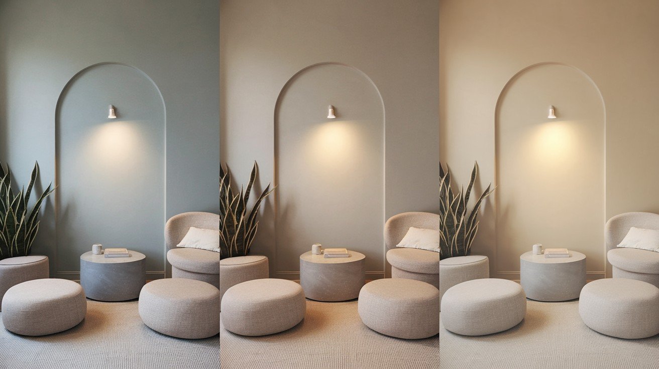
I call Coventry Gray a “stormy gray.” It’s not warm like beige greys, but it’s not ice-cold, either.
This color has a moody vibe that looks sophisticated without being boring.
In good lighting – think balanced natural light – it shows up as a clean, neutral grey. Perfect.
But here’s what you need to know: In bad lighting, things change. Fluorescent bulbs or dim corners can make it flash blue or blue-green.
This isn’t a flaw. It’s just how this color behaves.
The key? Test it in your actual room first.
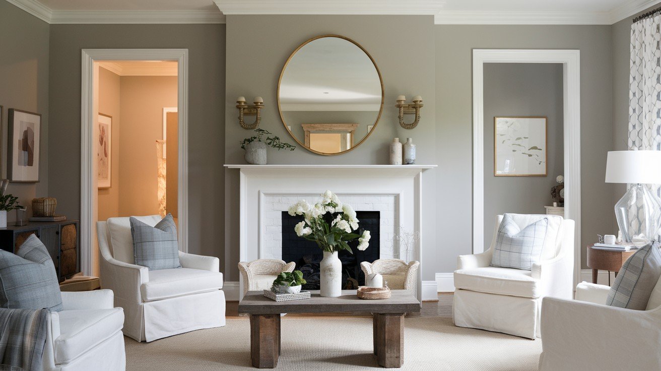
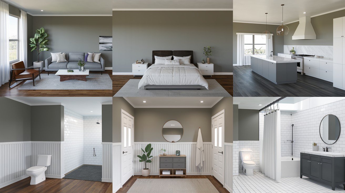
Room Applications and Design Ideas
Here are creative mantel designs that can enhance any room, living area, bedroom, or dining space, adding warmth, style, and architectural interest effortlessly.
Interior Applications
All walls in well-lit rooms work great with Coventry Gray. Natural light brings out its best qualities. Want drama? Try it as an accent wall. One wall in this color can change your whole room.
Kitchen islands and cabinets look amazing in this shade. I especially love it with brass hardware – the combination is timeless.
For bedrooms, Coventry Gray creates a calming atmosphere. It’s not boring beige, but it won’t keep you awake, either.
Bathroom vanities and cabinets also work well. The color handles moisture and still looks fresh.
Exterior Applications
Here’s something cool: Coventry Gray is an excellent choice for home exteriors. It won’t wash out in bright sunlight like some greys do.
This color works on different materials:
- Stucco homes
- Brick exteriors
- Lap siding
Style-wise? It fits modern homes, traditional houses, and Tudor-style architecture. Pretty versatile.
The color holds well against intense south-facing light. That’s important if your home gets blasted with afternoon sun.
Furniture and Special Projects
Got old furniture? Coventry Gray works great for vintage furniture restoration. It gives pieces new life without looking trendy.
Modern furniture updates also benefit from this color. A grey dresser or bookshelf instantly looks more expensive.
The result? A sophisticated, contemporary feel that doesn’t scream, “I just painted this yesterday.”
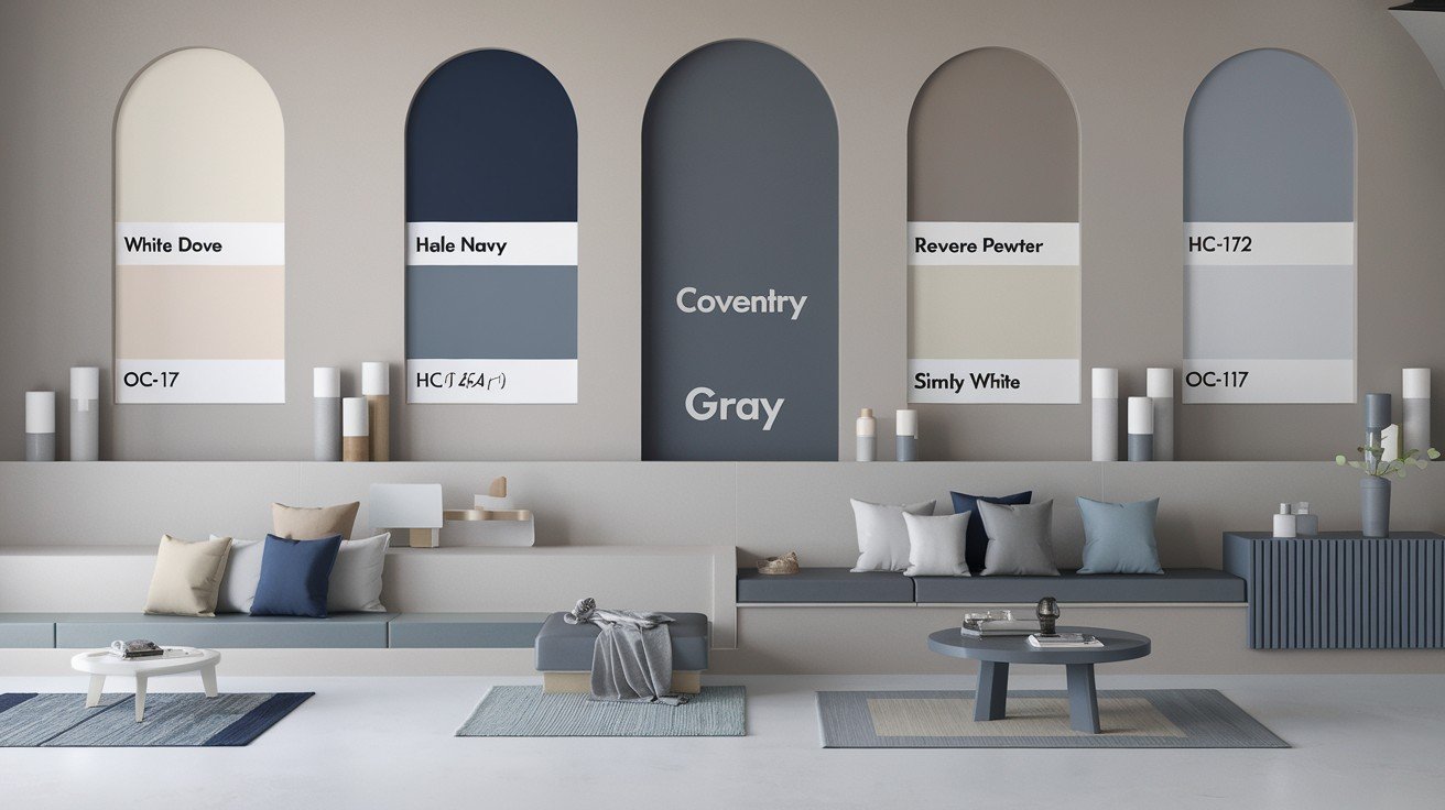
Perfect Color Pairings
You can choose the right color combinations for walls, mantels, and decor that create harmony, enhance mood, and visually elevate ceiling height.
Best White Trim Options
Benjamin Moore Chantilly Lace gives you a clean, crisp contrast. It’s the white that makes Coventry Gray pop. Want something softer? Try Benjamin Moore White Dove. It’s less stark but still looks polished.
Sherwin-Williams Pure White also works well. You don’t have to stick to one brand. Benjamin Moore Decorators White rounds out your options. Test them all to see which feels right in your space.
Complementary Color Schemes
Lighter greys with similar undertones create a layered look. Think monochromatic but interesting. Warm off-white colors balance Coventry Gray’s cool nature. They soften the overall feel.
Want contrast? Go bold with Benjamin Moore Kendall Charcoal. Dark and light greys work beautifully together. Navy blues are stunning partners. Benjamin Moore Hale Navy creates a classic combination that never gets old.
For something more sophisticated, try Benjamin Moore, Wedgewood Gray, and Horizon. These three colors together look expensive and thoughtful.
Here’s my tip: Don’t use more than three colors in one space. Pick your main color (Coventry Gray), add white trim, and then choose one accent color.
Keep it simple, and it will look professional.
Color Comparisons with Similar Shades

You can understand that subtle differences between similar shades help you choose the perfect hue to complement your mantel and overall room aesthetic.
Popular Benjamin Moore Alternatives
Stonington Gray is the lighter option with an LRV of 59.36. It’s more popular than Coventry Gray – and I understand why.
Metropolitan comes very close with an LRV of 49.96. These two are almost twins, but Metropolitan leans slightly warmer.
Boothbay Gray goes slightly darker and shows more blue. If you want something moodier, this might be your pick.
Gray Owl offers a lighter alternative at LRV 64.51. It’s the safe choice if you’re worried about going too dark.
Key Differences from Other Grays
Here’s what makes Coventry Gray different:
It’s deeper than typical light greys but softer than traditional medium greys. Think of it as sitting right in the middle.
More neutral than Boothbay Gray’s blue tendency. Boothbay can look almost blue-grey in certain light. Coventry Gray stays more balanced.
Cooler than warm greys like Revere Pewter. Revere Pewter has beige undertones that make it feel warmer.
Bottom line? Coventry Gray gives you sophistication without the commitment of a truly dark color. It’s not playing it safe, but it’s not risky either.
Practical Tips for Success
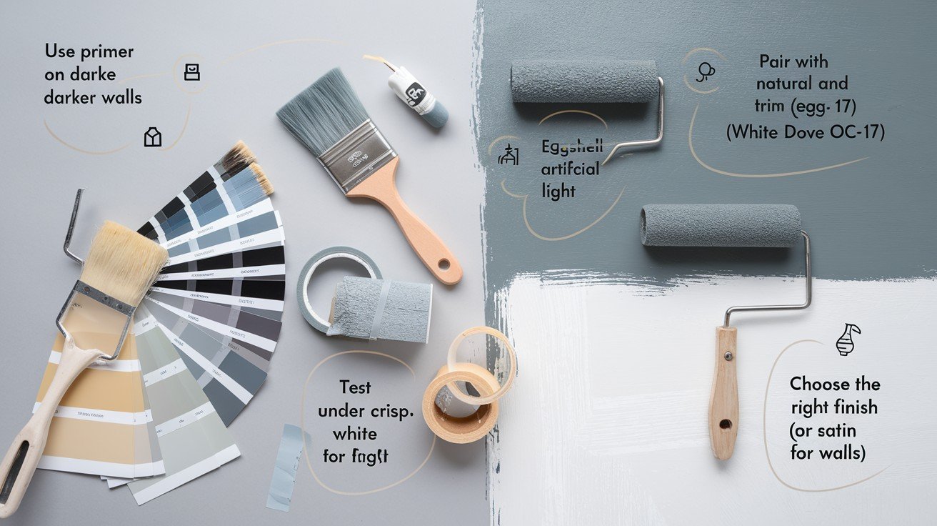
Simple strategies like measuring accurately, choosing the right materials, and planning ahead ensure a smooth, stress-free mantel installation process.
Room Orientation and Lighting Considerations
Best for south-facing and west-facing rooms with good light. These get enough natural light to show off Coventry Gray’s true color. Use caution in north-facing rooms. They don’t get direct sunlight, so this grey may appear too cool or flat.
Here’s what most people don’t realize: Natural lighting affects color perception significantly. The same paint looks different at 9 AM versus 3 PM. Always test in different lighting conditions throughout the day. I can’t stress this enough.
Testing and Application Guidelines
Always sample before committing. Use large samples – those tiny chips lie to you. Test in multiple areas and compare against your existing flooring, cabinets, and fixed elements. What looks good on one wall might clash with your oak floors.
Great with most wood stains, brass fixtures, and white trim. These combinations almost always work. Be cautious with pink-toned woods and cream trim combinations. The cool undertones in Coventry Gray can make these look muddy or off.
My rule: Paint two full sheets of poster board and move them around your room for a week. Live with the color before you buy five gallons. Trust me on this one.
Where to Find and Purchase?
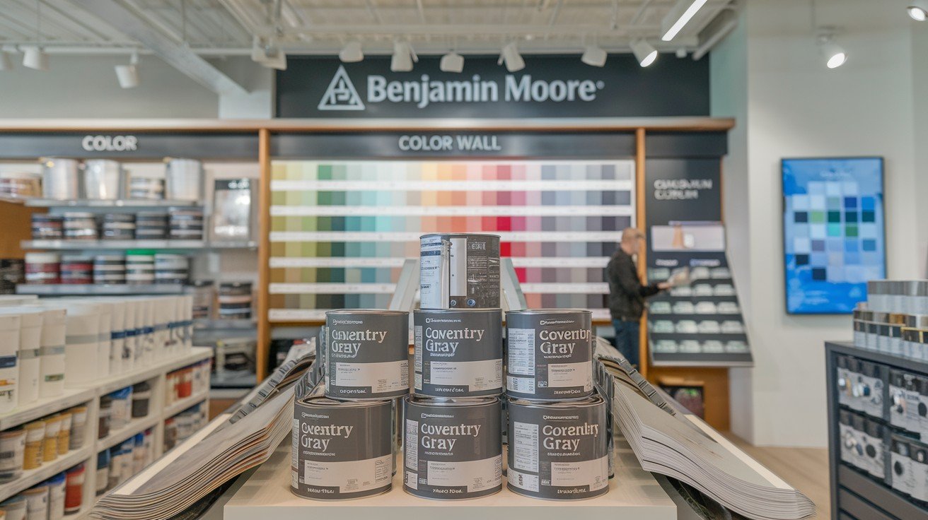
You can find Coventry Gray at Benjamin Moore authorized retailers. Don’t try to get it color-matched at other stores – it won’t be the same. Local Benjamin Moore stores provide expert color consultation. The staff there actually knows paint, not just how to ring up your purchase.
Here’s something worth knowing: Benjamin Moore uses Gennex Color Technology for long-lasting, vibrant results. This isn’t just marketing talk. What does that mean for you? The color stays true longer. It won’t fade weirdly or shift colors after a few years.
My advice: Visit a Benjamin Moore store in person. Bring photos of your room and samples of your flooring or furniture. The staff can help you see how everything works together. Plus, they’ll mix your paint fresh. No sitting-on-the-shelf mystery paint that might be off-color.
Remember: The paint code is HC-169. Write it down so you don’t forget.
Conclusion
Coventry Gray Benjamin Moore (HC-169) offers the perfect balance of sophistication and versatility you’ve been looking for. This medium grey works beautifully in most rooms, pairs well with white trim and brass fixtures, and won’t let you down.
You now have everything you need: the exact paint code, smart pairing suggestions, and practical tips to avoid common mistakes. Test it in your space first, and you’ll likely love the results.
Have you used Coventry Gray in your home? I’d love to hear about your experience in the comments below. And if this guide helped you make your decision, share it with someone else who’s stuck choosing the perfect grey.
Your walls are about to look amazing.
Frequently Asked Questions
What is the paint code for Coventry Gray Benjamin Moore?
The official paint code for Coventry Gray is HC-169. This color is part of Benjamin Moore’s Historical Colors collection and is available at all authorized Benjamin Moore retailers.
Is Coventry Gray a warm or cool grey?
Coventry Gray is a cool-toned grey with subtle blue-green undertones. It’s described as a “stormy gray” that’s neither overly warm nor cold, making it versatile for most spaces.
What LRV does Coventry Gray have?
Coventry Gray has a Light Reflectance Value (LRV) of 48.18, placing it in the light-medium range. This makes it darker than popular light greys but lighter than true medium greys.
What white trim works best with Coventry Gray?
Benjamin Moore Chantilly Lace provides the crispest contrast, while White Dove offers a softer approach. Sherwin-Williams Pure White and Benjamin Moore Decorators White are also excellent choices.
Can Coventry Gray be used on exteriors?
Yes, Coventry Gray works excellently on home exteriors and won’t wash out in sunlight. It’s suitable for stucco, brick, and lap siding on modern, traditional, and Tudor-style homes.