

Drift of Mist has you confused, doesn’t it? This popular paint color looks different in every room, and you can’t figure out why.
I get it. Color undertones are tricky. One minute, Drift of Mist looks like a soft gray. The next minute, it’s showing beige or even green hints. It’s frustrating when you’re trying to plan your space.
Here’s what I’ll cover in this review: The exact undertones in Drift of Mist, how lighting changes this color throughout the day, which colors pair well with it, and real room examples that show how it looks.
I’ve been a professional designer for over a decade. I’ve used this color in dozens of homes. I know it’s quirks. More importantly, I know how to make it work for you.
By the end of this article, you’ll understand exactly what Drift of Mist will look like in your space. No more guessing. No more paint regrets.
The Primary Undertones in Drift of Mist
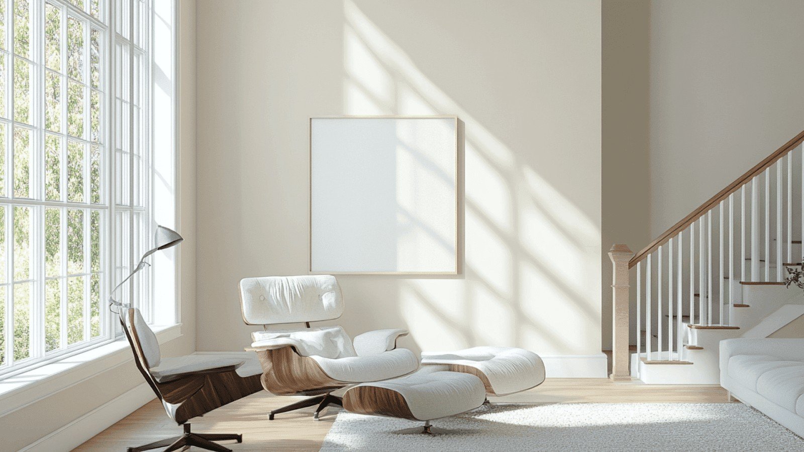
Drift of Mist sits at LRV 69. This means it reflects 69% of the light back into your room. Here’s why this matters for undertones.
Higher LRV colors show their undertones more clearly. You’ll see every subtle hint in this painting. There’s nowhere for undertones to hide.
The technical side? Drift of Mist belongs to the yellow hue family with an LCh angle of 98.347°. This is what gives it warmth underneath all those cool tones.
Green Undertones – The Dominant Characteristic
Green is the star of this show. I see green undertones in Drift of Mist more than any other color. They show up strongest in:
North-facing rooms, spaces with lots of natural light, rooms with white trim, and areas near green landscaping outside. The green is subtle but noticeable. It’s not screaming at you. But it’s there.
Some homeowners love this green hint. It feels fresh and natural. Others hate it because they want pure gray. Know which camp you’re in before you buy.
Blue Undertones Creating the “Misty” Effect
Blue undertones create that soft, cloudy look. Hence the name “mist.” You’ll see blue most in: Cool morning light and artificial LED lighting
The blue balances out the green. This creates complexity. It’s why the color feels so interesting instead of flat. But here’s the thing. The blue and green fight each other sometimes. Your wall might look muddy if the balance is off.
Beige/Warm Undertones
Remember that yellow hue family I mentioned? That’s where the beige comes from. This makes Drift of Mist a true greige. Not gray. Not beige. Something in between.
The warmth shows up against cool lighting. Fluorescent bulbs will pull out every bit of beige in this color.
Your walls might look completely different at night.
How does Lighting Dramatically affect the Drift of Mist Undertones?
Light changes everything with this color. I’ve seen the same paint look like three different colors in one day.
Here’s what happens in each room.
Natural Light Variations by Room Orientation
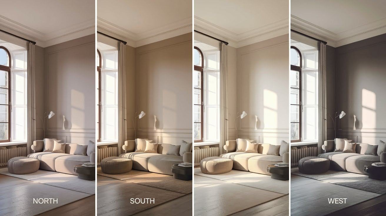
North-facing rooms get cool, steady light all day. Your Drift of Mist will look cooler here. Those green undertones? They’ll be front and center.
South-facing rooms bathe in warm, bright light. The color shifts to warmer. You’ll see more beige and less green. It becomes a true greige.
East-facing rooms catch that golden morning sun. The yellow-orange light pulls out warm undertones early. By afternoon, it cools down again.
But wait.
West-facing rooms do the opposite. Cool mornings, the hot afternoon light hits. That red-orange glow brings out every warm undertone hiding in the paint.
Artificial Lighting Impact on Undertones
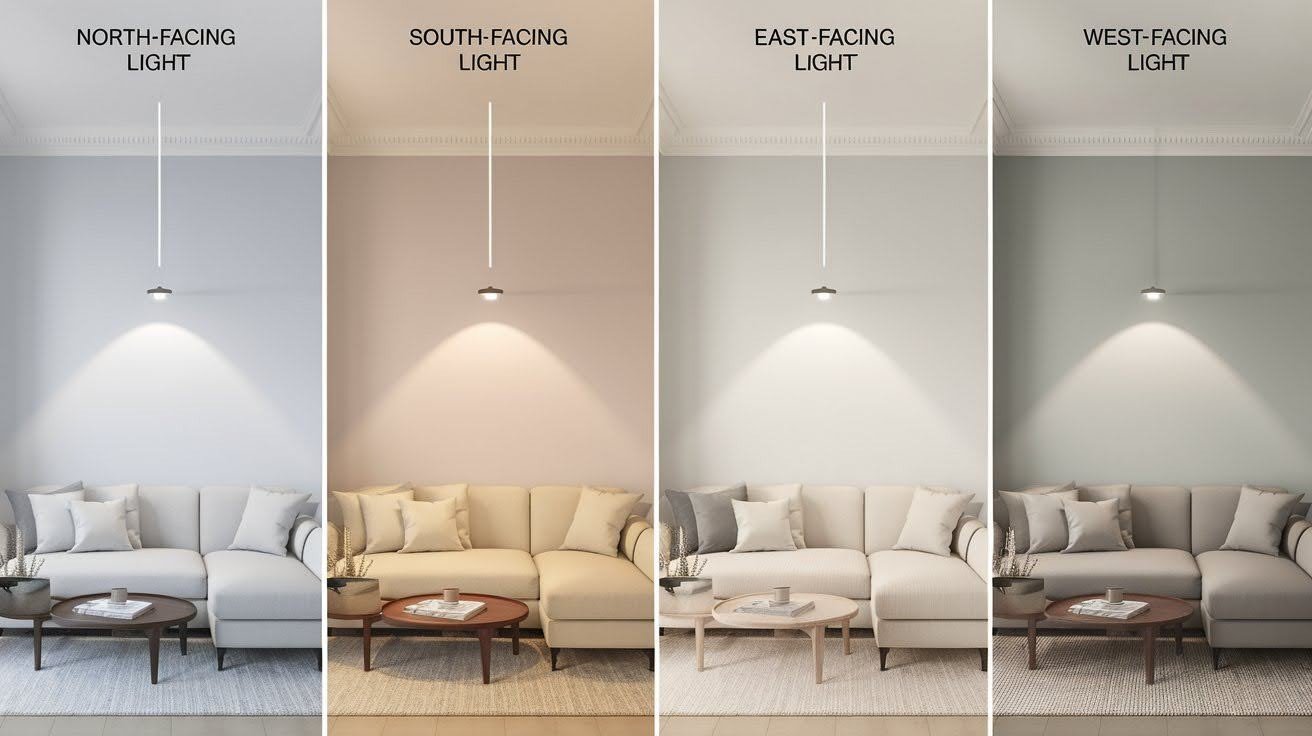
Your light bulbs matter more than you think. LED bulbs make Drift of Mist look cooler and grayer. Incandescent bulbs warm it up fast.
I recommend 2700K to 3000K color temperature. This range keeps the color balanced. It’s too cool, and it looks institutional. It’s too warm, and it looks muddy.
Different lights shift and the undertone dominates. Cool lights bring out green and blue. Warm lights bring out beige and yellow.
Test your paint with your actual lighting first.
Why is the Drift of Mist Technically Warm?
The paint belongs to the yellow hue family. Yellow equals warm in color theory. Period.
Compare it to Repose Gray. Repose Gray sits in the blue hue family. That’s cooler territory. Put them side by side, and you’ll see the difference.
But here’s the weird part.
Technical warmth doesn’t always match what your eyes see. Your brain processes undertones differently from color formulas.
When Undertones Make It Appear Cool?
North-facing rooms flip the script entirely.
Those green undertones take over. Green reads cool to most people. Your technically warm paint suddenly looks cold.
The visual shift happens fast. Morning light shows beige warmth. By noon, it’s all green and gray.
This is why homeowners get confused. They bought a warm grey. Now their walls look like sage green.
The prominence of undertones matters more than the technical classification. What you see beats what the formula says.
Cool undertones can overpower warm ones, especially in certain lighting conditions.
Always test in your actual room before making final decisions.
Managing Drift of Mist’s Undertones
You can work with the green undertones or against them. I’ll show you both approaches.
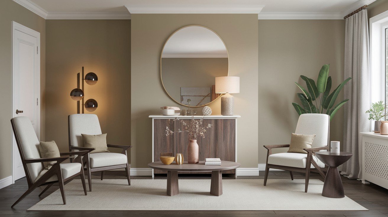
When Green Undertones Work Beautifully
Some spaces love that green hint.
Bathrooms with white tile, bedrooms facing gardens, kitchens with natural wood, and living rooms with lots of plants.
The green feels fresh and calming. It connects your indoor space to nature outside. Colors that play nice with green undertones:
Crisp whites, warm creams, soft blues, and natural wood tones. Design styles that benefit? Modern farmhouse, transitional, and Scandinavian interiors. The subtle green adds depth without being obvious. But sometimes, green goes wrong.
When Green Undertones Become Problematic?
The green looks muddy or sickly. This happens in rooms with poor lighting or too many competing colors. Quick fixes that work:
Change your light bulbs to 2700K warm white, add warm accent colors like terracotta or rust, and use cream trim instead of stark white. Still, hate the green? Try these alternatives instead:
Agreeable Gray for true neutral, Accessible Beige for warmth without green, or Repose Gray for cooler tones. Don’t fight a color you dislike. Life’s too short for wall colors that stress you out. Test any alternative in your actual space first.
Undertone Comparisons with Similar Colors
Choosing between similar grays? The undertones make all the difference. Let me break down the key players.
Drift of Mist vs. Agreeable Gray Undertones
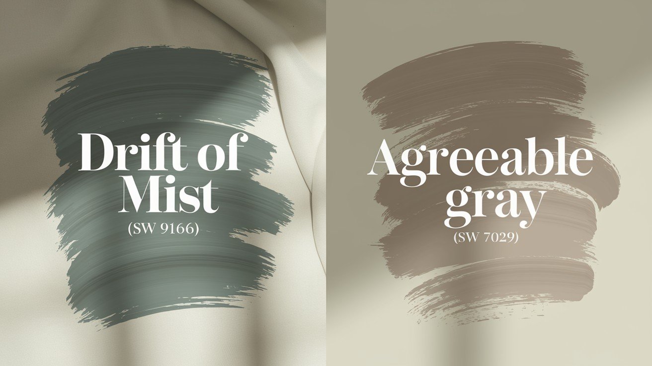
The LRV gap matters here. Drift of Mist sits at 69. Agreeable Gray drops to 60. That’s a full nine points darker.
But here’s the bigger difference.
Agreeable Gray leans beige. It’s warm and cozy. Drift of Mist goes green. That’s a completely different mood.
Lighting conditions change the game:
Agreeable Gray works better in dim rooms, Drift of Mist shines in bright spaces, northern light favors Agreeable Gray’s warmth, and Southern light brings out Drift of Mist’s complexity.
Pick Agreeable Gray if you want predictable warmth. Pick Drift of Mist if you like subtle complexity.
Drift of Mist vs. Gossamer Veil Undertones
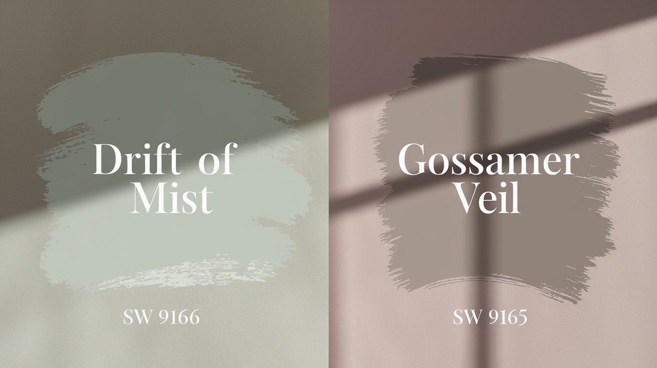
Gossamer Veil sits at LRV 62. That’s seven points darker than Drift of Mist.
The undertone intensity differs, too. Gossamer Veil keeps its undertones quieter. More controlled. The drift of Mist lets them show more freely.
When to choose what:
Choose Gossamer Veil for a subtle, consistent color, and choose Drift of Mist for dynamic, changing tones.
Gossamer Veil plays it safe. Drift of Mist takes more risks.
Conclusion
Now you know the truth about the drift of mist undertones. This color isn’t confusing anymore. It’s predictable. Green dominates in cool light. Beige shows up in warm light. Blue creates that soft, misty look. Simple as that.
You can work with these undertones or choose a different color entirely. Either way, you’re making an informed decision. No more paint regrets. No more second-guessing yourself at the paint store.
Test the color in your actual room with your actual lighting. Trust what you see, not what the paint chip promises. Do you have questions about other tricky paint colors? Drop a comment below. I love helping fellow homeowners avoid costly color mistakes.
Share this review if it helped you make sense of this popular but complex color.
Frequently Asked Questions
What is the main drift of mist undertones?
Drift of Mist has three primary undertones: green (most dominant), blue (creates the misty effect), and beige/yellow (adds warmth). The green undertones are most noticeable in north-facing rooms and bright natural light.
Why does the drift of mist undertones look different in each room?
Room orientation and lighting dramatically affect undertone visibility. North-facing rooms emphasize green undertones, while south-facing rooms bring out beige warmth. Artificial lighting also shifts, which undertones dominate.
Are the drifts of mist undertones warm or cool?
Technically warm due to its yellow hue family, but it appears cool when green undertones dominate. This contradiction confuses many homeowners since visual perception differs from technical classification.
How do I manage unwanted green drift of mist undertones?
Use 2700K warm light bulbs, add warm accent colors like terracotta, or choose cream trim over stark white. If green remains problematic, consider Agreeable Gray or Accessible Beige instead.
What colors work best with drift of mist undertones?
Crisp whites, warm creams, soft blues, and natural wood tones complement the green undertones beautifully. Avoid colors that clash with green if you want harmony.