

Are you on the hunt for that perfect white paint that’s not too stark but still feels fresh and clean?
You’re not alone. Choosing the right white can feel overwhelming with so many options available.
But there’s one shade that keeps showing up in home tours, Pinterest boards, and designer recommendations: Eider White Sherwin-Williams.
This isn’t your typical bright white paint. Instead, it offers something more nuanced; a soft, warm quality that makes spaces feel inviting rather than clinical.
From cozy bedrooms to open living areas, homeowners are choosing this particular shade for good reason.
But what exactly makes it so appealing?
And more importantly, is it right for your space? Let’s break down the real stories behind this popular paint choice and see what all the buzz is about.
Eider White (SW 7014) at a Glance
Eider White (SW 7014) comes with an LRV of 73, making it a true light color that reflects plenty of natural light without being blindingly bright.
You’ll find it available in all standard Sherwin-Williams finishes, from flat to high gloss, though most homeowners gravitate toward eggshell or satin for walls.
What Sets It Apart
This shade sits in the warm white family, featuring subtle pink and purple undertones that become more apparent in certain lighting conditions. Unlike cooler whites that can feel sterile, Eider White maintains a soft, lived-in quality that many find more approachable.
How It Stacks Up Against the Competition
Compared to Alabaster (SW 7008), Eider White feels slightly more muted and carries those distinctive pink undertones.
Pure White (SW 7005) appears much crisper and cooler by comparison, while Agreeable Gray (SW 7029) leans beige rather than white.
Think of Eider White as the middle ground; cleaner than off-whites but warmer than stark whites, making it a versatile choice for various design styles.
Common Themes in Customer Reviews
Homeowners consistently report similar experiences with Eider White, highlighting both benefits and drawbacks.
Loved for Its Soft, Cozy Vibe
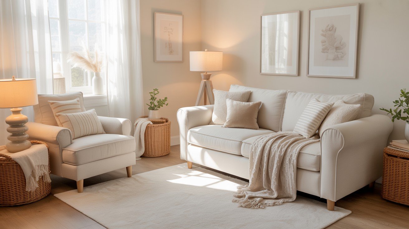
Walk through any home painted in Eider White, and you’ll immediately understand why homeowners rave about its calming yet sophisticated feel.
This isn’t the kind of white that shouts for attention; instead, it whispers comfort while maintaining an upscale appearance.
Parents especially love it for nurseries and children’s bedrooms, noting how it creates a peaceful atmosphere without feeling too babyish.
Living rooms get that same treatment, where the color provides a clean backdrop that still feels warm and inviting for family gatherings.
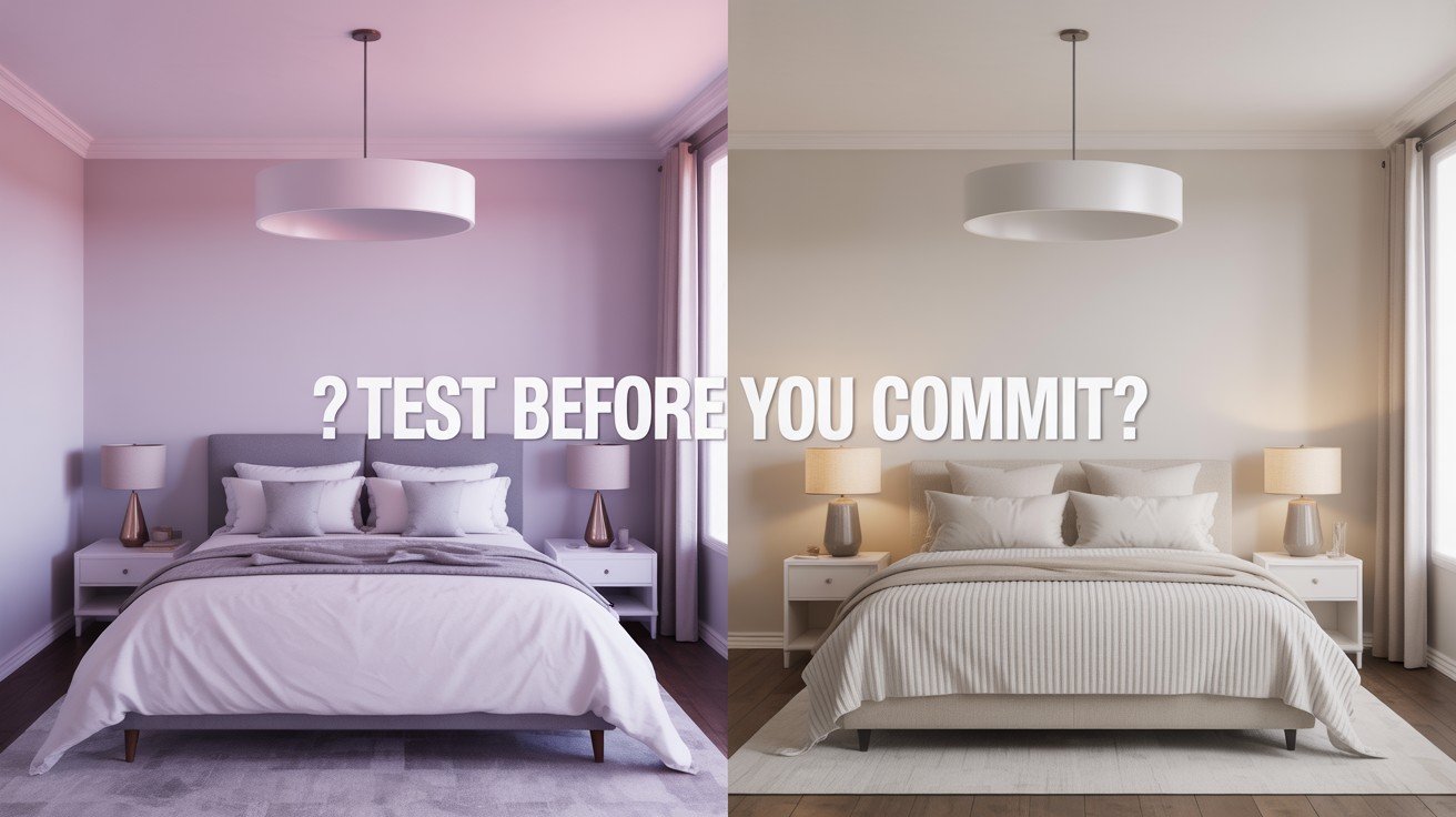
Subtle Undertones: Love It or Hate It
Here’s where opinions split. Many homeowners mention noticing purplish or pink undertones, particularly in north-facing rooms or under certain artificial lighting.
Some find this charming; it gives the color personality and prevents that cold, hospital-like feeling you get with stark whites.
Others? Not so much. A few reviews mention feeling surprised by these undertones, wishing they’d been more aware before painting entire rooms.
This is why nearly every positive review emphasizes the same advice: test it first. Paint large swatches on different walls and observe them throughout the day before making your final decision.
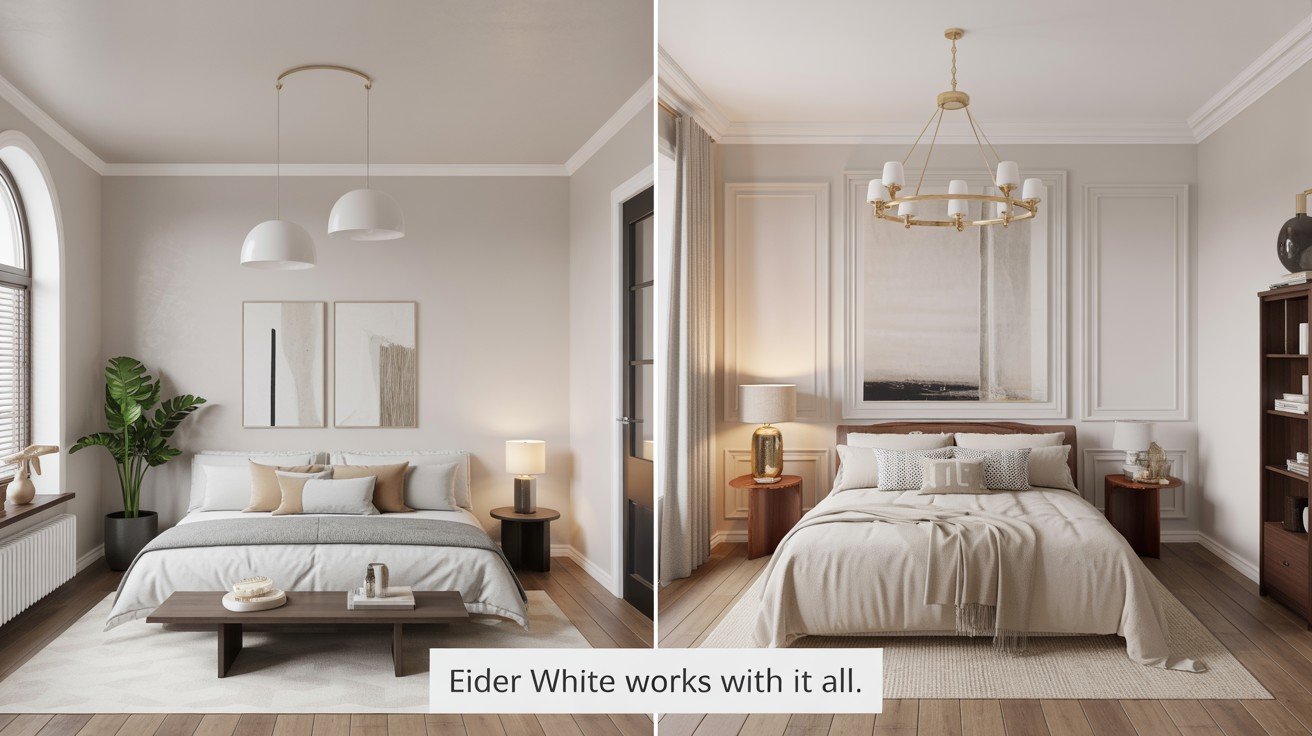
Great with Modern and Traditional Decor
One of Eider White’s strongest selling points is its versatility. Homeowners report success pairing it with both cool and warm accent colors, making it adaptable to changing decor preferences.
Popular combinations include black hardware for a modern farmhouse look, brass fixtures for warmth, and natural wood tones for a Scandinavian vibe.
The color seems to play well with others, acting as a neutral foundation that lets your furniture and accessories take center stage.
Designer and Blogger Opinions
Professional designers consistently praise Eider White for its ability to create sophisticated spaces without the harshness that comes with pure whites.
Interior design blogs frequently feature this shade in their “favorite whites” roundups, with many noting how it photographs beautifully in both natural and artificial light.
Where the Pros Recommend It?
Interior designers and paint professionals share specific applications where Eider White consistently performs well.
Open-Concept Home
Designers love using Eider White in open floor plans because it flows seamlessly from room to room while maintaining visual interest.
The subtle undertones prevent that flat, one-dimensional look you sometimes get with cooler whites in large spaces.
Trim and Cabinetry
Many professionals recommend it for built-ins, kitchen cabinets, and trim work. The warmth keeps white cabinetry from feeling too clinical, while still providing enough contrast against walls in complementary colors.
Creating Depth with Contrast
Design experts frequently pair Eider White with deeper, contrasting colors like navy blue, charcoal gray, or rich greens.
This combination allows the white to shine while the darker tones add drama and sophistication to the overall palette.
Several prominent home bloggers note that Eider White works particularly well in homes with lots of natural wood elements, as the warm undertones complement wood grains rather than competing with them.
This makes it a go-to choice for those wanting a fresh, updated look without losing the cozy factor.
Pros and Cons Based on Real Feedback
Here’s a balanced breakdown of what actual users appreciate most and what challenges they’ve encountered.
Pros:
- eVersatile and softe – Creates a cozy atmosphere while maintaining a clean, polished look that works with various design styles from modern to traditional.
- eWorks in many lighting conditionse – Performs well under both natural daylight and artificial lighting, making it reliable for most room situations.
- eLooks clean but not starke – Provides the freshness of white paint without the cold, sterile feeling that can make spaces feel unwelcoming.
Cons:
- eCan appear pink or purplee – The subtle undertones become more noticeable in certain lighting, which may not appeal to everyone’s taste or design vision.
- eMay not suit north-facing roomse – The warm undertones can intensify in rooms with limited natural light, potentially creating an undesired tinted appearance.
- eNeeds sampling to avoid surprisese – Requires careful testing in your specific space and lighting conditions to ensure the final result matches your expectations.
Where Eider White Really Shines?
eSouth-facing roomse get the most benefit from this paint color. The abundant natural light balances those subtle undertones perfectly, creating a bright yet warm atmosphere that feels inviting throughout the day.
Open spaces also work beautifully; the color’s soft quality prevents large areas from feeling stark while maintaining visual flow between connected rooms.
Cozy bedrooms represent another sweet spot for Eider White. The calming undertones create a restful environment that still feels fresh and clean, making it perfect for master suites and guest rooms alike.
Real-World Success Stories
Online reviews consistently mention successful applications in kitchen cabinetry, where homeowners love how it pairs with both stainless steel appliances and warm wood countertops.
Many forum users report great results in home offices, noting how the color provides a professional backdrop for video calls while remaining comfortable for long work sessions.
Bathroom applications get frequent praise too, with users mentioning how Eider White creates a spa-like feel without being too cold or clinical.
The Perfect Balance
What makes this color special is its ability to brighten without overwhelming. Unlike stark whites that can feel harsh, Eider White adds light to a space while maintaining a sense of warmth and comfort.
This quality makes smaller rooms feel more spacious without sacrificing their cozy character.
Conclusion
Eider White Sherwin-Williams has earned its popularity through a winning combination of versatility and warmth that many homeowners crave.
This isn’t just another white paint; it’s a thoughtful choice that brings light to spaces while maintaining the cozy comfort that makes a house feel like home.
The key to success with this color lies in understanding its personality. Those subtle undertones that some love and others question are exactly what give it character.
By testing samples in your specific space and lighting conditions, you’ll know if it’s the right fit for your vision.
From open-concept living areas to intimate bedrooms, Eider White continues to prove itself as a reliable choice for those seeking something softer than stark white but cleaner than cream.
It’s no wonder designers and homeowners keep coming back to this versatile shade.
Frequently Asked Questions
Does Eider White look pink in all lighting?
The pink undertones are most noticeable in north-facing rooms or under warm artificial lighting conditions.
Can I use Eider White for kitchen cabinets?
Yes, many homeowners successfully use it for cabinetry, especially when paired with natural wood or brass.
How does it compare to Alabaster?
Eider White has warmer undertones and appears slightly more muted than the popular Alabaster shade.