

Greek villa colours can make or break your Mediterranean-inspired space. You’ve probably seen those stunning coastal homes with their perfect colour combinations and wondered how to recreate that magic in your place.
The truth is, choosing the right coordinating colours isn’t as mysterious as it seems. Many homeowners struggle with this because they don’t understand the basic principles that make Greek villa palettes work so well together.
Here’s what you’ll learn in this guide:
How to pick colours that complement each other, which specific shades work best for different rooms, and practical tips for applying these colours in your home. We’ll also cover common mistakes that can ruin your Mediterranean look.
I’ve spent years studying authentic Greek architecture and colour theory. This isn’t about trendy colours that’ll look dated next year. These are time-tested combinations that have worked for centuries.
Are you ready to transform your space with authentic Greek villa colours that work together?
Classic Neutral Coordinating Colors
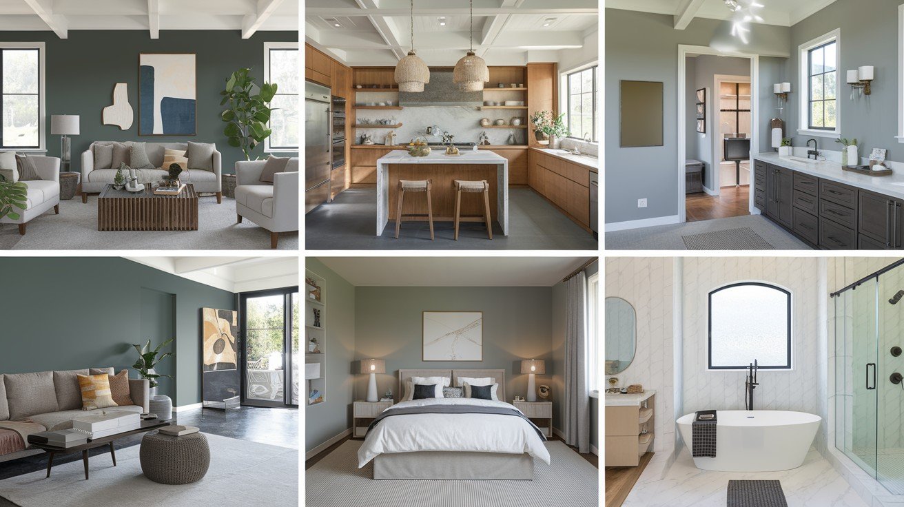
Grays Harbor (SW 6236) brings serious drama to your space. This dark grey works perfectly when you want bold contrast against the Greek Villa’s warm tones. I use it on accent walls or kitchen islands.
Think of it as your statement maker.
Austere Gray (SW 6184) offers something different. It has a subtle green tint that adds sophistication without shouting. You’ll love how it makes the Greek Villa look more refined in living rooms and bedrooms.
Fashionable Gray (SW 6275) fits modern homes perfectly. It’s that pleasant middle-ground grey that doesn’t lean too warm or too cool. Great for open floor plans where you need consistency.
Agreeable Gray might be the most popular choice. Its warm undertones complement the Greek Villa naturally. I recommend this combination for whole-house projects.
Oak Leaf Brown (SW 7054) adds richness wherever you use it. This deep brown works beautifully on accent walls or kitchen cabinetry. It makes the Greek Villa feel more grounded and substantial.
Perfect for creating cosy corners.
Urbane Bronze brings sophistication to home offices and studies. Its grey-brown undertones pair wonderfully with the Greek Villa’s warmth while maintaining a professional feel.
Natural wood tones complete the picture. Warm hardwood floors or wooden furniture pieces tie everything together seamlessly.
Antler Velvet offers the best of both worlds. This warm brown-grey creates cosy spaces while keeping things light enough for smaller rooms.
Bold and Dramatic Color Partnerships
Sometimes, you need more than neutrals to make your Greek villa colours truly special. I get it – safe colours feel, well, secure. But the right bold colours can transform your space from nice to absolutely stunning.
Here’s the secret: Bold doesn’t mean overwhelming.
The key is choosing colours that enhance the Greek Villa’s natural warmth while adding personality. Let me show you my favourite dramatic pairings that work in real homes.
Navy Blue Sophistication
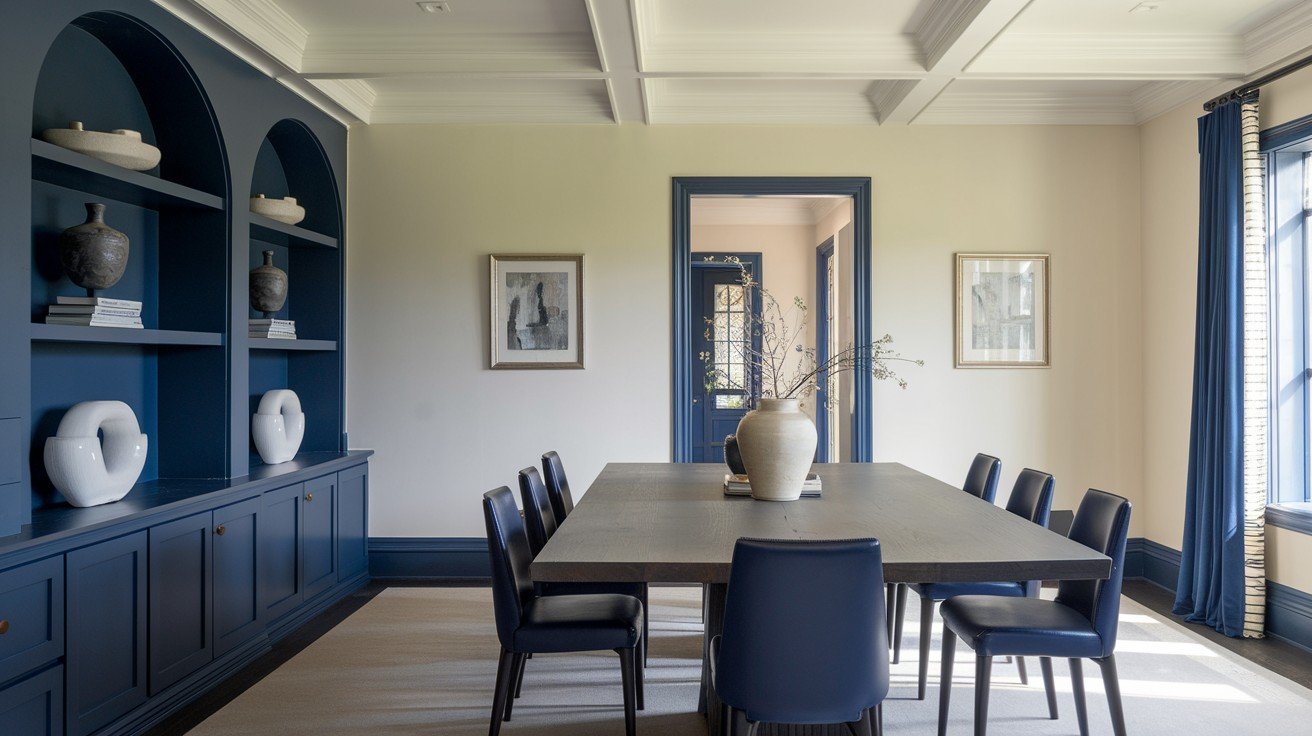
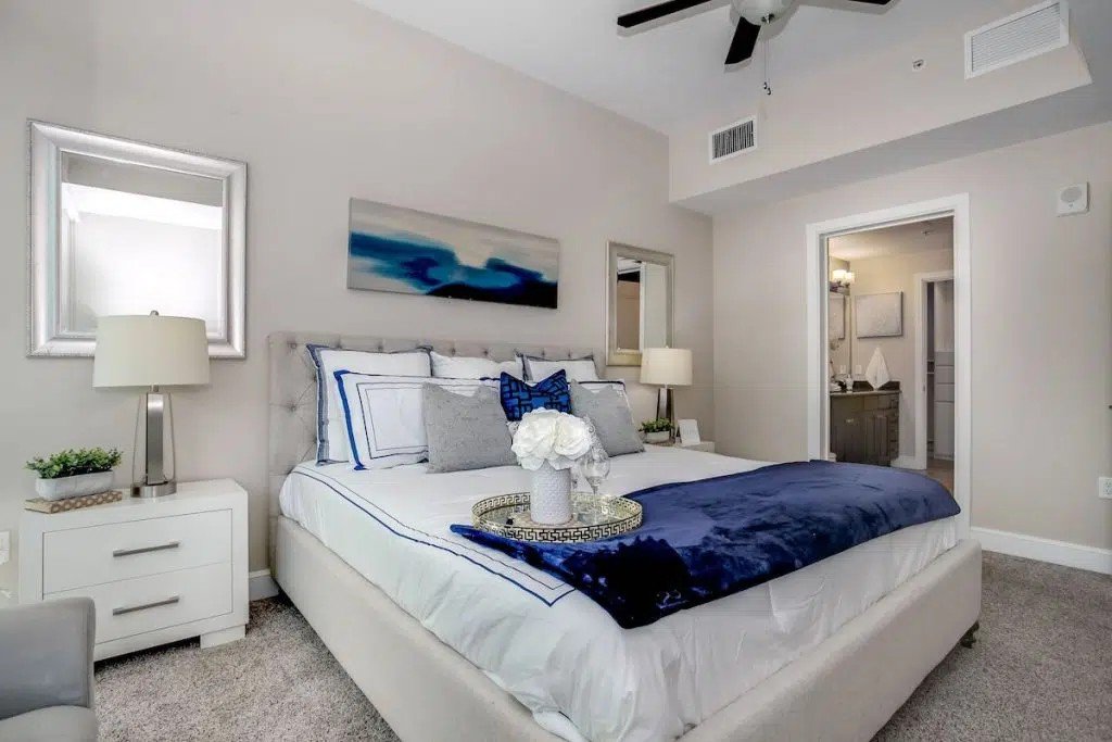
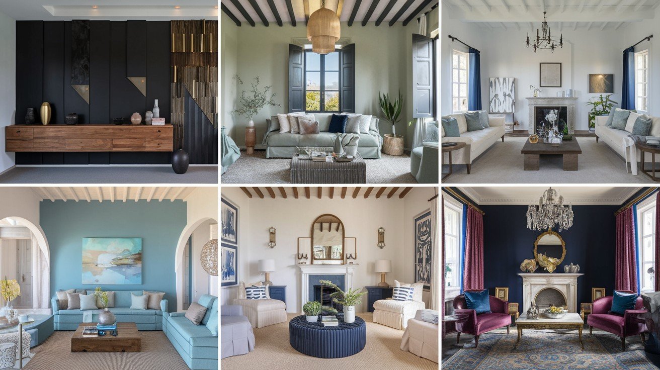
The Navy (SW 9178) creates an incredible contrast with the Greek Villa. This deep navy makes your warm walls pop while adding serious sophistication. I love using it in dining rooms where you want drama.
It’s bold without being risky.
Hale Navy works perfectly for front doors and built-in bookcases. This classic navy has a timeless appeal that won’t look outdated next year. Your guests will notice it immediately.
Britannia Blue offers a medium blue option for those who find deep navy too intense. It’s perfect for accent walls in stairwells or powder rooms where you want impact without overwhelming the space.
Think coastal sophistication meets Mediterranean charm.
Rich Green Accents
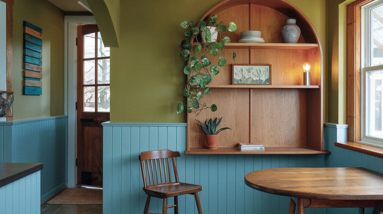
Illusive Green (SW 9164) brings festive energy to any room. This sophisticated green pairs beautifully with the Greek Villa’s undertones. I use it in kitchens and breakfast nooks where you want warmth and life.
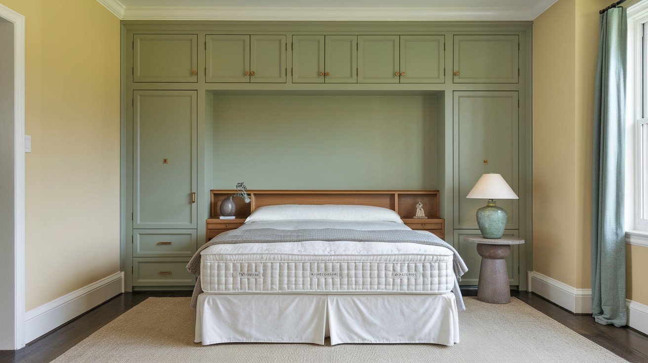
Rosemary adds an earthy, organic feel that complements the Mediterranean style perfectly. It works wonderfully in bedrooms where you want calm sophistication.
Sea Salt gives you that muted blue-green that feels both relaxing and refined. Bathrooms and bedrooms love this colour combination.
Clary Sage creates the most calming environments. This soft sage green makes the Greek Villa feel spa-like and serene.
Deep and Moody Combinations
Dirty Martini (SW 9119) brings contemporary appeal with its sophisticated olive tone. Perfect for modern farmhouse styles that need an edge.
Iron Ore goes nearly black for maximum contrast. Use it sparingly in modern spaces where you want architectural drama.
Charcoal Blue combines the best of both worlds – deep sophistication with subtle blue undertones that complement the Greek Villa’s warmth perfectly.
Room-Specific Coordinating Color Applications
Different rooms need different approaches. I’ve learned this through years of helping homeowners get their Greek Villa colours just right. What works in your kitchen might look completely wrong in your bedroom.
Here’s the thing: Each space has its personality and needs.
Kitchen Color Schemes
Greek Villa cabinets create the perfect foundation for your kitchen. I pair them with blue tile backsplashes all the time – the contrast is absolutely beautiful. My clients love how this combination feels, both fresh and timeless.
Hardware matters more than you think. Brushed gold or warm brass pulls complement the Greek Villa’s undertones perfectly. Skip the chrome – it fights with the warmth.
For countertops, consider warm granite or quartz options. White marble works, too, but adds coolness that some people don’t expect.
Warm wood cabinetry paired with Greek Villa walls creates incredible depth. Think honey oak or natural walnut – they bring out the best in both colours.
Living and Dining Room Combinations
Britannia Blue accent walls transform ordinary living rooms into showstoppers. I use this combination when clients want something special but not overwhelming.
The Navy works, too, but it’s bolder.
Gallery walls look amazing against Greek Villa backgrounds. The warm neutral makes your artwork pop without competing for attention. Your photos and paintings get the spotlight they deserve.
In open floor plans, the Greek Villa flows beautifully with coordinating neutrals. Use Agreeable Gray or Accessible Beige in adjacent spaces for seamless transitions.
Bedroom and Bathroom Pairings
Greek Villa walls with blue-green tile accents create the most relaxing bathrooms. Think Sea Salt or similar muted tones – they feel like a spa retreat.
Small bathrooms benefit from this combination because it makes spaces feel larger and brighter. The warmth prevents that cold, clinical feeling.
In bedrooms, muted coordinating tones work best. You want calm, not stimulation. Soft sages and pale blues complement the Greek Villa perfectly.
Exterior Color Coordination
Greek Villa siding looks fantastic with darker trim options. I often recommend deep navy or charcoal for window trim and shutters.
Skyline Steel creates beautiful low-contrast schemes that feel modern and sophisticated. Perfect for contemporary homes.
Bungalow Beige coordinates perfectly with garage doors. This combination feels cohesive without being boring.
For traditional homes with brick or stone, the Greek Villa bridges the gap between old and new beautifully.
Successful Color Combinations by Design Style
Your design style should guide your colour choices. I see too many homeowners picking colours they love without considering how they fit their overall aesthetic.
That’s backwards thinking.
The best Greek Villa combinations work because they match your home’s personality. Let me show you my proven formulas for different styles.
Traditional Style gets Greek Villa + Navy + Warm Browns. This combination has worked for decades. The navy adds sophistication, while warm browns bring comfort. I use this in colonial and craftsman homes all the time.
It never goes out of style.
Contemporary Style needs Greek Villa + Charcoal Blue + Iron Ore. These colours feel modern and clean without being cold. The contrast is sharp but not harsh. Perfect for minimalist spaces that need warmth.
Transitional Style loves Greek Villa + Sea Salt + Agreeable Gray. This combination bridges traditional and modern perfectly. It’s sophisticated but approachable. Great for families who want style without being too formal.
Most versatile option in my experience.
Mediterranean Style calls for Greek Villa + Illusive Green + Oak Leaf Brown. These colours capture that authentic coastal feeling. The green adds life, while the brown grounds everything. This combination feels like a vacation every day.
Here’s what I tell clients: Pick your style first, then choose your colours. Not the other way around.
Each combination works because the colours support each other. No single colour dominates – they create harmony instead.
The result? Spaces that feel intentional and complete.
Conclusion
Greek villa coordinating colours don’t have to be complicated. You now have the exact colour combinations that work – from classic neutrals like Agreeable Gray to bold choices like In The Navy.
The key is matching colours to your style. Traditional homes love navy and warm browns. Contemporary spaces shine with charcoal blues. Mediterranean styles come alive with greens and earth tones.
You’ve got everything you need to create that perfect coordinated look you’ve been wanting. No more guessing or second-guessing your choices.
Ready to start your colour transformation? I’d love to hear which combination speaks to you most. Drop a comment below and let me know which Greek villa coordinating colours you’re planning to try first.
Your dream space is just a paintbrush away.
Frequently Asked Questions
What colours coordinate best with Greek Villa paint?
Navy blues, warm greys like Agreeable Gray, and rich browns work beautifully. For bolder choices, try Illusive Green or Charcoal Blue. The key is balancing Greek Villa’s warm undertones with complementary colours that enhance rather than compete.
Can I use Greek Villa coordinating colours in small spaces?
Absolutely! Greek Villa with Sea Salt or muted blue-greens make small rooms feel larger. Stick to lighter coordinating colours and use darker accents sparingly for the best visual expansion effect.
Which Greek Villa colour combinations work for modern homes?
Try Greek Villa with Charcoal Blue and Iron Ore for contemporary appeal. This combination feels clean and sophisticated while maintaining warmth. Avoid overly traditional pairings like navy and brown in modern spaces.
How do I choose Greek Villa coordinating colours for open floor plans?
Use Greek Villa as your main colour, then flow into coordinating neutrals like Accessible Beige or Fashionable Gray in adjacent spaces. This creates seamless transitions while maintaining visual interest throughout your home.
What’s the biggest mistake with Greek Villa coordinating colours?
Choosing colours that fight the Greek Villa’s warm undertones. Avoid cool greys or stark whites that create unwanted contrast. Instead, pick colours that enhance the warmth, like Agreeable Gray or natural wood tones.