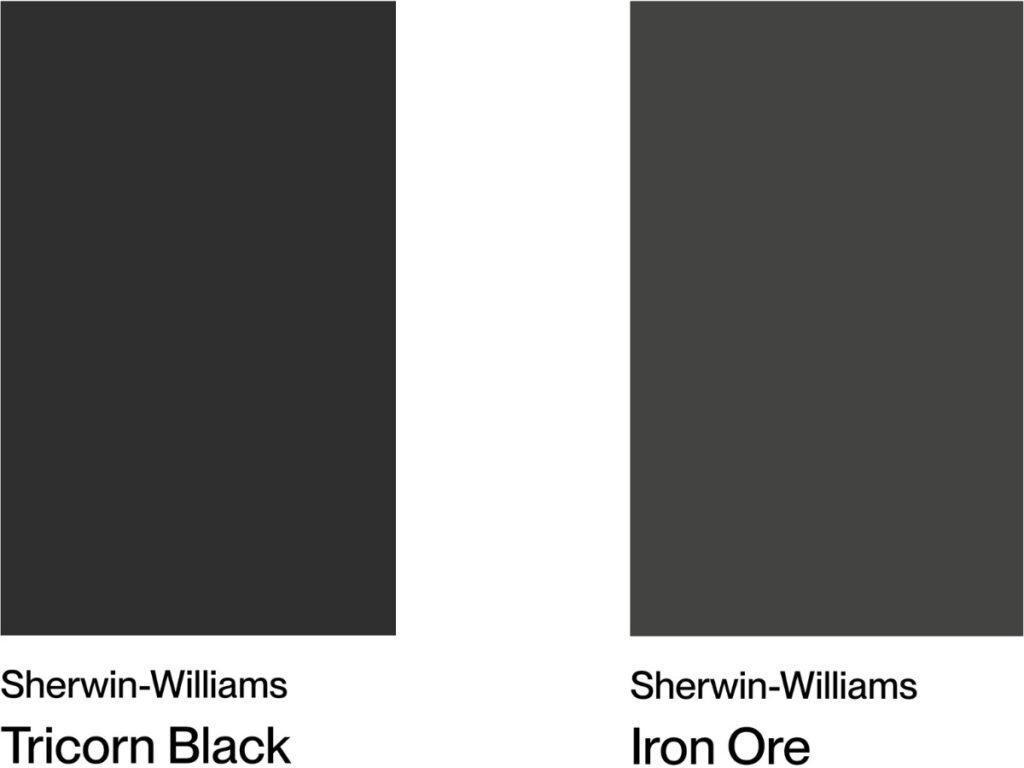
I’ve helped plenty of homeowners navigate tricky paint decisions, and I know choosing between Iron Ore and Tricorn Black can feel overwhelming. Both are rich, popular dark shades, but they’re not the same.
Iron Ore leans more charcoal, while Tricorn Black is a true, bold black. The wrong choice can throw off your room’s whole vibe.
In this guide, I’ll walk you through everything you need to know: undertones, lighting effects, which spaces each color works best in, and real feedback from people who’ve used them. I’ll also cover pricing, application tips, and which style each shade complements.
By the end, you’ll know exactly which one suits your home and why. No more second-guessing your swatches or wasting money on the wrong color. You deserve a space that feels just right, and picking the perfect black paint is a big step in getting there.
Understanding the Basics – Color Characteristics
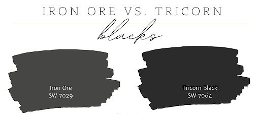
Grasping key color traits like hue, value, and saturation helps you make informed choices that shape mood and visual harmony. Let me break down what makes these colors different. It’s simpler than you think.
Sherwin Williams Iron Ore SW 7069
Iron Ore isn’t black. It’s what paint experts call a soft black or dark charcoal.
Here’s what you need to know:
Light Reflectance Value: 6 out of 100. This means it reflects some light into your room.
Undertones: Warm with subtle green hints. You might not see the green right away, but it’s there. This warmth makes rooms feel cozy instead of cold.
Why it works: Iron Ore gives you drama without going full black. It’s versatile enough for most spaces but still makes a statement.
Sherwin Williams Tricorn Black SW 6258
Now, this is a true black. No gray, no brown, no hints of other colors.
The facts: Light Reflectance Value: Just 3 out of 100. This makes it one of the darkest paints you can buy.
Undertones: None. It’s completely neutral with no color bias. The result: Pure, dramatic black that absorbs almost all light.
Here’s the key difference: Iron Ore softens a room while Tricorn Black commands attention. Both are beautiful, but they create different moods.
Performance in Different Lighting Conditions
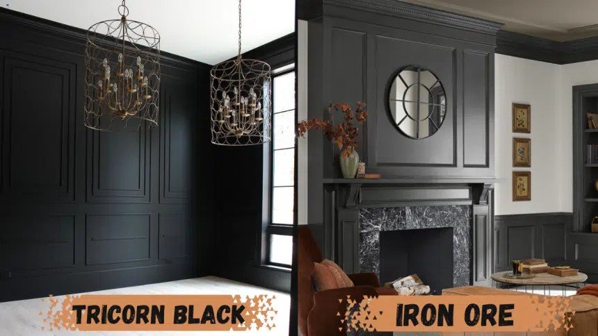
Lighting changes everything with dark colors. Trust me on this.
Natural Light Behavior
Iron Ore is like a chameleon. It shifts throughout the day. Morning light makes it look softer and grayer. By afternoon, those warm undertones start showing up. Evening light brings out the green hints I mentioned earlier.
Tricorn Black? It stays consistent. Pure black in the morning, pure black at night. No surprises.
Outside your windows matters, too. If you face north, Iron Ore might look cooler. South-facing rooms make it warmer and more inviting.
Artificial Lighting Impact
Here’s where things get interesting. LED lights make Iron Ore look cleaner and more gray. Tricorn Black stays true under LEDs.
Incandescent bulbs warm up Iron Ore significantly. You’ll see more brown and green tones. Tricorn Black absorbs the warm light but doesn’t change color.
My testing tip: Get sample sizes of both colors. Paint large swatches on different walls. Check them at other times of the day and with your actual light fixtures on.
Don’t skip this step. What looks good at the paint store might surprise you at home.
Room-by-Room Application Guide
Let me show you where each color works best. Location matters more than you think.
Kitchen Applications
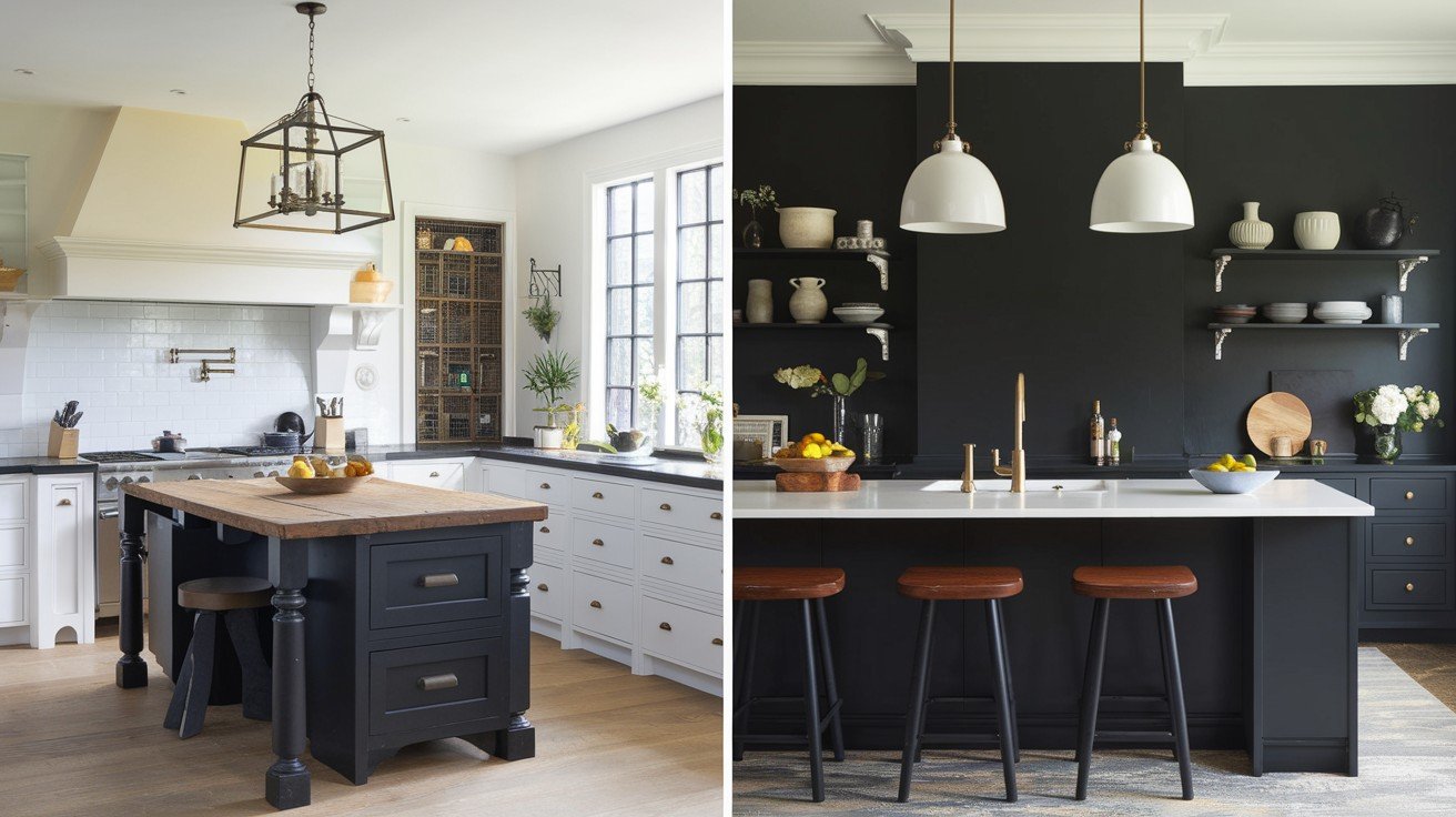
For cabinets: Iron Ore works better on upper cabinets. It’s not as heavy as Tricorn Black, so your kitchen won’t feel closed in.
Tricorn Black looks amazing on kitchen islands. The contrast with lighter upper cabinets creates visual interest.
Countertop pairing: Both colors work with white quartz and marble. Iron Ore also pairs well with warm wood countertops. Tricorn Black needs cooler materials to balance its intensity.
Living Spaces
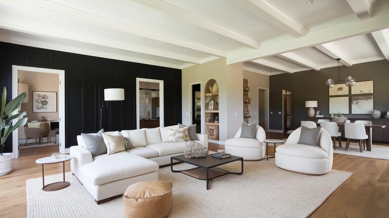
Accent walls are perfect for both colors. Iron Ore creates a cozy focal point behind your TV or sofa. Tricorn Black makes a bold statement but use it sparingly.
Fireplace projects: Iron Ore warms up a fireplace surround nicely. Tricorn Black creates drama but might overpower smaller rooms.
In open floor plans, Iron Ore flows better between spaces. It’s less jarring than pure black.
Bedroom Uses
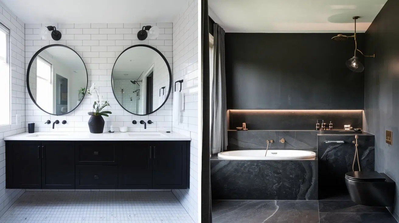
Want cozy? Iron Ore wins. It makes bedrooms feel like a warm hug.
Need drama? Tricorn Black behind your headboard creates a hotel-like feel.
.
Size matters here. Small bedrooms can handle Iron Ore. Tricorn Black needs bigger spaces to breathe.
Home Office and Study Areas
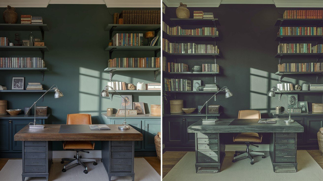
Dark colors reduce eye strain when you’re staring at screens. This is science, not opinion.
Iron Ore creates focus without feeling oppressive. Tricorn Black works in larger home offices where you want serious, professional vibes.
Both colors help you concentrate better than lighter shades.
Exterior Applications
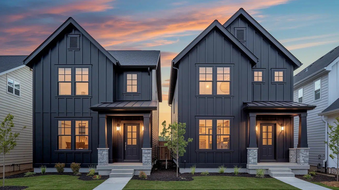
Your home’s outside needs different thinking than inside rooms.
Whole House Exterior Painting
Iron Ore softens your home’s look without going full dramatic. It works great on traditional and transitional styles.
Tricorn Black makes a bold, modern statement. Think sleek, contemporary homes. It’s perfect for farmhouse and industrial styles, too.
Your home’s architecture matters. Colonial and craftsman homes look better in Iron Ore. Modern, and mid-century homes can handle Tricorn Black’s intensity.
Accent Applications
Front doors: Both colors work amazingly well. Iron Ore gives you sophistication. Tricorn Black creates instant curb appeal.
For shutters and trim, Iron Ore pairs nicely with white, cream, and gray siding. Tricorn Black pops against lighter colors but needs careful planning.
Pro tip: Test both on small sections first.
Pairing with Exterior Materials
Brick homes: Iron Ore complements red and brown brick beautifully. Tricorn Black works with white painted brick or modern gray brick.
Stone exteriors: Both colors work, but Iron Ore feels more natural with warm stone. Tricorn Black suits contemporary stone applications.
Your landscaping changes how these colors look. Green plants make Iron Ore feel earthy. They make Tricorn Black look more dramatic.
Color Coordination and Pairing
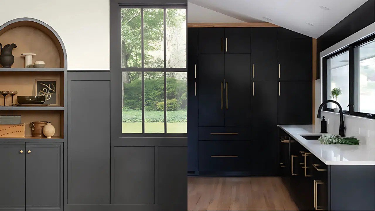
Getting the right color combinations makes all the difference. Let me save you from costly mistakes.
Best White Trim Colors
Pure White is your safest bet with both colors. It’s clean and works every time.
Alabaster adds warmth without competing. Greek Villa gives you a softer white that still pops against dark walls.
Extra White creates crisp contrast – perfect if you want that magazine look.
Skip the creamy whites. They look muddy next to Iron Ore and Tricorn Black.
Neutral Companions
Agreeable Gray works beautifully in rooms next to your dark spaces. It bridges the gap between light and dark areas.
Greige colors like Accessible Beige complement Iron Ore’s warm undertones. For Tricorn Black, cooler grays work better.
Whole-home tip: Use Iron Ore or Tricorn Black in one main space, then flow lighter neutrals throughout the rest of your home.
Bold Accent Colors
Iron Ore’s green hints pair well with navy blue, sage green, and warm brass accents.
Tricorn Black is like a blank canvas. It works with almost any bright color – coral, yellow, emerald green, or royal blue.
Both colors make artwork and colorful furniture pop.
When to Choose Each Color
Here’s how I decide between these two colors. It comes down to your specific situation.
Choose Iron Ore. When
Your space needs a softer contrast without going full black. It’s perfect for traditional and transitional home styles.
Limited natural light? Iron Ore won’t make your room feel like a cave. Its higher light reflectance helps bounce light around.
You need versatility. Iron Ore works in more situations than pure black. It’s the safer choice for most homeowners.
Choose Tricorn Black When
You love modern and contemporary design. Pure black fits these styles perfectly.
High-contrast design is your goal. Nothing beats true black for drama and impact.
Exterior projects require real black – not dark gray. Tricorn Black delivers authentic color.
Abundant natural light in your space means you can handle this intensity without the room feeling too dark.
Making Your Final Decision
Don’t guess. Test first, paint second.
Get samples of both colors. Paint large swatches on different walls – at least 2 feet by 2 feet each.
Sample peel-and-stick samples work great for initial testing. They’re easier than buying sample paint cans.
Check your samples in the morning, afternoon, and evening. Colors look completely different throughout the day.
Your lighting matters most. Turn on all your room’s lights. See how each color responds to your specific bulbs and fixtures.
Think about your design style. Traditional homes usually prefer Iron Ore’s softness. Modern spaces can handle Tricorn Black’s intensity.
Avoid these mistakes: Don’t test tiny patches. Don’t rush the decision. Don’t ignore how your furniture and decor look with each color.
Bottom line: The color that feels right in your space wins.
Conclusion
Now you know the real difference between iron ore and tricorn black. Iron Ore gives you sophisticated warmth with its soft charcoal tone, while Tricorn Black delivers pure drama with true black intensity.
Your choice depends on your space and style. Traditional homes and rooms with limited light work better with Iron Ore. Modern spaces with plenty of natural light can handle Tricorn Black’s boldness.
Remember to test both colors in your actual room before making the final call. What looks good in theory might surprise you in real life.
You’ve got this. Trust your instincts after testing, and you’ll end up with a color you love for years to come.
Have you used either of these colors in your home? Share your experience in the comments below.
Frequently Asked Questions
What is the main difference between Iron Ore and Tricorn Black?
Iron Ore is a soft black with warm undertones and an LRV of 6. Tricorn Black is a true black with no undertones and an LRV of 3.
Which color is better for small rooms?
Iron Ore works better in small rooms because it reflects more light (LRV 6) and feels less heavy than Tricorn Black’s pure intensity.
Can I use these colors on kitchen cabinets?
Yes. Iron Ore works well on upper cabinets for a softer contrast. Tricorn Black is perfect for kitchen islands paired with lighter uppers.
Which color is more versatile for different lighting conditions?
Iron Ore is more versatile as it adapts to various lighting. Tricorn Black stays consistently black but needs adequate natural light to avoid overwhelming spaces.
Are these colors good for exterior use?
Both work well outside. Iron Ore suits traditional home styles with a softer statement. Tricorn Black creates bold, modern curb appeal on contemporary homes.

