

Olympus White by Sherwin-Williams has become the paint colour everyone’s talking about. If you’re wondering why this particular shade is showing up in homes everywhere, you’re not alone.
You’re probably here because you’ve seen this colour online or heard friends mention it. Maybe you’re planning a room makeover and want to understand what makes this white so special.
This article will answer all your questions. We’ll cover why Olympus White works so well in different rooms, how it compares to other popular whites, and whether it’s right for your space.
I’ve spent years helping homeowners choose paint colours. The advice here comes from real experience with this specific shade. No sales pitch, just honest information about what you can expect.
By the end, you’ll know exactly why Olympus White has gained such a following and whether it deserves a spot on your walls.
What Makes Olympus White SW 6253 Special?
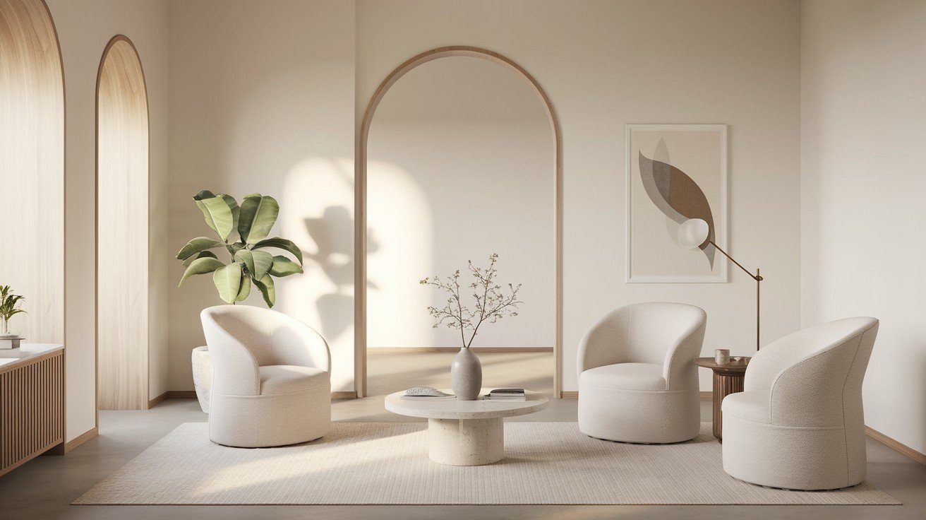
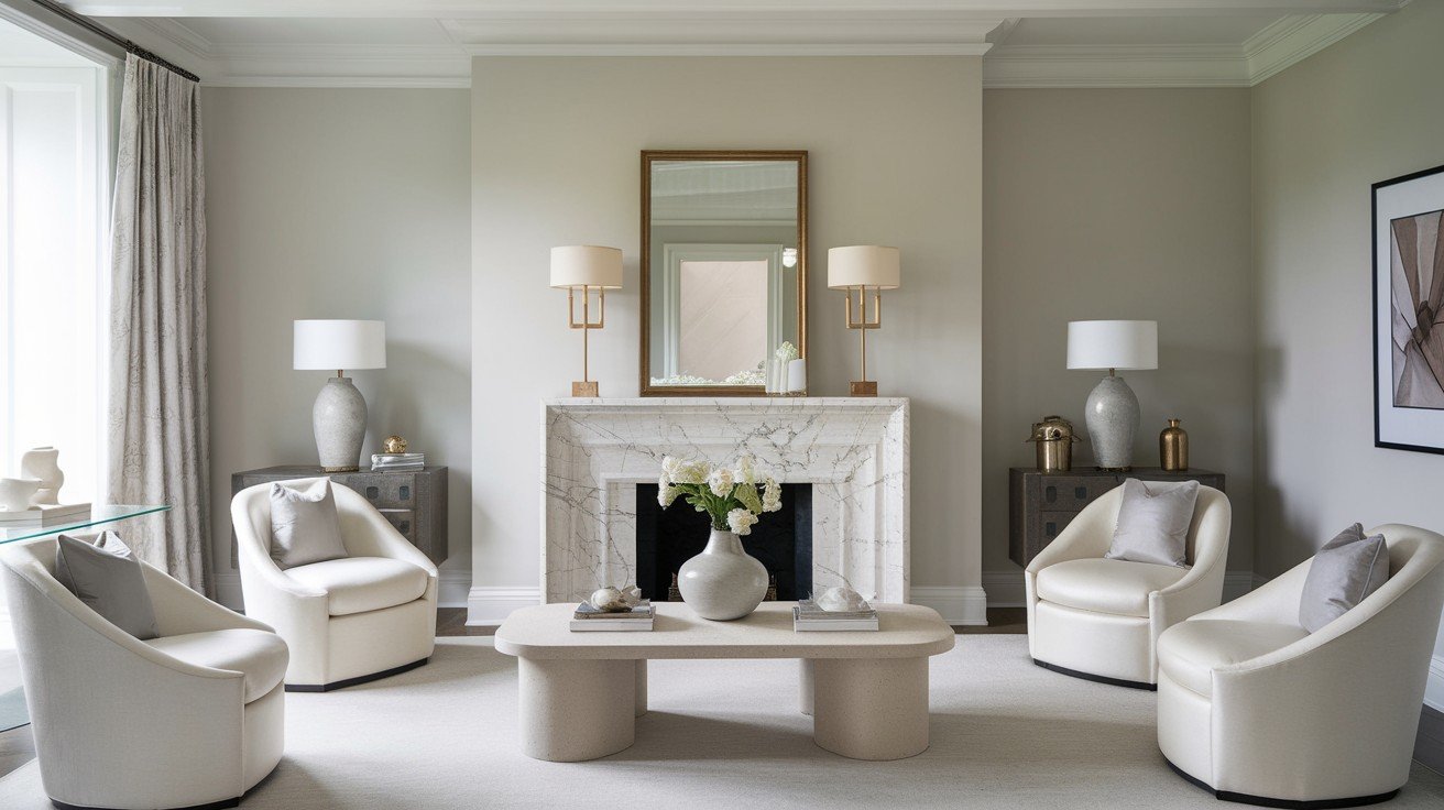
Olympus White isn’t your typical white paint. I’ve watched countless homeowners struggle with stark whites that feel cold or greys that seem too dark.
This colour sits right in the sweet spot.
It’s technically a light shade in the white and grey family. But here’s what makes it different – those subtle blue undertones that most people can’t quite identify.
You know that feeling when a room just feels right? That’s what happens here.
The Light Reflectance Value sits at 68.09. In simple terms, this means your rooms will feel bright and open without that harsh glare you get from pure white walls.
I call it the “just enough colour” paint. It gives you visual interest without making any bold statements. Perfect if you want something more interesting than plain white, but don’t want to commit to a strong colour.
Here’s why it works so well right now:
Modern design loves neutrals that have depth. Olympus White bridges that gap between pure white and light grey that everyone’s looking for.
It meets today’s design preferences without feeling trendy or dated.
Why Olympus White Is Trending Now
Post-Pandemic Design Shifts
The way we think about our homes changed completely after 2020. I’ve noticed a clear shift in what my clients want.
Gone are the days of stark, cold whites.
People now crave colours that feel calming. They want their walls to create a sense of peace, not stress. Olympus White delivers exactly that with its soft, sophisticated feel.
Your home became your everything – office, gym, restaurant, and retreat. This colour supports that home-as-sanctuary mindset that so many of us developed.
There’s also this concept called “quiet luxury” that’s taken over home design. It’s about choosing things that look expensive without being flashy. Olympus White fits this trend perfectly.
You get sophistication without the show-off factor.
Social Media and Digital Influence
Let’s be honest – Instagram changed everything. I see homeowners choosing colours based on how they’ll look in photos.
Olympus White photographs beautifully. It creates the perfect backdrop for those home photos that get thousands of likes.
Pinterest boards are full of rooms painted in this exact shade. When you search for “neutral paint colours,” you’ll see it everywhere.
Home tour videos on TikTok and YouTube feature this colour constantly. Lifestyle influencers know it creates that clean, polished look their followers want to copy.
Even home improvement shows have started featuring it more often. When you see it on TV, it looks effortless and expensive.
Modern Lifestyle Compatibility
Here’s something I didn’t expect – video calls changed paint preferences.
Olympus White looks great on camera. It provides the right amount of contrast without creating weird shadows or colour casts during your Zoom meetings.
Multi-generational homes are more common now. Grandparents, parents, and kids all living together need colours that work for everyone. This neutral pleases all age groups.
If you’re planning to sell your home, real estate photographers love this colour. It makes rooms look bigger and brighter in online listings.
The versatility factor is huge, too.
You can change your furniture, art, and accessories without worrying about clashing with your wall colour. Perfect for people who like to update their decor seasonally or when they get bored.
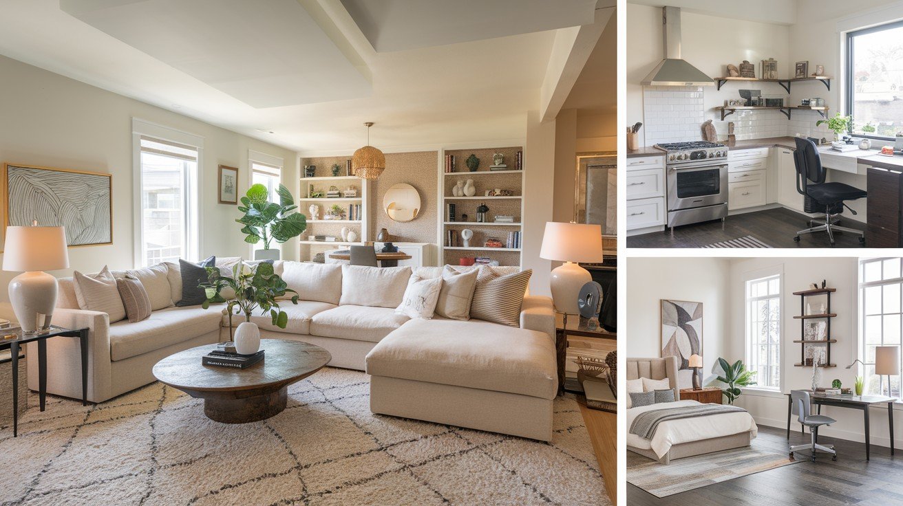
I’ve seen clients use it in every room – bedrooms, kitchens, living rooms, even bathrooms. That kind of flexibility is rare with paint colours.
It adapts to your life changes instead of fighting against them.
Current Design Movements Driving Popularity
2024-2025 Interior Design Trends
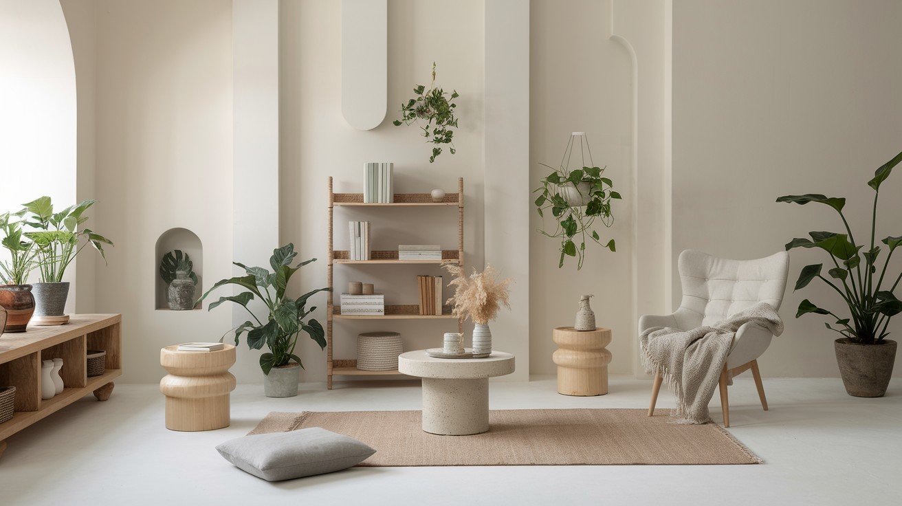
Coastal and Scandinavian styles are everywhere right now. I see clients asking for that clean, serene look constantly.
Olympus White captures both perfectly.
The minimalist movement needs colours that won’t compete with clean lines and simple furniture. This shade provides the perfect backdrop without adding visual noise.
Wellness-focused design is huge these days. People want their homes to support their mental health. Calming colours like Olympus White help create that peaceful environment we all need.
Sustainability matters more than ever, too.
Instead of trendy colours that look dated quickly, people are choosing timeless shades. Olympus White won’t look outdated in five years – that’s smart, sustainable thinking.
You invest once and enjoy it for decades.
Economic Factors Behind the Trend
Let’s talk about money. Paint is one of the cheapest ways to make your home look like a million bucks.
Olympus White gives you that designer look without the designer price tag. I’ve seen $50 worth of paint transform rooms that would have cost thousands to renovate.
During uncertain economic times, people want safe choices that still feel stylish. This colour delivers both security and sophistication.
Think of it as affordable luxury.
You get maximum impact for minimum investment. One gallon can completely change how expensive your space looks and feels.
Smart homeowners understand the investment value in choosing colours that won’t quickly go out of style. While trend-driven colours lose their appeal, Olympus White maintains its value year after year.
It’s the financial equivalent of buying a classic white shirt instead of a trendy top you’ll hate next season.
Real-World Success Stories and Applications
Trending Room Applications
Home offices got a major makeover during remote work. I’ve painted dozens of them with Olympus White because it looks professional on video calls.
No weird colour casts or distracting backgrounds.
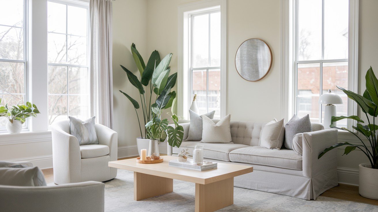
Open floor plans love this colour. When your kitchen flows into your living room, you need something that works everywhere. Olympus White creates that seamless connection modern homes require.
Master bedrooms become instant spa retreats with this shade. The calming blue undertones help promote better sleep – something my clients notice right away.
Living areas are photographed beautifully for social media. If you’re someone who loves sharing your space online, this colour makes everything look more expensive and put-together.
Modern Design Combinations That Work
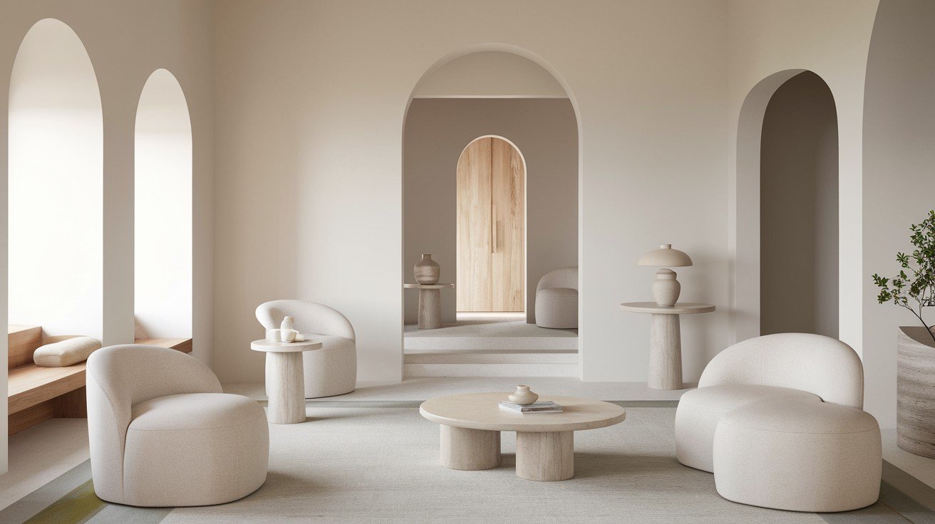
Natural textures are trending hard right now. Think wood beams, jute rugs, and linen furniture. Olympus White makes all these textures pop without competing for attention.
Brass and black fixtures look amazing against this backdrop. The subtle undertones complement both warm and cool metals perfectly.
Monochromatic grey schemes are popular, using different shades of grey throughout your home. Olympus White bridges white and grey beautifully in these designs.
The hygge movement focuses on comfort and cosiness.
This colour supports that feeling without being too warm or too cold. It creates the perfect foundation for layering cosy textures and soft lighting.
Wellness design emphasises mental health through colour choices. The calming nature of Olympus White fits perfectly into this movement, helping create spaces that make you feel better.
It works with trending design philosophies instead of fighting against them.
Professional Designer Endorsements and Recognition
Industry Recognition Driving Popularity
Major design magazines can’t stop featuring this colour. I see it in House Beautiful, Better Homes & Gardens, and Architectural Digest constantly.
Celebrity homes are showcased regularly on Instagram and in lifestyle magazines. When A-listers choose a paint colour, people notice.
Professional painting contractors recommend it because they know it works. These are people who see hundreds of paint jobs – they know which colours clients love and which ones cause problems.
Design competitions have started recognising spaces painted in Olympus White. When industry professionals vote for the best rooms, this colour keeps showing up.
That kind of recognition doesn’t happen by accident.
Why Design Professionals Choose It Right Now
My clients specifically ask for camera-ready colours now. They want their homes to look good in photos, video calls, and social media posts. Olympus White delivers every time.
Design trends change constantly, but this colour adapts to whatever’s popular. I don’t worry about it looking outdated when new trends emerge.
The market demands flexibility right now. People change how they use their spaces more often than before. This colour supports those lifestyle shifts instead of limiting them.
Post-pandemic life is different.
Homes need to function as offices, gyms, and social spaces all at once. Professional designers choose colours that work for multiple purposes.
I recommend it because it solves problems instead of creating them. When you’re charging clients for your expertise, you choose colours that deliver results.
Other designers trust it because it has a proven track record. In our industry, reputation matters – and this colour has earned its place.
The Social and Cultural Factors
Generational Appeal
Millennials are buying homes in record numbers, and they’re driving the neutral colour trend. I see this generation choosing sophisticated colours over the bold accent walls their parents loved.
Gen Z takes mental health seriously when designing their spaces. They specifically ask for calming colours that won’t add stress to their daily lives. Olympus White fits perfectly.
Baby Boomers downsizing want colours that work anywhere. When you’re moving from a large home to a smaller space, you need versatile paint that adapts to different furniture and lighting.
Multi-generational homes are becoming common.
This colour pleases everyone from teenagers to grandparents. That’s rare in paint colours – most lean too young or too mature.
Cultural Shift Toward Mindful Living
Mental health awareness changed how we think about our homes. People now understand that colour affects mood and stress levels. Olympus White promotes calm without feeling sterile.
The minimalism movement teaches us to choose things that truly add value. This colour supports that philosophy by providing beauty without distraction.
We’re rejecting throwaway culture in favour of lasting choices. Instead of painting rooms every few years to keep up with trends, people want colours that age gracefully.
The connection to nature matters more than ever.
Those subtle blue undertones remind us of sky and water – natural elements that humans find inherently calming.
Outdoor living trends have brought nature indoors. This colour bridges that gap between inside and outside spaces beautifully.
It reflects our cultural values of sustainability, wellness, and mindful consumption. When your paint colour aligns with your values, it feels right in ways that go beyond just looking good.
Conclusion:
Now you understand why Olympus White Sherwin-Williams has become such a phenomenon. It’s not just another trendy colour – it’s a thoughtful response to how we live today.
This shade works because it solves real problems. It looks great on video calls and photographs beautifully, and creates the calm spaces we all need. Plus, it adapts to whatever life throws at you.
You’ve got all the information you need to decide if it’s right for your home. Whether you’re planning a single-room refresh or a whole-house transformation, you know what to expect.
Have you tried Olympus White in your space? I’d love to hear about your experience in the comments below. And if this helped you make a decision, share it with someone else who’s stuck choosing paint colours.
Frequently Asked Questions
What color is Olympus White Sherwin-Williams?
Olympus White SW 6253 is a light neutral in the white/gray family with subtle blue undertones. It has an LRV of 68.09, creating bright spaces without harsh glare.
Why is Olympus White Sherwin-Williams so popular right now?
It meets current demands for calming, sophisticated neutrals. Perfect for video calls, social media photos, and modern lifestyles requiring versatile, wellness-focused color choices.
What rooms work best with Olympus White Sherwin-Williams?
It works in any room – home offices, bedrooms, living areas, and open floor plans. The color photographs well and creates professional backgrounds for video calls.
Does Olympus White Sherwin-Williams look good with modern decor?
Yes, it complements natural textures, metallic accents, and monochromatic schemes. The color supports minimalist, coastal, Scandinavian, and wellness-focused design trends perfectly.
Is Olympus White Sherwin-Williams worth the investment?
Absolutely. It’s a timeless choice that won’t date quickly, photographs beautifully for resale, and provides affordable luxury that transforms spaces without major renovation costs.