

When I redesigned a small guest room recently, I questioned whether the standard white ceiling was helping or hurting the overall look. Painting the ceiling the same color as the walls has become a popular design choice, and for good reason.
It can create a seamless, modern feel that makes rooms appear larger or more intimate, depending on the color and lighting.
From my experience working on various DIY spaces, this technique can work beautifully in certain settings, but it’s not for every room. Some spaces benefit from a unified palette, while others may feel darker or closed in.
Before picking up your paint roller, it’s important to understand how this trend might affect your room’s size, brightness, and style. Let’s break down the pros and cons to help you decide.
Pros of Painting the Ceiling the Same Color as the Walls
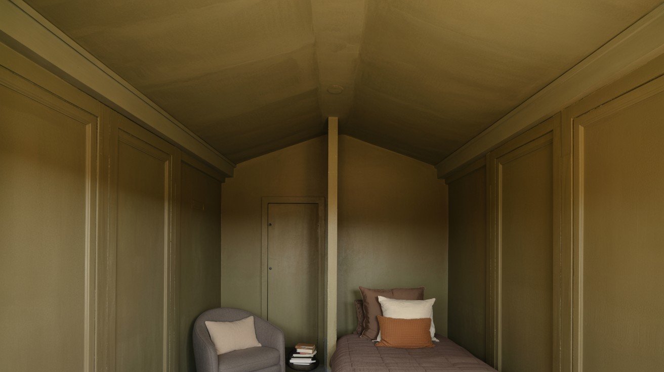
1. Creates a Cozy, Enclosed Feel
When walls and ceiling share the same color, the room develops a cocoon-like atmosphere that feels intimate and protected. This technique works particularly well in bedrooms, reading areas, or any space where you want to foster relaxation and comfort.
2. Makes Small Rooms Appear Larger
Eliminating the visual break between walls and ceiling tricks the eye into perceiving expanded space. Without a contrasting ceiling line to define boundaries, the room’s dimensions seem to stretch beyond their actual measurements.
3. Minimizes Visual Distractions and Breaks
A unified color scheme creates seamless flow throughout the room, allowing your eye to move smoothly without stopping at color transitions. This clean approach lets furniture, artwork, and architectural details take center stage instead of competing with busy color changes.
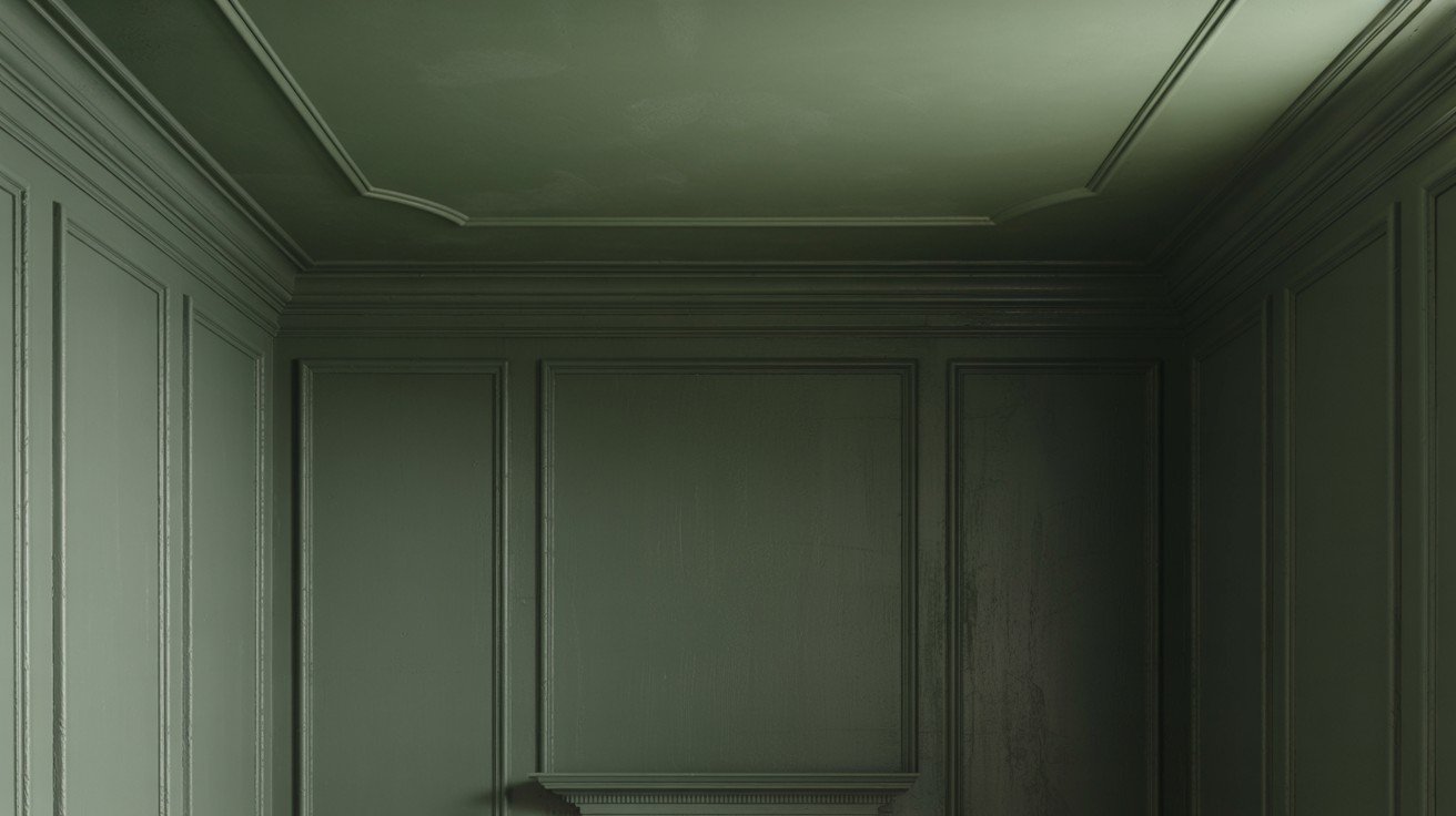
4. Hides Ceiling Imperfections
Matching colors helps camouflage ceiling flaws like cracks, water stains, or uneven textures that would stand out against contrasting colors. Dark or medium tones are especially effective at concealing these common ceiling issues.
5. Easier Color Matching and Paint Selection
Shopping becomes simpler when you only need one paint color for the entire room. You avoid the challenge of finding complementary shades and eliminate concerns about undertones clashing between different paint colors.
Cons of Painting the Ceiling the Same Color as the Walls
1. May Make a Room Feel Smaller or Darker
Dark or medium colors applied to both surfaces can create a cave-like effect that makes spaces feel compressed and dim.
This is especially problematic in rooms with limited natural light, where the unified color absorbs rather than reflects available light sources.
2. Can Feel Overwhelming in Large Spaces
In spacious rooms, wall-to-ceiling color can become visually heavy and dominating. The lack of visual breaks may create an intense, almost suffocating atmosphere that makes even generous square footage feel uncomfortable or oppressive.
3. Reduces the Ceiling Height Illusion
Traditional white or light ceilings create the perception of height by drawing the eye upward. When ceilings match darker walls, this upward pull disappears, making standard 8-9-foot ceilings appear lower than they are.
4. Limited Visual Contrast
Without contrasting elements, rooms can appear flat and one-dimensional. The absence of light-dark interplay reduces depth perception and can make carefully chosen furniture and accessories blend into the background rather than stand out.
5. Not Ideal for Every Design Style
Traditional, classical, and formal design styles rely on the architectural definition that contrasting ceiling colors provide.
Crown molding, coffered ceilings, and period-appropriate details lose their impact when everything blends in a single hue.
When does painting the ceiling the same as the walls work best?
- Open Concept Spaces. In flowing, connected living areas, matching ceiling and wall colors create visual continuity that unifies different functional zones.
This approach prevents choppy color transitions that can make open floor plans feel disjointed or confusing to the eye.
- Minimalist or Modern Decor, Contemporary design principles favor clean lines and simplified color palettes, making this technique a natural fit.
The monochromatic approach supports the minimalist philosophy of reducing visual clutter while maintaining sophisticated style.
- Rooms with Lower Ceilings Counterintuitively, matching colors can make low ceilings feel less oppressive by eliminating the harsh line that emphasizes height limitations.
The unified approach creates a flow that draws attention away from ceiling constraints.
- Rooms with Architectural Features to Highlight: When you have beautiful exposed beams, crown molding, or built-in shelving, a consistent background color makes these elements pop.
The unified backdrop acts like a gallery wall, allowing architectural details to become the room’s focal points rather than competing with busy color schemes.
Conclusion
From my own experience experimenting with ceiling-wall color combos, I’ve learned that this design choice is about far more than just keeping up with trends.
It’s about how color directly influences the way a space feels and functions for you.
You’re working with a compact guest room or an open-concept living area, a unified color scheme can turn a bland room into a warm retreat or give modern homes a clean, intentional finish.
Still, success depends on key factors, like room size, ceiling height, lighting, and your overall design goals.
I always recommend testing your chosen color on both the wall and ceiling sections, then observing it over a few days at different times.
This real-time approach helps you make a confident decision that enhances your space and supports your daily comfort.
Frequently Asked Questions
Should I use the same paint finish on walls and ceiling?
Use a flat or matte finish on ceilings to minimize imperfections, while walls can handle eggshell or satin finishes better.
What colors work best for this technique?
Light to medium tones work well in most spaces, while dark colors suit smaller accent rooms or modern designs.
Will this make my room feel smaller?
It depends on the color choice and room size; light colors typically expand space while dark ones create intimacy.