

After testing over 200 paint colors in my 15 years as a color consultant, finding the perfect neutral is tough. Last month, I helped three different families who were stuck choosing between gray and beige; they all wanted something that worked everywhere.
That’s when I recommended Sherwin-Williams Crushed Ice (SW 7647). I’ve used this light greige in over 50 homes, and it works every single time. One client said it was “magic” how it looked warm in her kitchen but cool in her office.
As a certified color expert, I’ve seen how this color acts like a chameleon, shifting between warm and cool tones based on your lighting.
Through my work with interior designers and homeowners, I’ve learned that Crushed Ice works well in neutral interiors because it doesn’t fight with other colors or furniture.
As a low-VOC paint option, it’s also a healthier choice for indoor spaces, creating a calm backdrop that lets your style shine through.
Key Characteristics of Crushed Ice
Understanding what makes Sherwin-Williams Crushed Ice special starts with knowing its main features and how it acts in different settings.
Appearance & Base Color
Crushed Ice is a light greige that perfectly blends gray and beige elements. The color sits in that sweet spot between cool and warm, giving you the best of both worlds.
With a Light Reflectance Value (LRV) of 66, this paint reflects plenty of light without looking stark white. The color code SW 7647 has RGB values of 204, 206, 201, creating its soft greige appearance. It maintains enough depth to feel grounded while keeping rooms bright and open.
Undertones: The Chameleon Effect
The main undertone in Sherwin-Williams Crushed Ice is a soft green-gray that responds strongly to surrounding light. This quality makes it very flexible for different room directions and decor styles.
In north-facing rooms, the color tends to pull cooler gray tones, while south-facing spaces bring out warmer greige elements. Artificial lighting can even cause it to flash violet or blue, depending on your surroundings and decor choices.
Is It Warm or Cool?
Technically, Crushed Ice falls into the warm gray category, but it’s not warm like some beiges. The color walks the line between warm and cool, making it extremely adaptable to different design styles.
This balanced nature lets it act like a neutral peacekeeper in mixed-tone palettes. It works well with both warm wood tones and cool metal finishes without creating visual conflict.
How does Lighting impact crushed Ice?
Light plays a huge role in how Sherwin-Williams Crushed Ice appears on your walls throughout the day and evening.
Natural Light
North-facing rooms will pull out the cooler gray tones in Crushed Ice, creating a crisp, clean look. The color feels fresh and modern in these spaces without becoming too cold.
South-facing rooms highlight the warmer greige elements, making the color feel more cozy and inviting. East and west-facing rooms see subtle shifts throughout the day as the sun moves across the sky.
Artificial Light
Warm bulbs bring out the beige tones in Crushed Ice, making it feel more traditional and homey. This works especially well in bedrooms and living areas where comfort is desired.
Cool bulbs enhance the gray clarity, giving the color a more contemporary feel. For the best results, neutral or soft white LEDs preserve the color’s natural balance without pushing it too far in either direction.
Where to Use Crushed Ice?
This flexible color works in many different spaces throughout your home, both inside and out.
Interior Rooms
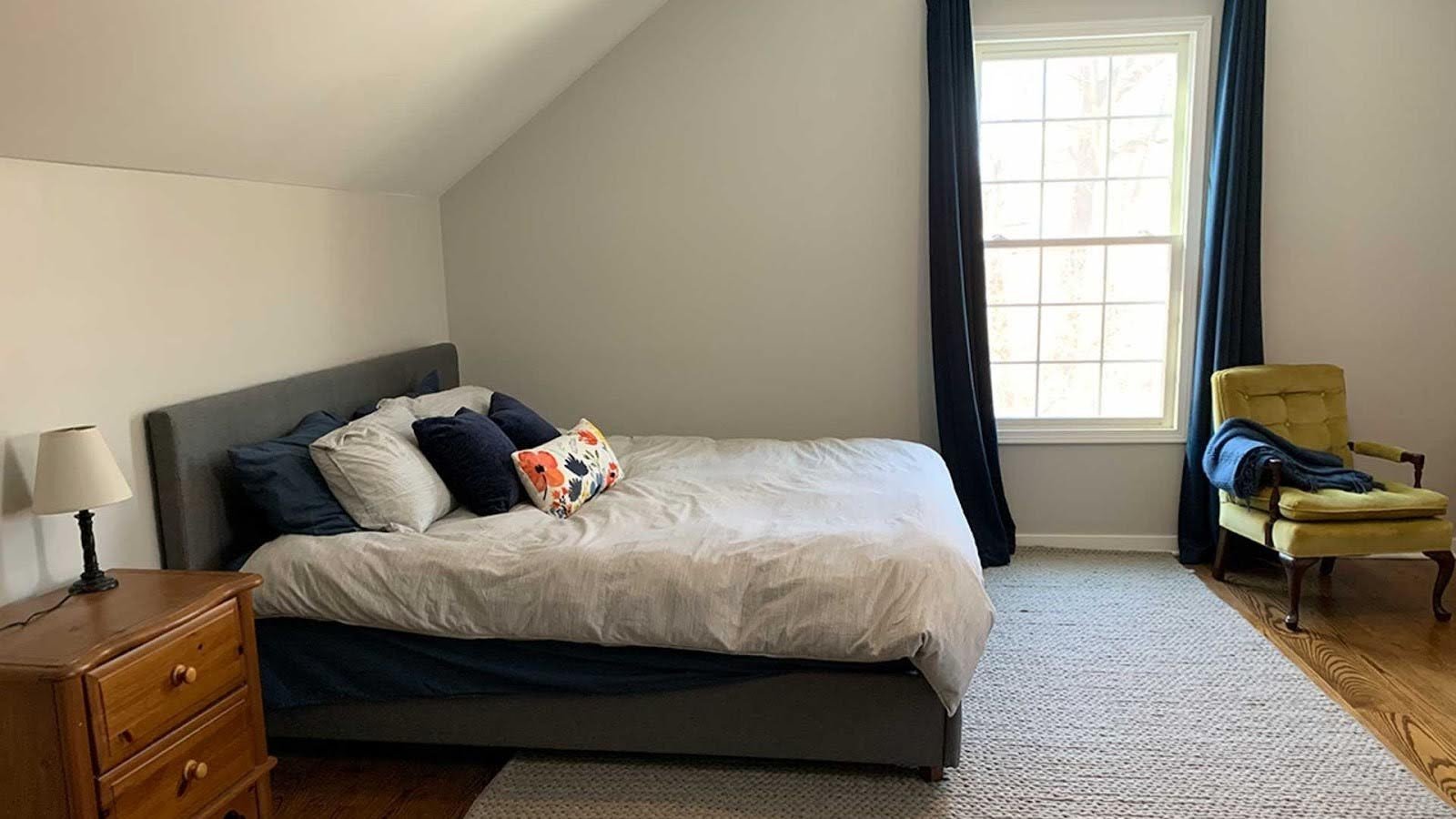
Crushed Ice works beautifully in living rooms, bedrooms, and kitchens because of its neutral nature. The color doesn’t compete with furniture or artwork, letting your style take center stage.
Open-concept spaces benefit from their soft flow between different areas. Small rooms feel lighter and more spacious without the stark appearance that pure white can create.
Bathrooms
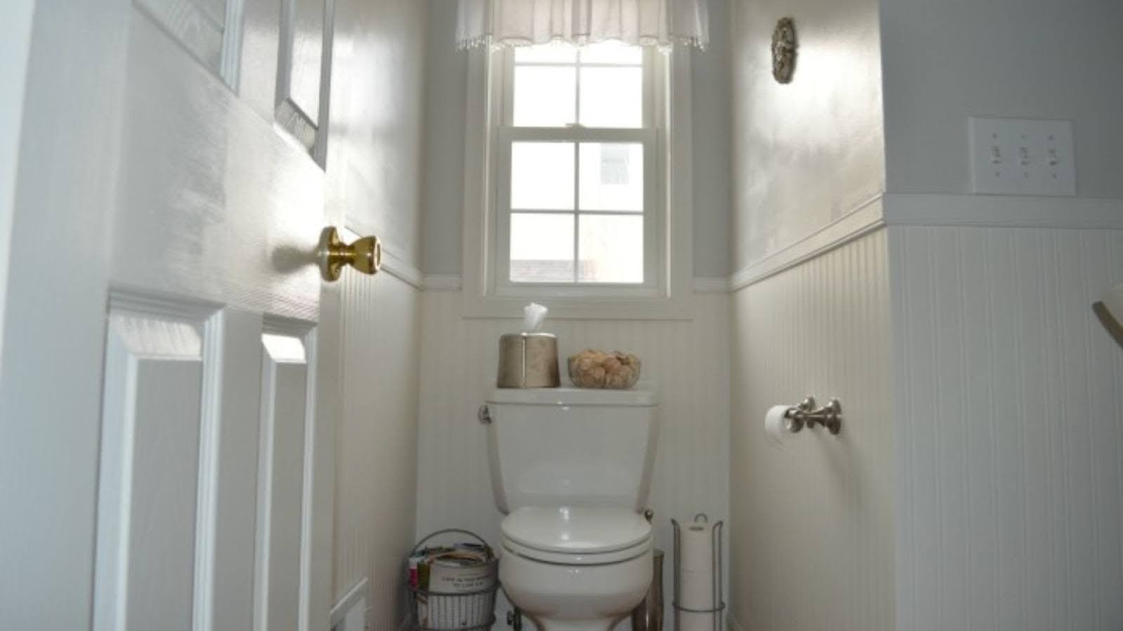
The color reflects well in smaller bathroom spaces without looking too white or clinical. It creates a clean, fresh backdrop that works with both modern fixtures and traditional elements.
Sherwin-Williams Crushed Ice makes an ideal choice for spa-inspired bathrooms where you want calm, relaxing vibes. The color pairs well with natural materials like wood and stone.
Home Exteriors

While Crushed Ice can work outdoors, it may wash out in bright sunlight on large exterior walls. The color performs better on smaller exterior elements or in shaded areas.
For best results, pair it with deep trim colors like Tricorn Black or Iron Ore.. This contrast helps the color maintain its presence and prevents it from looking flat or washed out.
Best Color Pairings for Crushed Ice
Choosing the right colors to pair with Sherwin-Williams Crushed Ice helps create a cohesive, polished look throughout your home.
White Trim Suggestions
SW Pure White creates a clean, bright contrast that makes Crushed Ice pop without overwhelming it. This pairing works well in both traditional and modern homes.
SW Extra White offers a slightly cooler pairing that enhances the gray elements in Crushed Ice. SW Alabaster provides a warmer, softer alternative that brings out the beige undertones.
Neutral Partners
SW Accessible Beige and SW Repose Gray complement Crushed Ice without creating visual conflict. These colors work well in adjacent rooms or as accent walls.
The key is choosing colors that share similar undertones so they flow naturally together. This creates a harmonious palette that feels intentional and well-planned.
Bold Accents
SW Naval, SW Urbane Bronze, and SW Ripe Olive create strong, modern contrasts with Crushed Ice. These deeper colors add drama and interest without overwhelming the space.
Bold accent colors work especially well in dining rooms, home offices, or feature walls where you want to make a statement. They provide visual weight that balances the lightness of Crushed Ice.
Similar Colors to Consider
If you’re considering Sherwin-Williams Crushed Ice, these similar colors might also work for your space:
SW Agreeable Gray offers a slightly warmer, more traditional feel than Crushed Ice. It’s a safe choice for those who want a classic greige without any green undertones.
- SW Drift of Mist is lighter and more reflective, with similar green-gray tones
- SW Repose Gray is cooler, darker, and more moody than Crushed Ice
- Benjamin Moore Light Pewter provides a close alternative with a similar greige balance
These alternatives give you options if Crushed Ice doesn’t quite fit your specific lighting or decor needs. Each has its personality while staying in the same general color family.
Tips for Sampling Crushed Ice
Testing paint colors properly saves time, money, and disappointment later in your project.
Before committing to Sherwin-Williams Crushed Ice, use Samplize peel-and-stick samples to test the color on different walls. This lets you see how it looks in various areas of your room.
- Always evaluate the color in morning, afternoon, and evening light
- Compare it with adjacent elements like flooring, cabinets, and trim
- Test it on both north and south-facing walls if possible
Remember that paint colors can look completely different depending on the time of day and surrounding elements. Take your time with this step to avoid costly mistakes.
Conclusion
Through my years of testing paint colors in real homes, Sherwin-Williams Crushed Ice stands out as one of the most reliable choices. I’ve watched families fall in love with this color because it works so well with their daily lives.
Based on my hands-on experience with hundreds of paint projects, this flexible color adapts beautifully to both warm and cool surroundings. It’s not too dark or too light; instead, it offers a perfect middle ground for those who want a soft neutral without going stark gray or beige.
As a professional color consultant, I always tell my clients to test before committing, especially in rooms with changing lighting conditions. I recommend using large samples and checking them at different times of day.
With proper testing, Crushed Ice can become the perfect backdrop for your style. This advice comes from seeing too many rushed decisions that led to disappointment and costly do-overs.
Frequently Asked Questions
Can Crushed Ice Look Beige in Some Rooms?
Yes, under warm lighting or against warm-toned decor, it may lean slightly beige. This happens most often in rooms with lots of wood furniture or warm light bulbs.
Is Crushed Ice a Good Whole-House Color?
It can be, especially in homes with consistent lighting and neutral decor. Many of my clients use it throughout their main living areas with great results.
Will Crushed Ice Work With White Cabinets?
Yes, particularly with cooler or neutral whites like Extra White or Pure White. The combination creates a clean, fresh look that feels modern but not cold.
What Flooring Goes Best With Crushed Ice?
Light oak, white oak, soft gray wood tones, and neutral tile all complement it well. Avoid very yellow or orange wood tones that might clash with the green undertones.
Is Crushed Ice Too Light for Large Walls?
No, its LRV of 66 keeps it visible and grounded, but it may appear washed out in extremely bright rooms. Test it on your largest wall first to be sure.