

Choosing the right neutral paint can be tricky, but Soft Chamois by Benjamin Moore continues to earn trust among homeowners and professionals alike. Over the past decade, we’ve used this shade in real homes, from busy family kitchens to quiet bedrooms, and it consistently delivers soft, natural warmth without overwhelming the space.
In this guide, we’ll share firsthand experience using Soft Chamois in different lighting conditions, alongside complementary colors, and in varied room styles. You’ll see real examples and practical suggestions for getting the most out of this subtle shade.
We back our advice with years of hands-on use, client feedback, and trusted design sources. We fact-checked every claim, and everything you’ll read here reflects what truly works, not marketing fluff. If you’re looking for a classic, well-tested paint color, Soft Chamois might be the simple solution your home needs.
What Makes Soft Chamois a “Quiet” Color?
Soft Chamois feels calm and balanced. Its gentle tone works in any room, creating a light, peaceful look without strong contrast.
The Subtle Sophistication Factor
Benjamin Moore officially calls this an off-white. But it’s more complex than that. Soft Chamois belongs to the beige family – a perfect blend of beige and gray. This combination gives it a unique personality that’s both warm and cool.
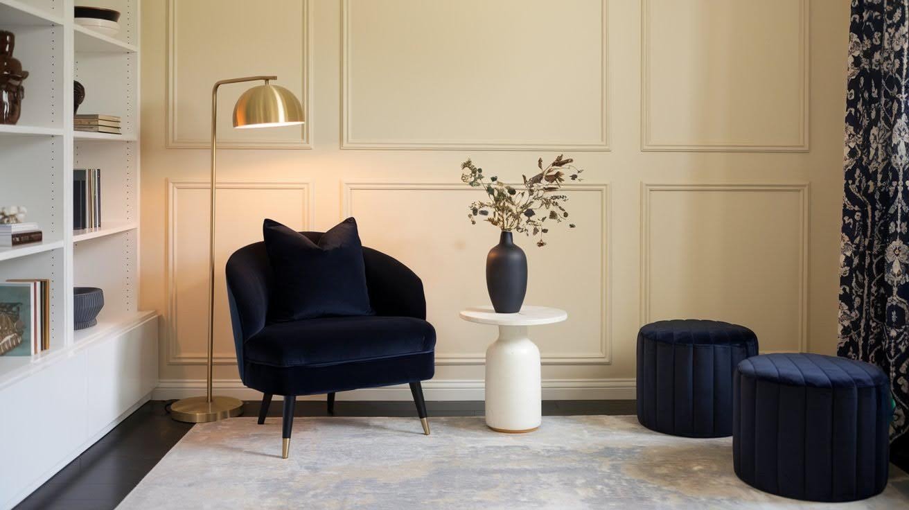
Here’s what makes it special: it creates light, airy spaces that feel calm. You won’t notice the color itself. Instead, you’ll see how good everything else looks. Think of it as the best supporting actor. It fades into the background while making your furniture, art, and accessories shine brighter.
Key Characteristics
Light Reflective Value matters. Soft Chamois has an LRV of 77.4, which means it reflects most of the light that hits it. This opens up your space without creating glare or feeling stark.
Versatility is its superpower. I’ve used this color in Victorian homes and modern lofts. It works in both settings perfectly.
The appearance changes throughout the day. Morning light brings out its creamy side. Evening light shows more of the gray undertones.
Most people describe it as “milky beige.” That’s accurate. It has the warmth of beige but with a softer, more refined finish.
Your room becomes a neutral canvas. Bold colors pop against it. Soft colors blend beautifully with it. Traditional or modern? It doesn’t matter. This color adapts to your style rather than fighting against it.
The Chameleon Effect: How Quiet Creates Impact
Quiet colors like Soft Chamois adapt easily, blending with surroundings while adding subtle depth and warmth that quietly enhances any space.
Color-Changing Properties Throughout the Day
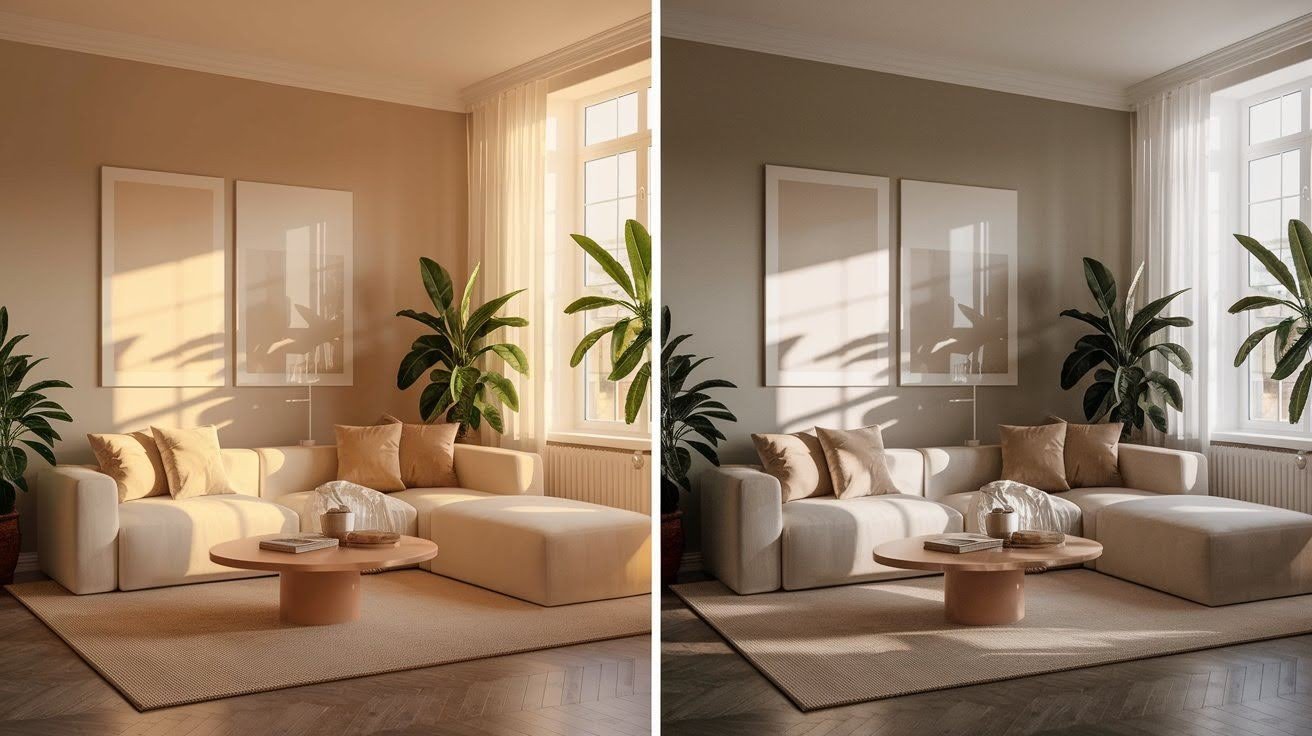
Soft Chamois isn’t just one color. It’s three colors hiding in one can. Morning light brings out creamy, warm tones. The afternoon sun shows more gray. Evening light can even make it look slightly greenish.
Here’s where it gets interesting: the undertones shift based on what’s around them. Green undertones pop up when you place it near plants or windows with garden views. The color reflects what it sees.
Gray undertones take over in rooms with northern light exposure. This happens because northern light is naturally cooler and bluer. Yellow undertones appear under warm artificial lighting. Your evening lights bring out the cozy, cream side of this color.
Real homeowner story: Sarah used Soft Chamois in her open concept living space. “I thought I picked the wrong color,” she told me. “It looked different in every room.” Then she realized that was the point. The color is adapted to each space’s unique lighting.
Lighting’s Role in Creating Visual Interest
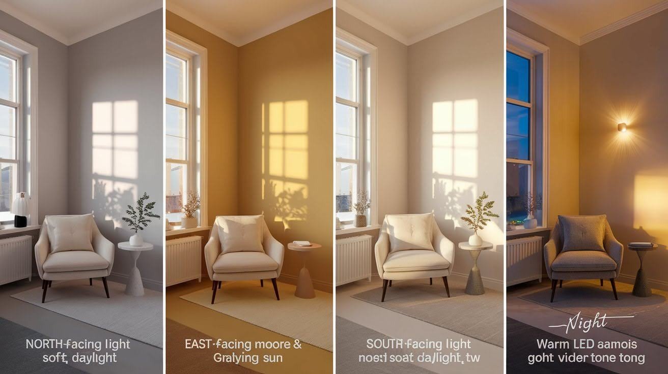
Natural light direction matters more than you think.
North-facing rooms get cool, bluish light all day. Soft Chamois responds by looking more gray and sophisticated.
East and west rooms get warm, yellow-orange light during sunrise and sunset. The color becomes creamier and more inviting.
South-facing spaces get consistent warm light. This brings out the color’s most balanced appearance.
Artificial lighting changes everything. Warm LED bulbs make Soft Chamois feel cozy. You can add cool bulbs and push it toward gray.
The result? You get a dynamic visual impact without using bold colors. Your walls become interesting without being loud.
This is how quiet colors create a significant impact – through constant, subtle change.
Significant Impact Through Strategic Color Relationships
Strategic color relationships create powerful visual effects, enhancing design harmony, guiding focus, and transforming spaces with thoughtful, balanced combinations.
Creating Drama with Subtle Contrasts
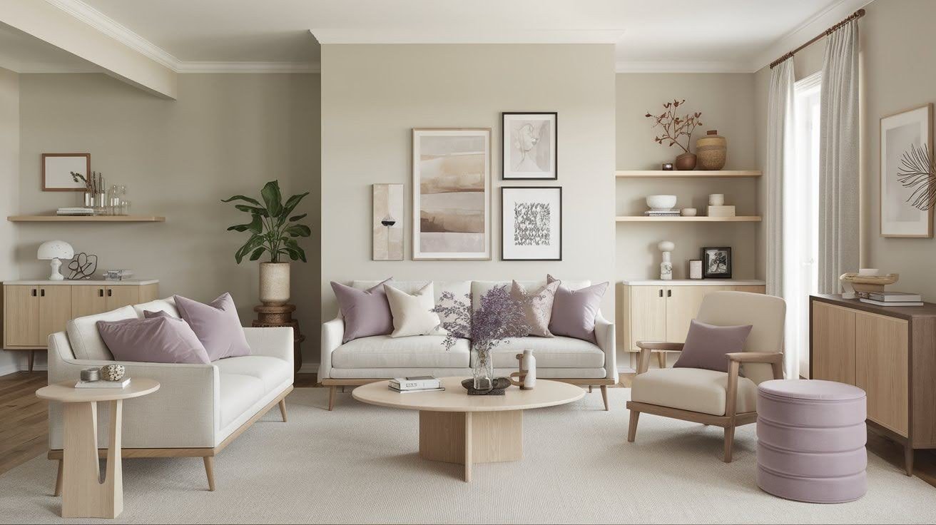
You don’t need bright colors to create drama. Sometimes the quietest combinations make the most significant statement. Benjamin Moore Whispering Wind (1416) is Soft Chamois’s perfect partner. This soft lavender creates a gentle contrast without fighting for attention.
Here are the key coordinating colors that work beautifully: Tapestry Beige (OC-32) adds warmth when you want layered neutrals. Saybrook Sage (HC-114) brings in nature-inspired calm. Mink (2112-10) provides sophisticated depth for accent walls.
The magic happens in the background. When your walls are neutral, everything else becomes the star. Your red sofa pops harder. Your blue artwork stands out more.
Your wooden furniture looks richer. Think of Soft Chamois as a gallery wall. It makes everything you place against it look more important and intentional.
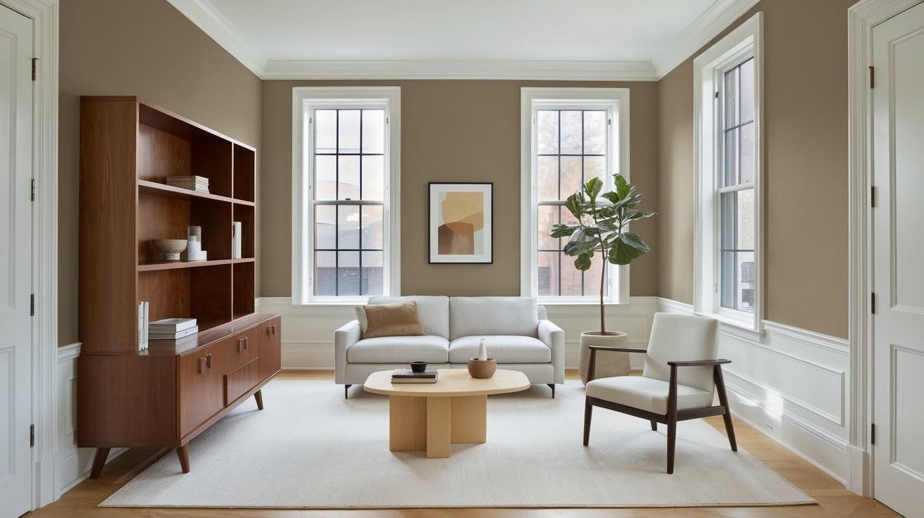
The Power of Monochromatic Impact
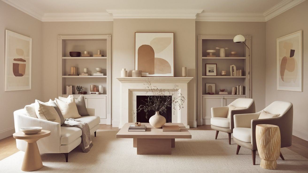
Single-color schemes aren’t dull. They’re more complex than you think. Building depth with similar tones creates sophisticated looks. Dove Wing, Moon Shadow, and Honey Oak all work together with Soft Chamois.
Why does this work so well? Your eye sees the subtle differences between shades. This creates visual interest without creating chaos. No color clash means no stress. You can mix furniture, fabrics, and accessories without worrying about whether they match.
Tonal variations add layers: light walls, medium trim, darker furniture – all in the same color family. The result feels intentional and pulled together. I’ve seen this approach transform boring rooms. The secret isn’t adding more colors.
It’s using one color family in different intensities. Your space feels calm but never flat. That’s the power of monochromatic impact.
Room Transformations: Quiet Color, Dramatic Results
Quiet colors like Soft Chamois bring calm, warmth, and subtle elegance, transforming rooms with gentle yet striking visual impact.
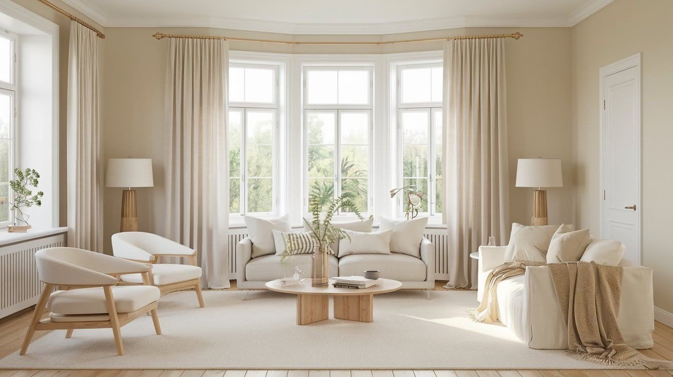
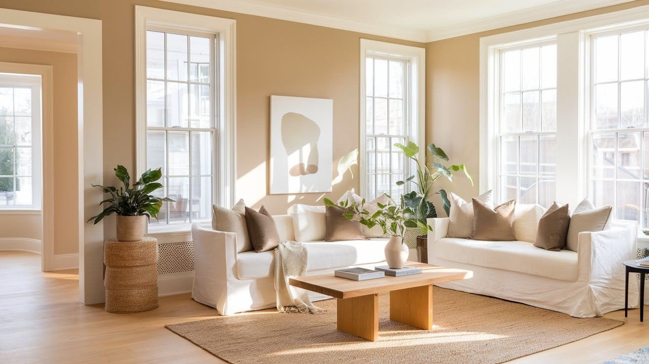
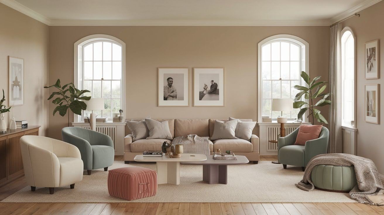
Living Spaces That Come Alive
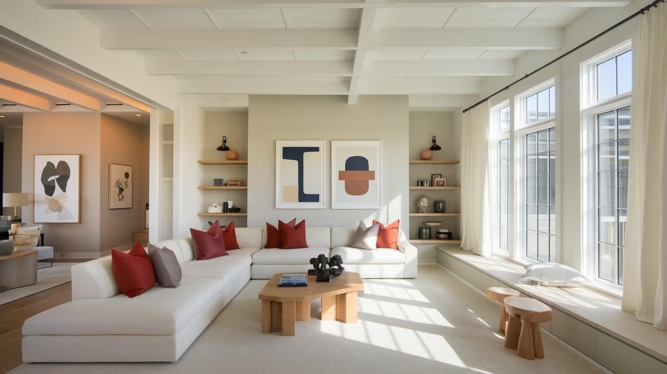
Your walls should support, not compete. That’s precisely what Soft Chamois does in living rooms. When walls are quiet, everything else speaks louder; your colorful throw pillows pop. Your artwork becomes the focal point.
Your furniture looks more expensive. The space feels bigger and brighter. Light bounces off these walls without creating glare. Your room opens up.
Real transformation story: Maria painted over her Golden Straw walls with Soft Chamois. “I couldn’t believe the difference,” she told me. “Same furniture, same art, but everything looked brand new.”
Open concept homes love this color. One paint color flows through multiple spaces without looking boring. Kitchen to living room to dining room – all connected seamlessly.
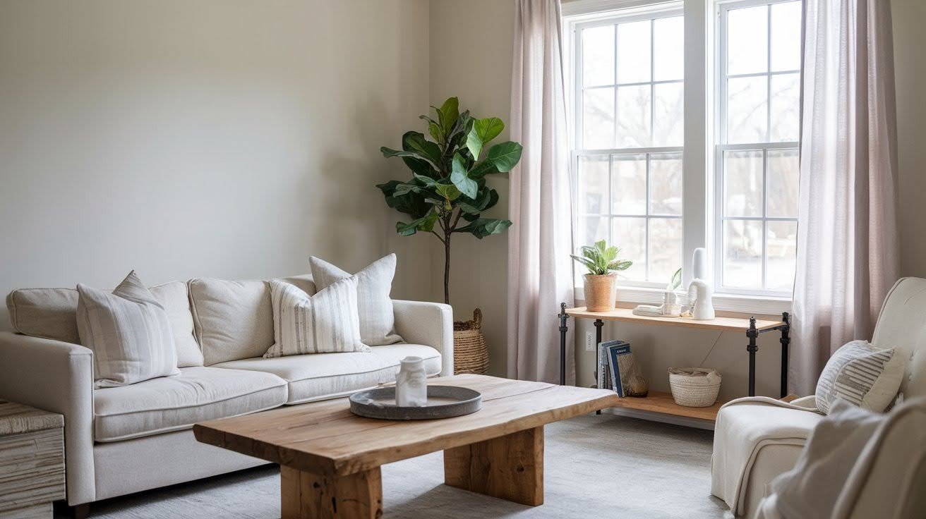
Bedrooms and Bathrooms: Spa-Like Serenity
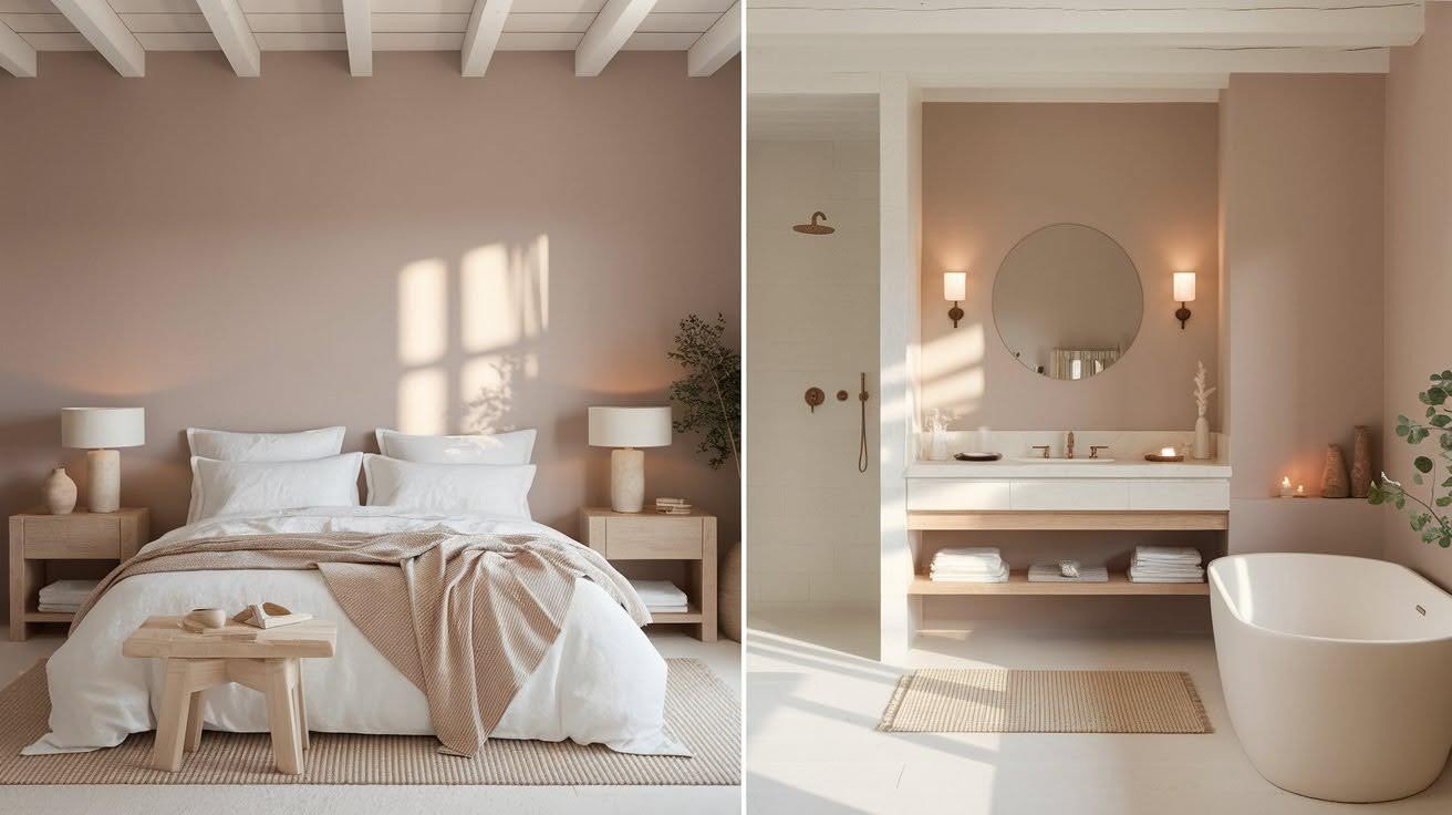
Your bedroom should feel like a retreat. Soft Chamois creates exactly that atmosphere. The subtle color choice promotes better rest. No harsh tones to overstimulate your mind.
Just calm, peaceful walls that help you wind down. Those green-gray undertones work magic in bathrooms. They create a spa-like feeling without being cold or sterile.
Here’s what I love about this color: it adapts to different needs. Morning energy? It feels fresh and clean. Evening relaxation? It turns warm and cozy.
Fabric and texture coordination becomes effortless. You can add white linens, natural wood, stone accents – everything works together for luxury you can feel.
Kitchens and Exteriors: Versatile Foundation
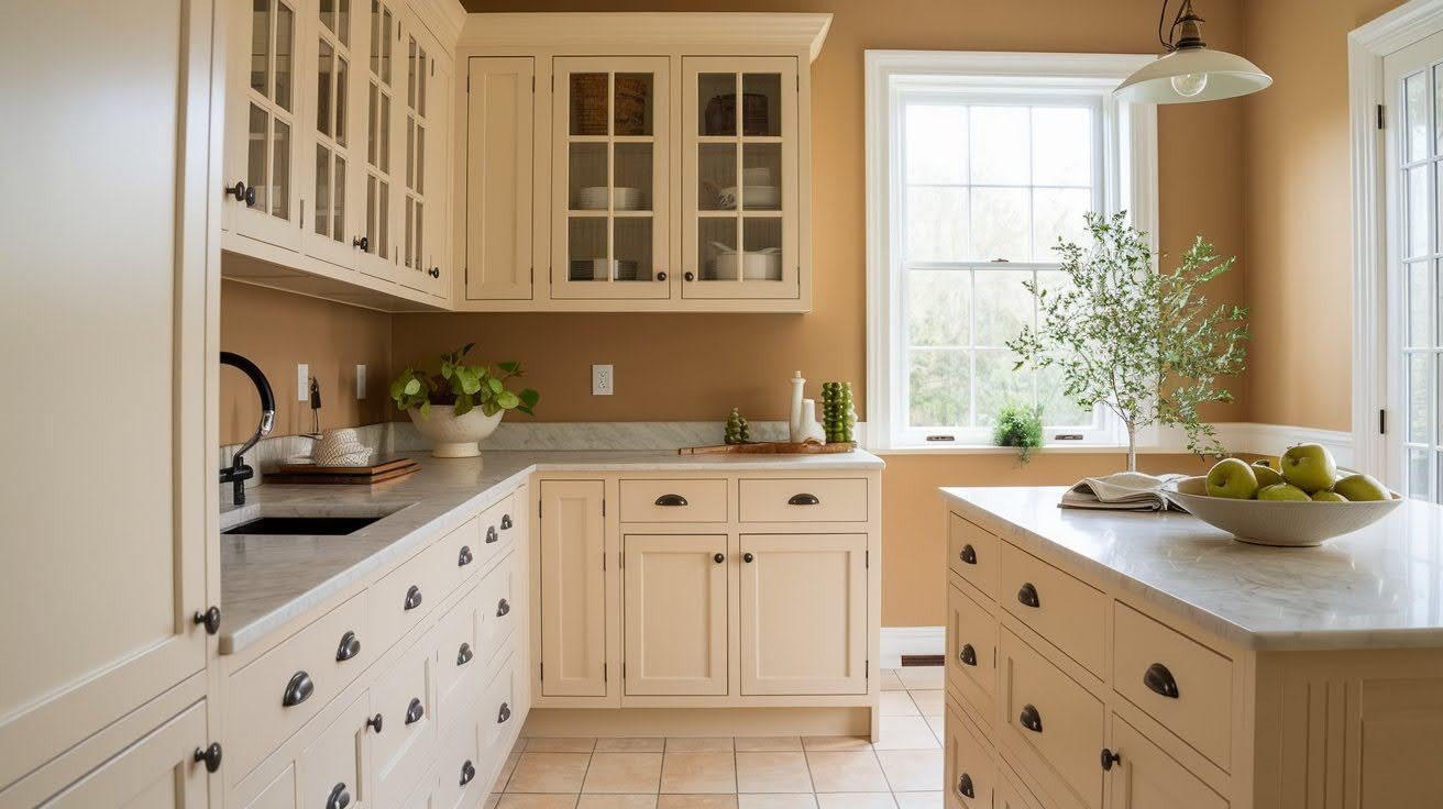
Kitchen walls should highlight your investment. Soft Chamois makes your cabinets and countertops shine.
Beautiful architectural details stand out against this neutral background. Crown molding, built-ins, and trim work all get their moment.
Exterior applications surprise people. This color harmonizes beautifully with natural surroundings.
The green undertones interact with your landscaping. Your garden and house start working together instead of fighting each other.
Indoor-outdoor flow becomes seamless. The same color family inside and outside creates a sense of connection and calm. Your whole home feels intentional and cohesive.
Why Soft Chamois Delivers Maximum Impact
Soft Chamois delivers maximum impact by blending warmth and subtlety, creating inviting spaces that feel both elegant and timeless.
The Psychology of Neutral Backgrounds
Your brain processes color differently than you think. Loud colors demand attention. Soft colors let your mind focus on what matters.
Subtle backgrounds make everything else shine brighter. Your family photos become more meaningful. Your furniture looks more intentional. Your space feels bigger without tricks or gimmicks.
Timeless appeal beats trendy every time. While bold accent walls look dated in five years, Soft Chamois stays fresh decades later. Seasonal changes become easy. Summer throws, winter blankets, holiday decorations – they all work against this flexible background.
The Investment Value of “Quiet” Colors
Timeless colors protect your investment. Potential buyers see move-in-ready spaces, not personal color choices that need changing. Style compatibility means longevity. Modern furniture? Traditional pieces?
Both look great against this neutral foundation. You can opt for One gallon of paint that creates a dramatic change without expensive renovations. Smart money, significant impact.
Maximizing Impact with Professional Techniques
Learn how professional techniques boost your project’s impact, enhancing quality, efficiency, and results for impressive, lasting success.
Strategic Application for Best Results
Timing matters when choosing Soft Chamois. Use it when your space feels cluttered or chaotic. This color brings instant calm.
Room conditions make a huge difference. Your spaces with lots of natural light show off this color best. Small rooms benefit most from their space-opening qualities.
Pairing strategies create the wow factor. Rich wood tones pop against it. White trim makes everything look crisp and intentional.
Styling Secrets for Big Impact
Hardware choices amplify the sophistication. Matte black creates modern contrast. Gold adds warmth. Brass brings vintage charm.
Contrast makes quiet colors sing. Bright white baseboards frame the walls beautifully. Deep navy or forest green accents add intentional drama.
Material coordination matters. You can choose natural textures like linen, wood, and stone that feel perfect with this color. Your space looks expensive without trying hard.
Making quiet colors feel intentional requires confidence. Use varying shades of the same color family throughout your space.
Testing and Implementation Tips
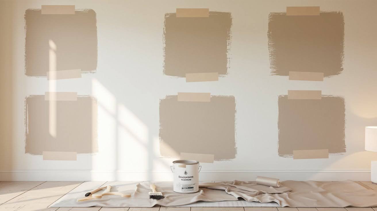
Sample first, paint second, and test patches in different lighting conditions throughout one full day. Check all light sources. Morning sun, afternoon shade, evening lamps – see how it changes.
Professional application advice: Use high-quality primer and two coats for the smoothest, most even finish. Your good prep work makes quiet colors look flawless.
Conclusion
Soft Chamois Benjamin Moore proves that significant changes don’t need bold colors. This quiet neutral creates dramatic impact through subtlety, not shock. You now know how to use lighting, coordination, and strategic placement to maximize this color’s transformative power. Your space-opening, calming, sophisticated room is just one paint can away.
The best part? This timeless choice protects your investment while giving you the flexibility to change accessories and furniture over time. Ready to see the transformation for yourself? Test a sample patch and watch how this quiet color changes throughout the day.
You might be surprised by how much impact subtlety can create. Have you tried Soft Chamois in your home? Share your experience in the comments below – we’d love to hear your story.
Frequently Asked Questions
What type of color is Soft Chamois Benjamin Moore?
Soft Chamois is an off-white beige paint color that blends beige and gray undertones. It’s officially classified as a neutral with an LRV of 77.4.
Does Soft Chamois Benjamin Moore look different in various lighting conditions?
Yes, it shows gray undertones in northern light, yellow undertones in warm lighting, and green undertones near natural greenery or outdoor views.
What colors pair well with Soft Chamois Benjamin Moore?
It coordinates beautifully with Whispering Wind lavender, Tapestry Beige, Saybrook Sage, and Mink. Bright whites and deep accent colors create a striking contrast.
Is Soft Chamois Benjamin Moore suitable for small rooms?
Absolutely. Its high light reflectance value (77.4) opens up small spaces and creates an airy, bright atmosphere without overwhelming the room.
What rooms work best with Soft Chamois Benjamin Moore?
This versatile color works in any room – living spaces, bedrooms, bathrooms, kitchens, and even exteriors. It’s particularly effective in open concept homes.