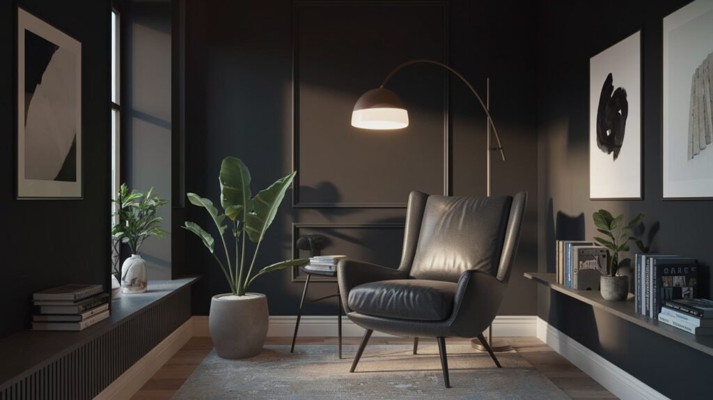
Black paint can feel intimidating. Too dark? Too dramatic? Many homeowners worry about making the wrong choice.
SW Caviar changes everything. This isn’t just another black paint – it’s the shade professional designers reach for again and again.
In this article, you’ll learn exactly why Caviar works so well. We’ll show you real room examples, explain the science behind its unique undertones, and give you practical tips for using it in your own home.
Here’s what we’ll cover:
How Caviar differs from other black paints, the best rooms for this bold color, lighting tricks that make it shine, common mistakes to avoid, and designer secrets for getting perfect results.
Why trust this guide? We’ve tested dozens of black paints in real homes. We’ve seen what works and what doesn’t. No guesswork, no marketing fluff – just honest advice from years of hands-on experience.
Ready to see why designers can’t stop talking about this paint?
What Is Sherwin-Williams Caviar SW 6990?
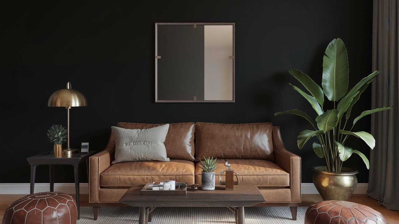
Caviar isn’t your average black paint. Sherwin-Williams describes it as a “dark, rich black that introduces a refined air to a well-lit room.”
Here’s what makes it special:
It’s technically neutral despite looking so bold. The SW 6990 code appears in several collections – Pottery Barn Kids, 2020 Play, and 2017 Intrepid.
Why do designers love it? It works with everything.
Let me break down the numbers that matter:
An LRV of 3 means it reflects almost no light. For comparison, pure white has an LRV of 100. This creates serious drama.
The RGB values tell the real story: R:49, G:48, B:49. Notice how balanced these numbers are? That’s why it plays well with other colors.
Here’s the surprise: Caviar is warm. It sits at 300° on the color wheel, putting it in the red-purple family.
Most people expect blacks to be cold. Not this one.
This warmth prevents that harsh, sterile look you get with cooler blacks.
Understanding Caviar’s Unique Character
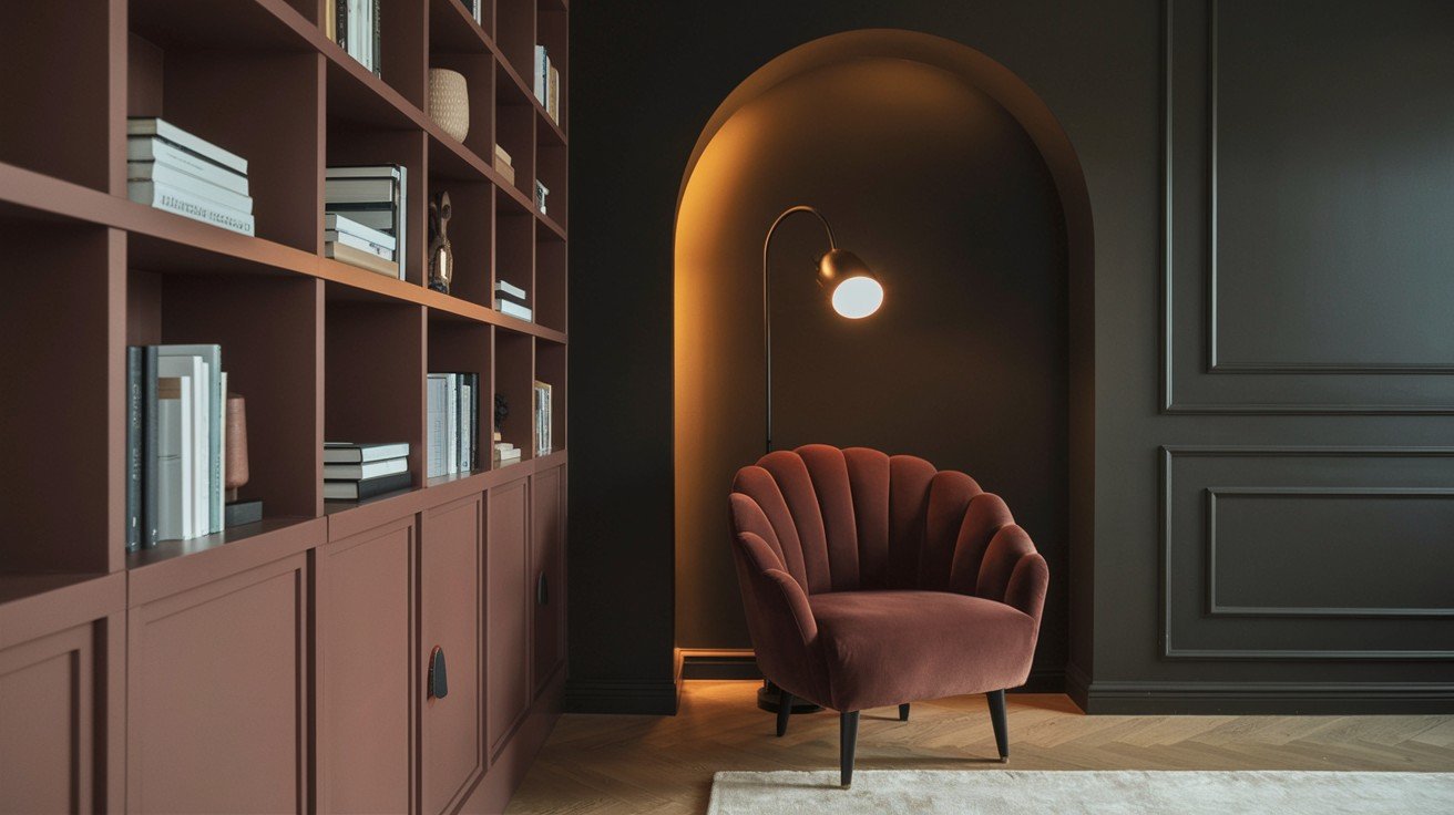
Most blacks feel cold and harsh. Caviar doesn’t.
Here’s why: It has purple undertones. These subtle hints create warmth that softer blacks can’t match.
Compare it to Tricorn Black. Tricorn leans cooler and feels more sterile. Caviar feels rich and inviting.
The purple undertones are barely visible. But they make all the difference in how the color feels in your space.
Think of it like this: Cool blacks push you away. Warm blacks draw you in.
Lighting changes everything with this paint.
North-facing rooms get cooler light. Caviar might feel too dark here. You’ll need extra artificial lighting to balance it out.
South-facing rooms? Perfect match. The warm natural light brings out Caviar’s best qualities.
For artificial lighting, stick to 2700K to 3000K bulbs. Higher Kelvin temperatures make it look flat and dull.
Professional tip: Use multiple light sources. One overhead light isn’t enough.
Try table lamps, wall sconces, and accent lighting. This creates depth and prevents the room from feeling like a cave.
The goal is balance. Too little light kills the sophistication. Too much washes out the drama.
Why Designers Choose Caviar Over Other Blacks
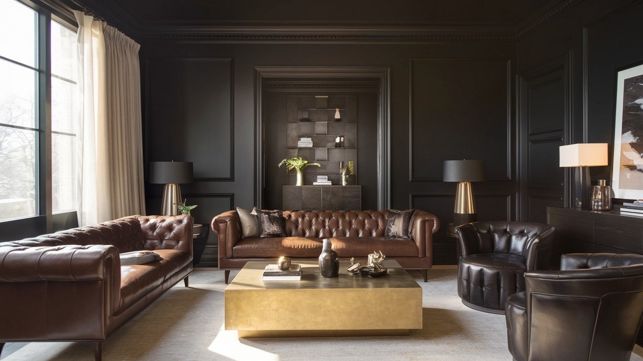
Caviar vs Top Black Paint Alternatives
Not all blacks are created equal. Here’s how Caviar stacks up against the competition:
Caviar vs Tricorn Black: Both have an LRV of 3, but that’s where the similarities end. Tricorn feels cold and institutional. The caviar feels warm and refined.
Caviar vs Black Magic: Black Magic has strong blue undertones that can feel harsh. Caviar’s red undertones are much more subtle and livable.
Caviar vs Iron Ore: This isn’t even a fair fight. Iron Ore is dark charcoal, not true black. Caviar gives you real drama.
Benjamin Moore’s Black Beauty comes closest to matching Caviar’s appeal. It’s slightly warmer but harder to find in stores.
The winner? Caviar wins on availability and consistency.
Professional Designer Preferences
Why do the pros keep coming back to Caviar?
First, it’s sophisticated without being harsh. Many blacks feel aggressive. Caviar feels confident.
Second, it works as a neutral despite looking bold. You can pair it with any color palette, and it behaves.
Here’s the magic: Caviar creates cozy, intimate spaces and dramatic, spacious ones. Same paint, different lighting, and furniture choices.
That’s the versatility designers pay for.
Interior Applications Designers Love
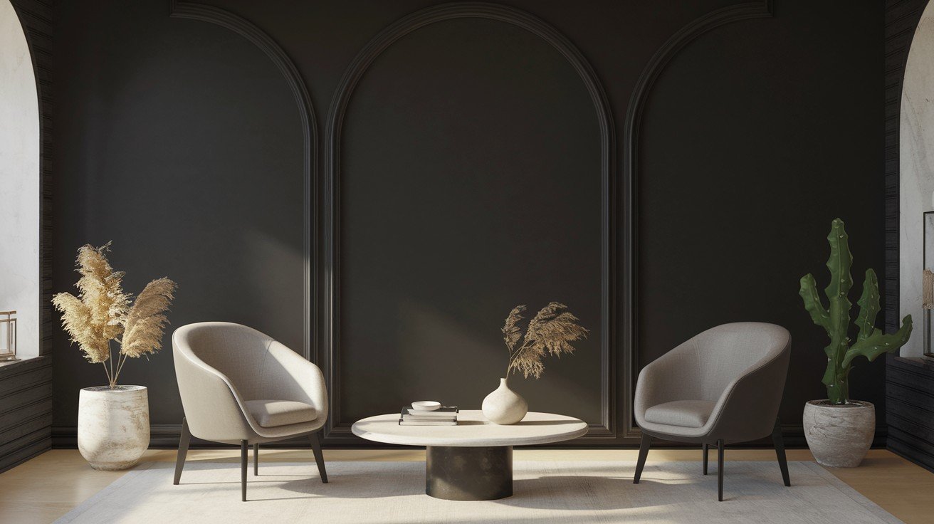
Statement Kitchen Cabinets
Kitchen cabinets in Caviar? Absolutely.
This creates instant modern appeal. Your old oak cabinets become sleek and contemporary. No renovation is required.
The key is balance. Pair Caviar cabinets with light countertops. White quartz or marble works perfectly.
Hardware matters, too. Brass and gold warm things up. Chrome and stainless steel keep it cool and modern.
For backsplashes, stick to whites or light grays. Let the cabinets be the star.
Dramatic Accent Walls
Scared to commit to full-room black? Start with one accent wall.
This gives you drama without overwhelming the space. Choose the wall behind your bed or sofa for maximum impact.
Balance is everything here. Keep the other three walls light. White, cream, or soft gray work best.
In living rooms, Caviar creates the perfect TV wall. The dark color makes screens disappear when off.
Bedrooms benefit from Caviar behind the headboard. It creates instant hotel luxury.
Architectural Feature Enhancement
Think beyond walls.
Staircases look amazing in Caviar. Paint the risers for a modern geometric effect. Keep the treads natural wood.
Trim and molding in Caviar adds a contemporary edge to traditional homes. This works especially well with white walls.
Window frames painted Caviar create a dramatic contrast. Your views become a living artwork.
The goal? Modern sophistication that respects your home’s character.
Exterior Applications for Maximum Impact
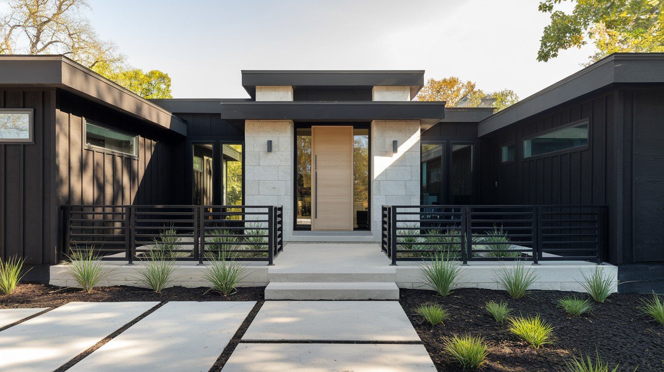
Modern Exterior Statements
Caviar works outside, too.
Whole-house applications create stunning contemporary appeal. Modern homes look incredible in this rich black. Think sleek and sophisticated.
Not ready for full commitment? Try the front door first. Caviar doors make powerful first impressions against any siding color.
.
Architectural accents shine in this color. Window trim, garage doors, and shutters all benefit from Caviar’s drama.
Natural materials are your best friends here. Stone, wood, and concrete pair beautifully with black exteriors. The contrast feels organic and balanced.
Climate and Maintenance Considerations
Here’s the reality check.
Black absorbs heat. In hot, sunny climates, your cooling bills will increase. Factor this into your decision.
Fading happens faster with dark colors. Expect touch-ups every 3-4 years in harsh sun conditions.
Northern climates handle Caviar better. Less intense sun means longer-lasting color.
Maintenance is higher for lighter colors. Dust and water spots show more easily.
But the impact? Worth it for the right home.
Expert Color Pairing Strategies
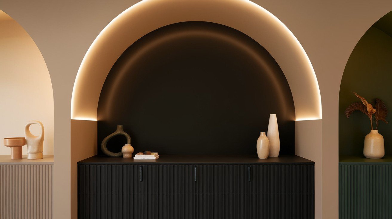
High-Contrast Combinations
White trim makes Caviar pop.
SW Pure White creates clean, modern lines. This combination never fails. SW Snowbound adds subtle warmth while keeping things crisp.
For maximum drama, try BM Chantilly Lace. It’s the whitest white available.
Light neutrals soften the contrast. Cream and off-white options prevent the look from feeling too stark.
The goal? Balance drama with livability.
Sophisticated Neutral Palettes
Gray families work beautifully with Caviar.
Light French Gray creates soft transitions. Repose Gray adds contemporary appeal. Dorian Gray bridges warm and cool tones perfectly.
Deep blues complement Caviar’s undertones. Naval SW 6244 creates rich, moody spaces when paired thoughtfully.
Monochromatic schemes use multiple shades of black and gray. This approach feels sophisticated and intentional.
Designer-Approved Color Collections
Complete palettes take the guesswork out.
Mineral Gray SW 2740 works as a perfect mid-tone between Caviar and white. This three-color system handles any room.
Balance warm and cool elements by mixing metal finishes. Brass warms things up. Chrome keeps it contemporary.
Professional tip: Use the 60-30-10 rule. Caviar gets 10%, neutrals get the rest.
Professional Application Guidelines

Critical Sampling Requirements
Never skip testing with dark colors. What looks perfect on a tiny paint chip can shock you on a full wall.
Order sample peel-and-stick samples. These are larger and more accurate than store chips.
Test in different lighting throughout the day. Morning light differs from evening light. Your Caviar will look different each time.
Don’t trust artificial lighting alone. Natural light shows the true character.
Room Requirements for Success
Caviar needs adequate lighting to work.
Small, dark rooms become caves. High ceilings help prevent this feeling. Standard 8-foot ceilings work, but need extra artificial lighting.
North-facing rooms struggle without multiple light sources. South-facing rooms handle Caviar beautifully.
When to skip Caviar? Tiny powder rooms, windowless spaces, or rooms with only one light fixture.
Application Best Practices
Premium paint quality matters more with dark colors. Cheap paint shows streaks and uneven coverage.
Use high-quality primer first. Dark colors need a proper foundation.
Consider a professional application. Caviar shows every imperfection in brush strokes and roller marks.
Conclusion
SW Caviar proves that black paint doesn’t have to be intimidating. With its warm undertones and sophisticated appeal, it’s easy to see why designers choose it again and again.
You now know exactly how to test it properly, where it works best, and how to pair it with other colors. No more guessing or second-guessing your paint choices.
The key is proper lighting and thoughtful application. Follow the guidelines we’ve covered, and you’ll get those same professional results designers achieve.
Ready to transform your space? Start with that Samplize sample and see how Caviar looks in your specific lighting conditions.
Have you used SW Caviar in your home? Share your experience in the comments below – we’d love to hear how it worked for you.
Frequently Asked Questions
What makes SW Caviar different from other black paints?
SW Caviar has warm purple undertones that prevent the harsh, cold feeling of most black paints. This creates a sophisticated, inviting atmosphere rather than a sterile one.
What is the LRV of Sherwin-Williams Caviar?
SW Caviar has an LRV (Light Reflectance Value) of 3, meaning it reflects very little light. This creates dramatic depth while maintaining its rich black appearance.
Does SW Caviar work in small rooms?
Small rooms need adequate lighting to handle Caviar successfully. Without proper natural and artificial lighting, small spaces can feel cave-like. Consider lighter alternatives for tiny rooms.
What colors pair best with SW Caviar?
Classic white trim, light grays like Repose Gray, and warm neutrals work beautifully. Naval blue and Mineral Gray create sophisticated palettes when used thoughtfully.
Should I hire a professional to paint with SW Caviar?
Dark colors show every imperfection in the application. Unless you’re experienced with premium paints and proper techniques, professional application ensures the best results.

