

When I first used Tricorn Black in a room makeover, I was hooked, but figuring out which colours to pair with it. That took some trial and error. It’s bold, beautiful, and surprisingly versatile, but only if you get the supporting shades right.
To save you the guesswork, I’ve studied real designer projects, interviewed colour pros, and tested combos in actual homes. This guide pulls together the best pairings, warm whites that soften, cool greys that balance, and accent colours that make it all pop.
If you’re planning to use Tricorn Black but feel stuck on what works with it, you’re in the right place.
What Makes Tricorn Black Special for Color Coordination?
Tricorn Black isn’t your average dark paint. It’s what I call a “true black” – and that makes all the difference when you’re choosing colours to pair with it.
Here’s why it works so well:
Most blacks have hidden undertones. Blue undertones. Green undertones. Brown undertones. Not Tricorn Black. With an LRV of 3, it’s pure black without any sneaky colours hiding underneath.
This matters more than you think.
When you pick coordinating colours, you don’t have to worry about clashing undertones. Your whites stay white. Your greys remain grey. Your accent colours look exactly like they should.
The result? You get a neutral foundation that works with everything. Traditional furniture? Modern art? Bold throw pillows? They all look great against Tricorn Black.
That’s the flexibility advantage. This paint adapts to your style instead of fighting against it. Plus, its classic appeal means your colour choices will look good for years to come.
Classic White Combinations That Never Fail
Timeless and fresh, classic white pairings bring balance, brightness, and versatility to any design, making them endlessly reliable choices.
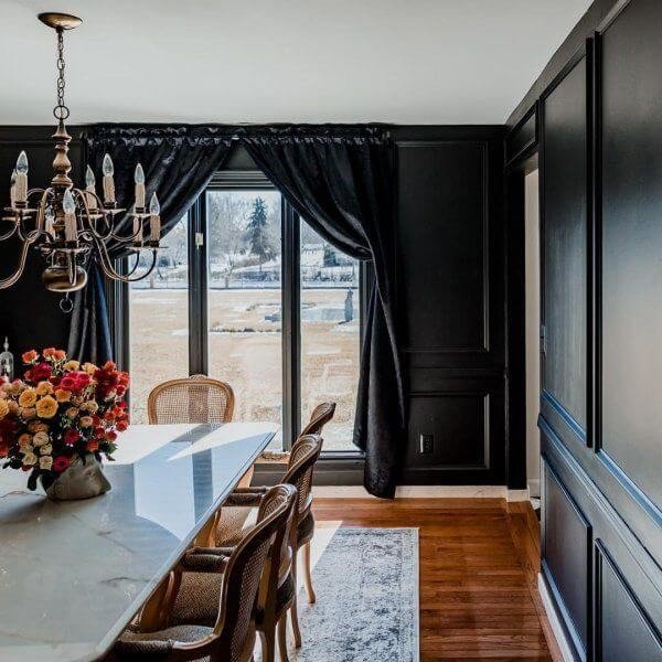
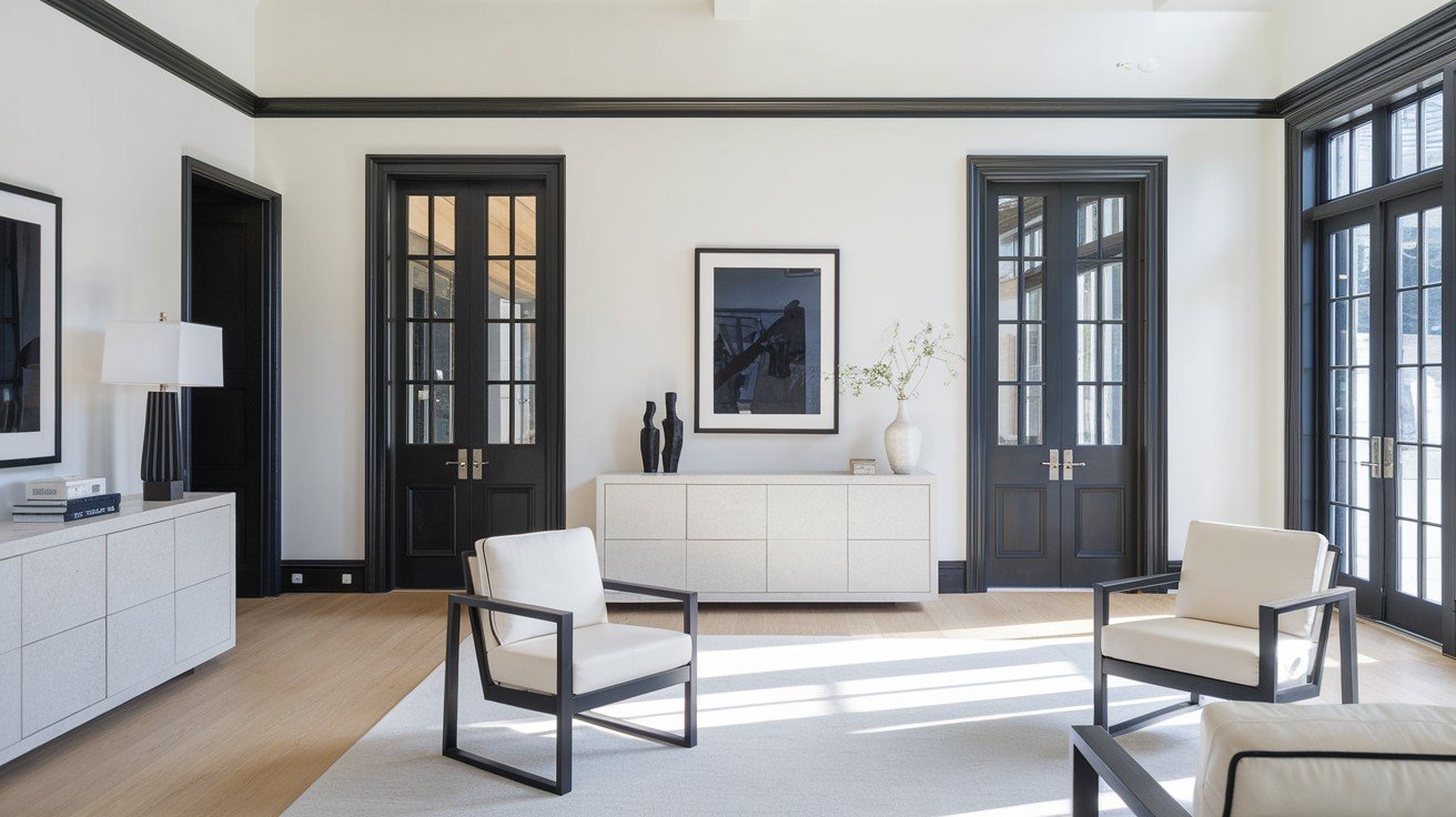
Crisp High-Contrast White Options
Do you want drama? These whites create bold statements against Tricorn Black. SW Pure White is my go-to for most projects. It has just enough warmth to keep rooms from feeling cold.
Perfect for trim work and accent walls where you want clean lines without the harsh feeling. But sometimes you need more punch.
SW Extra White gives you that stark, modern contrast. I use this in contemporary spaces where bold statements matter. Think gallery walls and minimalist kitchens. It’s not subtle – and that’s the point.
BM Chantilly Lace sits right between the two. Clean and bright, but not as intense as Extra White. Great for bathrooms and kitchens where you want fresh, contemporary vibes.
Here’s the key: These high-contrast whites work best in spaces with good natural light. Too little light? They can feel harsh.
Softer White Transitions
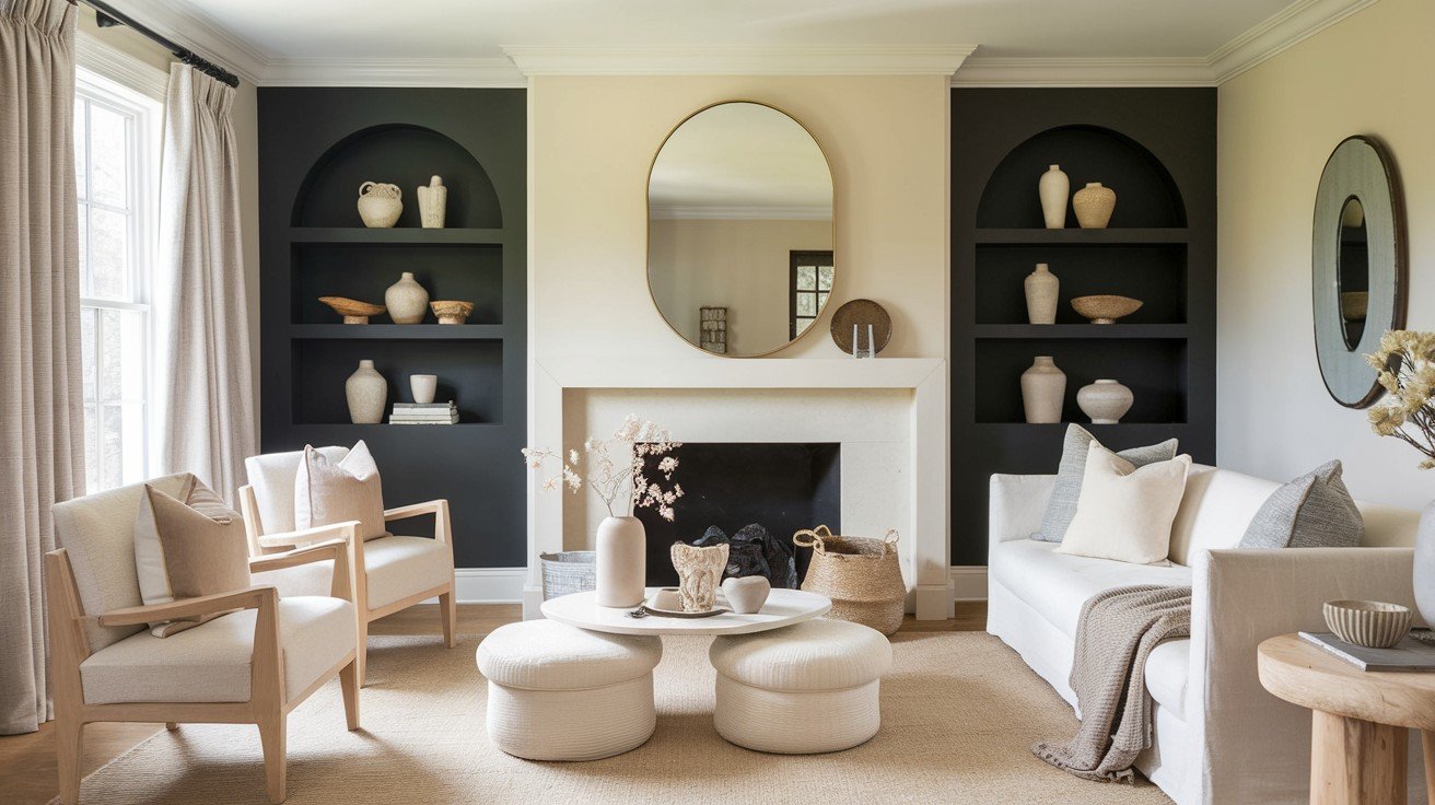
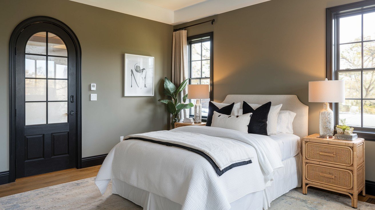
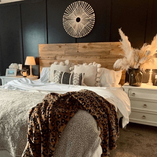
Not every room needs drama. Sometimes, you want whites that whisper instead of shout. SW Alabaster brings creamy warmth to any space. This is comfort in paint form. I pair it with Tricorn Black in bedrooms and living rooms where cosy matters more than crisp.
SW Divine White offers a gentle contrast without the shock. Perfect for families who want sophistication but need livability too. Want something different?
SW Classic Light Buff adds soft pinkish notes. Sounds weird and looks amazing. This combination works beautifully in dining rooms and entryways where you want warmth with personality.
SW Oyster White mixes light beige and grey notes. It isn’t very easy in the best way. This creates subtle depth that makes Tricorn Black feel rich instead of flat. The result? Rooms that feel intentional but never cold.
Sophisticated Gray Coordinating Colors
You can pair gray with the right tones, like soft blues, warm taupes, or crisp whites, to create refined, balanced, and effortlessly elegant spaces.
Cool Gray Options
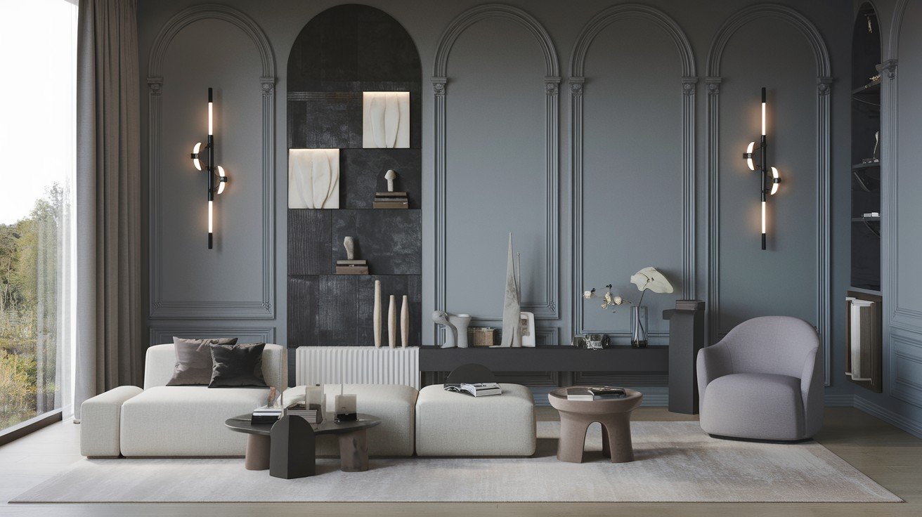
Cool, greys and Tricorn Black? That’s a match made in design heaven.
SW Ice Cube looks exactly like its name suggests. Icy white with cool grey undertones that make Tricorn Black feel modern and fresh. I use this combination in bathrooms and kitchens where you want that spa-like feeling.
SW Frostwork takes things up a notch. Light silvery grey with almost invisible green notes. You won’t see the green unless you look for it, but it adds depth that plain grey can’t match.
Do you need something moodier?
SW Passive brings cool grey with slight blue undertones. It has a stormy appearance that pairs beautifully with Tricorn Black in bedrooms and home offices. Think sophisticated, not cold.
BM Gray Owl offers cool grey with both blue and green undertones. Complex but not complicated. This combination works in spaces where you want personality without being loud about it.
The key with cool greys? They make Tricorn Black feel crisp and contemporary.
Warm Gray Combinations
Warm greys soften Tricorn Black’s intensity while keeping things sophisticated.
SW Agreeable Gray is popular for a good reason. Balanced and livable – this combination works in any room where you want comfort and style together. I’ve used it in hundreds of projects.
SW Repose Gray adapts to different lighting conditions better than most greys. Soft and versatile – morning light, evening light, it always looks right with Tricorn Black.
Want something in between?
SW silverpointe bridges warm and cool tones perfectly. Medium grey plays well with everything. Great for open floor plans where you need colours that flow from room to room.
BM Mt. Rainier Gray replicates glacial ice with soft blue-grey tones. Sounds cold but feels warm. This combination creates spaces that feel both serene and inviting.
Bottom line: Warm greys make Tricorn Black approachable.
Bold Color Pairings That Create Drama
Striking combinations like deep navy with gold or emerald with black add instant impact, transforming spaces with energy and visual intrigue.
Blue Coordinating Colors
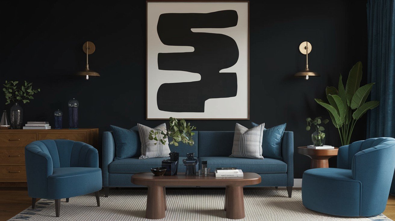
Blue and black together? It’s not as risky as you think.
SW Blithe Blue brings medium blue with pale surface and grey hints. The grey undertones are key – they keep the blue from fighting with Tricorn Black. I use this combo in bedrooms where you want calm but not boring.
SW Watery offers a green-blue shade with a light, soothing surface. Think of a peaceful lake, not an electric pool. This works beautifully in bathrooms and powder rooms where you want that spa feeling.
BM In the Tropics replicates the ocean breeze with medium turquoise tones. Sounds bold and looks balanced. Perfect for accent walls in living rooms or home offices.
Navy variations work differently. Deep blues complement without competing with Tricorn Black. They’re partners, not rivals. Use navy in fabrics, artwork, or smaller accent pieces.
The secret? Choose blues with grey or green undertones. Pure blues clash. Muted blues sing.
Warm Earth Tone Colors
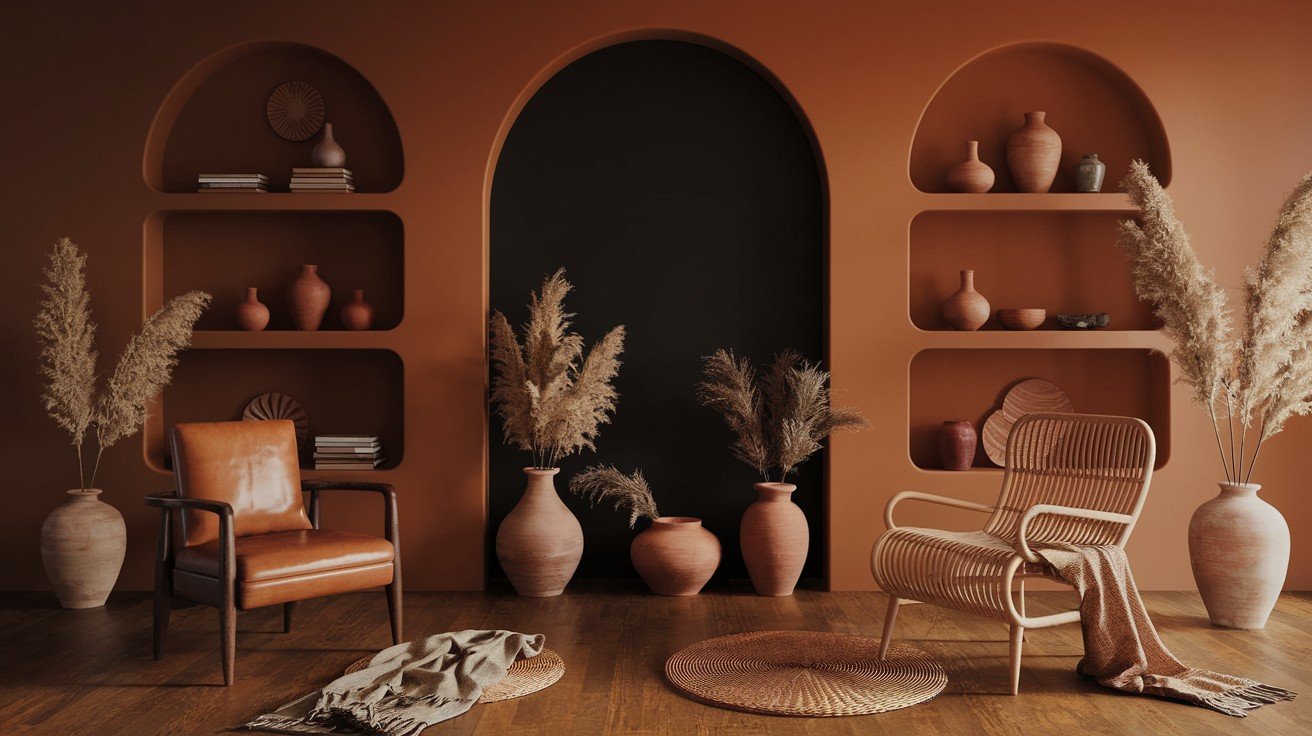
Earth tones make Tricorn Black feel grounded and natural.
SW Camelback delivers medium tan with the perfect balance of warm and cool notes. Not too yellow, not too grey. This combination works in any room where you want sophistication with warmth.
SW Coral Clay offers a charming coral shade neutralised like natural clay. Think desert sunset, not tropical fish. Great for dining rooms and entryways where you want personality without screaming.
Terracotta variations bring earthy oranges and corals for that bohemian flair. But pick carefully – too bright, and you’ll overpower the black.
Natural wood tones are foolproof. Warm oak, walnut, and cedar create organic contrast against Tricorn Black. Wood adds texture that paints alone can’t match.
The key with earth tones? They make blacks feel intentional, not accidental.
Pink and Coral Coordinating Shades
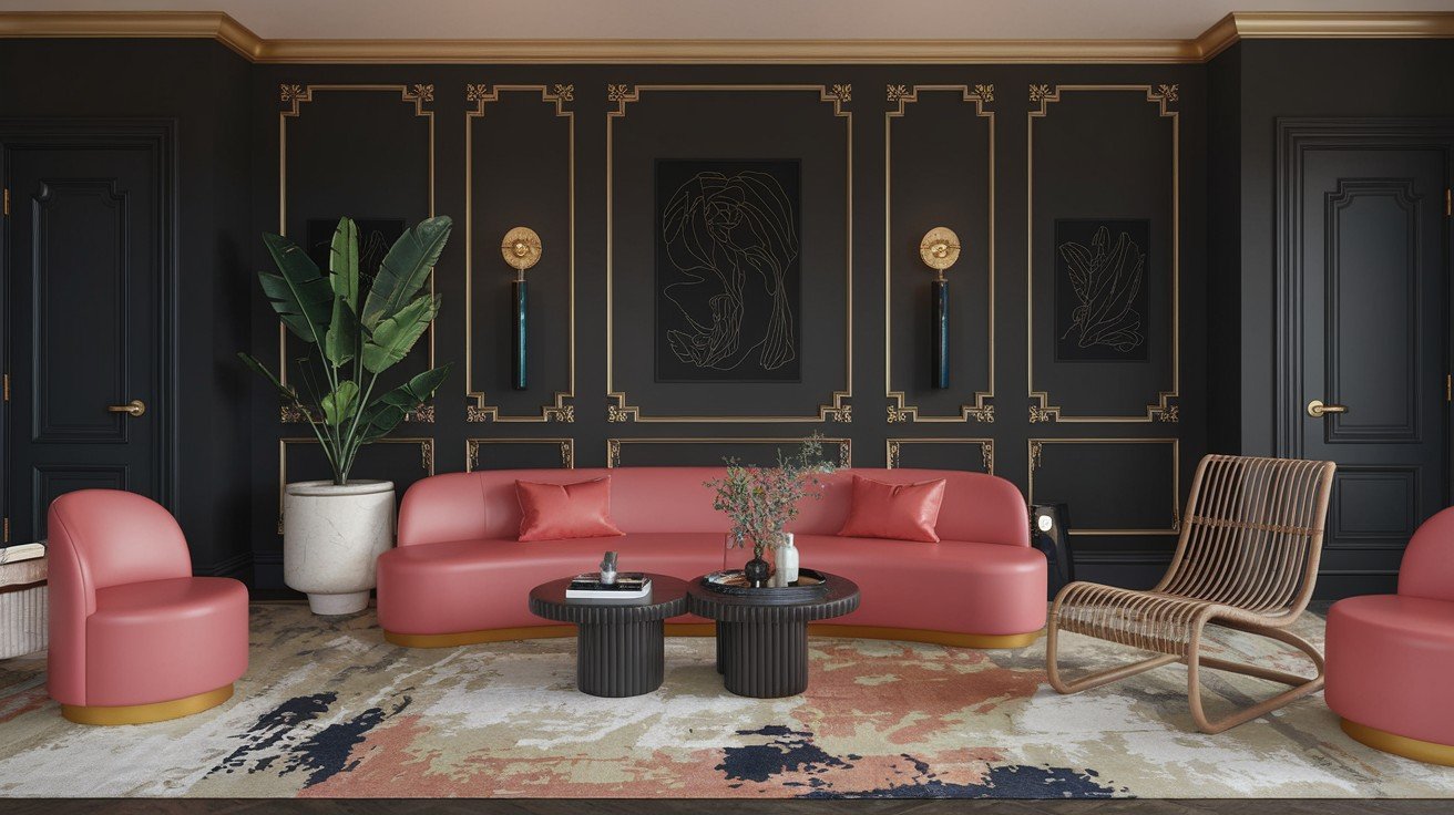
Pink with black isn’t just for teenagers anymore.
SW Rose Colored brings dusty medium-to-light pink with grey hints. Those grey undertones matter – they keep the pink sophisticated instead of sweet. Perfect for master bedrooms and powder rooms.
BM Kept Love Letters offers a charming medium-to-light pink with a tiny grey hint. Subtle but impactful. This combination creates spaces that feel both grown-up and romantic.
Blush tones add warmth without overwhelming the space. Think whisper, not shout. These soft pinks work in any room where you want a gentle contrast.
Salmon shades bring peachy-pink tones that add life to black backgrounds. More coral than pink – they feel fresh and current.
Here’s what works: Choose pinks with grey or brown undertones. Skip the bubble gum colours. Go for dusty, muted, or clay-based pinks instead.
Temperature-Based Color Coordination
Colour temperature changes everything. It’s why some rooms feel cosy and others feel cold.
Tricorn Black is neutral – it works with both warm and cool colours. That’s your superpower. You control the mood based on what you pair with it.
Here’s my simple rule: Match your room’s light. North-facing rooms need warm colours. South-facing rooms handle cool colours better.
The warm palette direction uses creams, golds, corals, and warm woods with Tricorn Black. Think fireside comfort. Perfect for bedrooms and living rooms.
Cool palette direction pairs blues, silvers, cool greys, and whites with black. Fresh and crisp – great for kitchens and bathrooms.
Mixed temperature balance combines warm and cool coordinating colours for dynamic interest. This creates the most interesting spaces. Try warm wood with cool walls and black trim.
Seasonal adaptability means coordinating colours that work year-round. A neutral base and changeable accents keep things fresh without major updates.
Conclusion
Choosing tricorn black coordinating colours doesn’t have to be overwhelming anymore. You now have the exact colour combinations that professional designers use every day.
Start with the whites and greys if you want to play it safe. Ready for more personality? Try the blues, earth tones, or even those sophisticated pinks we covered.
Remember the temperature rule: warm colours for cosy, cool colours for fresh, and mixed temperatures for the most interesting spaces.
Your Tricorn Black project is going to look amazing. These proven combinations take the guesswork out of colour selection.
Got questions about a specific room? Drop a comment below. I love helping readers create spaces they want to live in.
Ready to start painting? Save this guide – you’ll want to reference these combinations as you shop for coordinating colours.
Frequently Asked Questions
What are the best tricorn black coordinating colours for beginners?
Start with SW Pure White or SW Alabaster for foolproof combinations. These whites create a clean contrast without being too bold. Add SW Agreeable Gray for a third colour that works in any room.
Do tricorn black coordinating colours work in small spaces?
Yes, but stick to lighter coordinating colours like whites and pale greys. Use Tricorn Black as an accent wall or trim colour rather than painting all walls to keep small spaces feeling open.
Can I mix warm and cool tricorn black coordinating colours?
Absolutely. Mixed temperature palettes create the most interesting spaces. Try warm wood floors with cool grey walls and Tricorn Black trim for a dynamic balance that feels intentional.
What’s the biggest mistake with tricorn black coordinating colours?
Choosing colours with conflicting undertones. Always test paint samples in your actual lighting conditions. Colours that look great in the store might clash in your specific room.
How many coordinating colours should I use with Tricorn Black?
Keep it simple with 2-3 coordinating colours maximum. One main colour (like white or grey), one accent colour, and Tricorn Black create a balanced, professional-looking palette.