

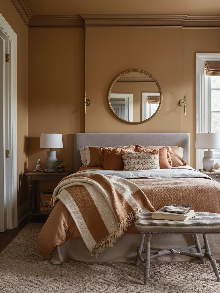
I know how hard it is to pick the right beige paint. I’ve stood in the paint aisle, completely overwhelmed. Every swatch starts to look the same. That’s why I made this guide.
I’ve gathered 13 warm beige paint colors that designers use. These shades work in real homes, not just in theory. Each one includ
es the exact name, brand, and tips for using it well. These colors have been tested in all kinds of light. No matter if your style is cozy, modern, or classic, there’s a beige here that fits. I’ve done the trial and error, so you don’t have to.
Now you can skip the guesswork. Let’s find a beige that finally feels like you.
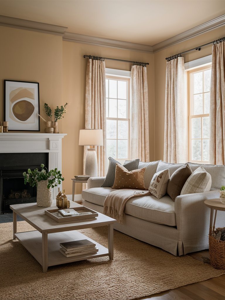
Understanding Warm Beige Paint Colors
Warm beige gets its cosy feeling from specific undertones. These are the subtle colour hints you see when light hits the paint.
The main warm undertones include:
- Yellow (like sunshine)
- Orange (like peach skin)
- Pink (like blush)
- Brown (like coffee with cream)
Cool beiges work differently. They contain grey undertones that make rooms feel crisp and modern. Warm beiges do the opposite – they make spaces feel welcoming and lived-in.
Here’s something important: lighting changes everything. Your warm beige might look peachy in the morning sun, but it turns golden under evening lamps.
I’ve noticed designers stick to certain beiges for good reasons.
They look for colours that work in multiple situations. The best warm beiges act like chameleons – they adapt to different furniture, art, and lighting without clashing.
These colours also have track records. Designers need paints that look great in photos and real life.
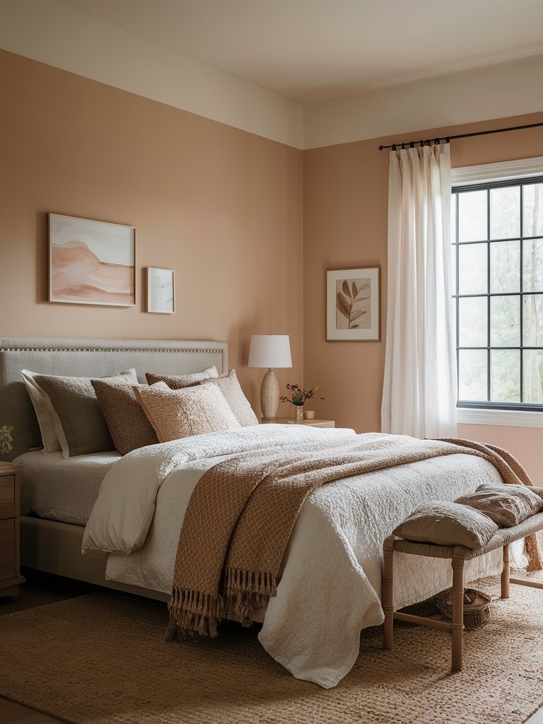
Top Sherwin-Williams Warm Beige Paint Colors
1. Accessible Beige (SW 7036)
Accessible Beige (SW 7036) is one of America’s most loved neutrals, and for good reason. It’s beige, but never boring, thanks to its soft gray undertone that keeps it from going too yellow or too pink.
- LRV (Light Reflectance Value): 58
- VOC Level: Low (meets or exceeds most VOC compliance standards)
- RGB: R: 209, G: 199, B: 184
It reflects a moderate amount of light, making it ideal for open floor plans and main living areas. It pairs beautifully with Warm Whites like SW Alabaster or Rich Charcoal Accents like SW Urbane Bronze for depth.
For a calm, layered look, try combining it with sage green or dusty blue decor. It shifts slightly with lighting, appearing cozier in north-facing rooms and more neutral in southern light.
Versatile, timeless, and welcoming, this shade plays well in any room without overpowering your palette.
2. Shiitake (SW 7043)
Shiitake (SW 7043) has a split personality, and that’s exactly why designers love it. In north or east-facing rooms, it leans cool and sophisticated. But in southern or western light, it softens with golden, welcoming undertones.
- LRV (Light Reflectance Value): 51
- VOC Level: Low (compliant with most VOC standards)
- RGB: R: 202, G: 192, B: 177
it’s balanced enough for both bright and dim spaces. It pairs effortlessly with soft whites like SW Pure White for contrast or earthy greens like SW Clary Sage to play up its organic feel.
For a richer, cozy look, bring in muted terracottas or deep navy blues. Shiitake’s adaptability makes it perfect for whole-house palettes, especially in homes with mixed lighting. It helps create visual flow without repetition fatigue.
The result? One color that feels curated, not compromised, in every space.
3. Bungalow Beige (SW 7511)
Bungalow Beige (SW 7511) carries warm brown-red undertones that make oak finishes, especially red or honey oak, look intentional instead of outdated. Most beiges clash with reddish woods, but this one plays nice.
- LRV (Light Reflectance Value): 41
- VOC Level: Low (meets most VOC compliance standards)
- RGB: R: 197, G: 178, B: 156
it brings gentle depth without feeling heavy. Pair it with creamy whites like SW Alabaster for trim, or sage greens like SW Escape Gray for a muted, earthy contrast.
Want to add sophistication? Try bronzed accents or dusty blues like SW Storm Cloud for balance. This color shines in traditional homes, French country decor, and anywhere oak trim needs softening, not hiding.
The magic happens when wood and wall tones collaborate, and Bungalow Beige pulls that off beautifully. Warm, cozy, and timeless.
4. Natural Tan (SW 7567)
Natural Tan (SW 7567) is beige for people who think they hate beige. It reflects a good amount of light, making it ideal for dim spaces like basements or north-facing rooms.
- LRV (Light Reflectance Value): 65
- VOC Level: Low (compliant with most VOC standards)
- RGB: R: 222, G: 210, B: 191
It skips the dated yellow undertones of early 2000s beiges and leans into a creamy brown with soft gray influence, fresh and modern. For pairings, try cool whites like SW Snowbound for trim to highlight its soft neutrality. To warm it up, layer in burnt orange, muted rust, or brushed brass accents.
For a calm palette, go with cool blues like SW Krypton or sage greens like SW Softened Green. Natural Tan adapts easily and won’t fight your lighting or your furniture.
5. Pavilion Beige (SW 7512)
Pavilion Beige (SW 7512) is beige with good manners. It carries a soft, warm yellow undertone that brightens cold or shadowy rooms without being loud. Its stony base tone keeps it sophisticated, steering clear of the builder-basic look.
- LRV (Light Reflectance Value): 54
- VOC Level: Low (meets most VOC compliance standards)
- RGB: R: 214, G: 198, B: 177
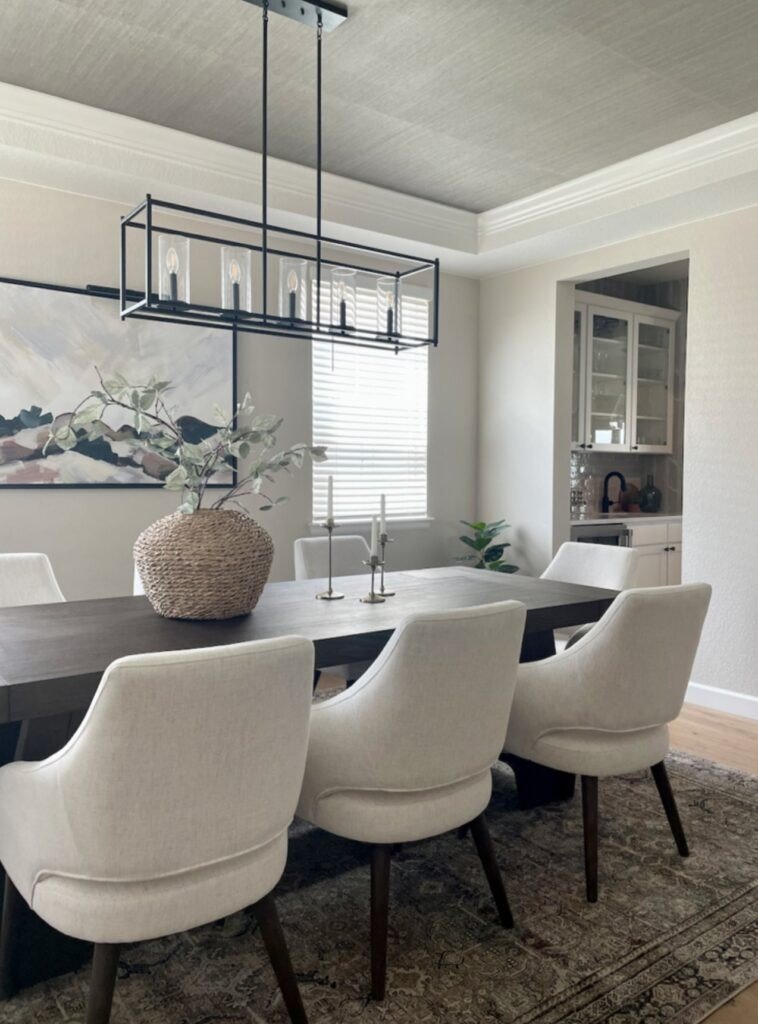
Ideal fornorth-facing living rooms,kitchen cabinets, andformal dining rooms, it brings quiet elegance to any space. For trim, pair it withSW Alabaster for a crisp, clean contrast.
To add depth, layer withdeep browns,antique bronze hardware, orolive green accents like SW Svelte Sage.
Pavilion Beige makes wood tones glow and works especially well withnatural textures like linen, cane, and warm oak. It’s not trendy, just timeless and tasteful.
Top Benjamin Moore Warm Beige Paint Colors
6. Edgecomb Gray (HC-173)
If I could only recommend one beige paint, this would be it.
Edgecomb Gray sits at the top of every designer’s go-to list. It’s not grey despite the name – it’s a perfect warm beige that works everywhere. Its subtle greige undertone makes it incredibly flexible for both traditional and modern interiors.
- LRV (Light Reflectance Value): 63.88
- VOC Level: Low (varies slightly by product line, but generally under 50 g/L)
- RGB: R: 218, G: 211, B: 199
Pair it with crispWhite Dove (OC-17) for trim, or add depth withChelsea Gray orHale Navy on cabinets or accent walls. For a soft contrast, tryBalboa Mist in adjoining rooms. Edgecomb Gray ties everything together beautifully.
Use it for Whole-house colour schemes, Main living areas, Bedrooms and hallways and When you can’t decide on anything else.
Bottom line? This colour has never let me down.
7. Shaker Beige (HC-45)
This beige has a personality without being pushy.
Shaker Beige carries orange undertones with the softest hint of pink. That combination sounds weird on paper, but looks amazing on walls. It’s warm enough to feel cosy but neutral enough to work with any decor.
- LRV (Light Reflectance Value): 54.61
- VOC Level: Low (varies by product line, typically under 50 g/L)
- RGB: R: 210, G: 188, B: 160
Pair it with warm whites likeSwiss Coffee for trim or creamy neutrals likeManchester Tan in nearby rooms. Add contrast withWrought Iron orHearthstone on built-ins or accent furniture. This pairing creates a rich, layered look without overwhelming the space.
8. Muslin (OC-12)
This colour has been quietly winning over designers for decades.
Muslin carries a slight peach undertone that you’ll notice in artificial light. But here’s the cool part: natural daylight makes that peachy hint almost disappear, leaving you with pure, soft beige.
- LRV (Light Reflectance Value): 66.54
- VOC Level: Low (typically under 50 g/L depending on product line)
- RGB: R: 227, G: 216, B: 199
Pair Muslin withWhite Dove for trims and ceilings to enhance its softness. Use richer tones likePashmina orGrant Beige for nearby rooms to keep things grounded. If you’re adding accent furniture or textiles, muted terracottas and warm grays create an inviting, cohesive palette.
9. Lenox Tan (HC-44)
This is beige with a backbone.
- LRV (Light Reflectance Value): 43.26
- VOC Level: Low (varies by product line, typically under 50 g/L)
- RGB: R: 191, G: 167, B: 135
Lenox Tan comes from Benjamin Moore’s Historical Collection, which means it’s been tested over time. The grey-khaki undertone gives it a sophistication that regular beiges can’t match. It pairs beautifully withWhite Dove orSwiss Coffee for trim and ceilings. For added contrast, use it withHale Navy orKendall Charcoal on doors, cabinetry, or accent walls.
Here’s what sets it apart: it’s deeper than typical beiges without going dark. That extra richness makes rooms feel more expensive. It also works great for interior walls needing depth, exterior siding or trim, and spaces wanting sophistication. The best part? It enhances both interiors and exteriors with equal ease.
10. Pashmina (AF-100)
When regular beige feels too safe, try this.
- LRV (Light Reflectance Value): 44.2
- VOC Level: Low (typically <50 g/L depending on the base)
- RGB: R: 176, G: 167, B: 154
Pashmina sits deeper than typical beiges without crossing into brown territory. It’s the perfect middle ground for rooms that need more presence than light neutrals can provide. Designers often pair it withWhite Dove orSimply White for trim to create a crisp contrast, or use it alongsideBalboa Mist orEdgecomb Gray for a soft, layered look.
Here’s how designers use it: as the secondary colour in neutral schemes, lighter beiges on main walls, Pashmina on accent walls or built-ins. This colour needs natural light to shine. In dim rooms, it can look muddy. But with good light, it’s gorgeous and adds quiet drama without overwhelming the space.
Top Behr Warm Beige Paint Colors
11. Warm Beige (33C-2)
Sometimes, the simplest name tells the whole story.
- LRV (Light Reflectance Value): 62
- VOC Level: Low (meets strict VOC standards; typically <50 g/L)
- RGB: R: 223, G: 207, B: 183
Behr’s Warm Beige does exactly what it promises – it’s warm, it’s beige, and it works everywhere. The subtle yellow undertone gets grounded by brown notes, so it never looks too sunny or fake. For a polished, timeless combo, pair it withSwiss Coffee for trim orCreamy Mushroom for a slightly darker wall accent. If you’re aiming for contrast,Antique White cabinetry also plays beautifully against Warm Beige.
Here’s why I recommend it: the colour hits that sweet spot between light and dark. Not so pale it disappears, not so deep it overwhelms. The brown grounding keeps it from looking cheap – a common problem with yellow-based beiges.
12. Honey Beige (390D-4)
This is the happiest beige you’ll ever see.
- LRV (Light Reflectance Value): 47
- VOC Level: Low (Behr paints are typically <50 g/L, meeting strict VOC regulations)
- RGB: R: 201, G: 174, B: 137
Honey Beige brings a cheerful yellow undertone that makes rooms feel sunny, even on cloudy days. But here’s what’s smart about it: the sophistication stays intact despite the optimistic vibe. For balance, pair it withBehr’s White Mocha on trim orClassic Silver for cool contrast.
Want a cozy pairing? Try it withMushroom Bisque on cabinetry or accent walls. It works with everything, coastal blues, contemporary greys, and traditional reds.
The result? Walls that make you smile without looking juvenile or unprofessional. Honey Beige injects warmth and light into spaces without overwhelming them, perfect for anyone tired of serious neutrals.
13. Almond Latte (N260-2)
This beige has an attitude.
- LRV (Light Reflectance Value): 73
- VOC Level: Low (typically <50 g/L, depending on the Behr product line)
- RGB: R: 235, G: 224, B: 207
Almond Latte blends orange and pink undertones in a way that shouldn’t work, but does. It’s warmer and more intense than safe beiges, which is exactly what some spaces need. For a soft, grounded combo, pair it withBehr’s Natural Almond orCreamy Mushroom.
Want more drama? Add contrast withCracked Pepper on an accent wall or trim. It also complementsbrass or antique gold hardware beautifully.
This shade works wonders in homes with honey oak cabinets, mid-2000s fixtures, or warm-toned tile. It doesn’t fight those features; it uplifts them. The pink keeps the orange from going too bold. Smart color chemistry that feels curated, not forced.
Conclusion
You now have 13 proven warm beige paint colours that professional designers trust. No more guessing or second-guessing your choice.
Each of these colours has been tested in real homes with real lighting conditions. From Sherwin-Williams’ Accessible Beige to Behr’s Almond Latte, you have options for every room and every style.
The best part? You can’t go wrong with any of these selections. They’ve all earned their place on designers’ go-to lists for good reasons.
Your next step is simple: pick the one that speaks to your space and lighting situation. Trust your instincts – you’ve got solid options to choose from.
What warm beige paint colours are you considering for your home? Share your thoughts in the comments below.
Frequently Asked Questions
What makes a beige paint colour “warm”?
Warm beige paint colours contain undertones like yellow, orange, pink, or brown that create a cosy, inviting feeling. This differs from cool beiges that have grey undertones and feel more crisp or modern.
Which warm beige paint colour is best for north-facing rooms?
Edgecomb Gray (Benjamin Moore) and Pavilion Beige (Sherwin-Williams) work excellently in north-facing rooms. These colours have enough warmth to counteract the cooler natural light that northern exposures typically receive.
Can I use the same warm beige throughout my entire house?
Yes! Colours like Accessible Beige (SW 7036) and Edgecomb Gray (HC-173) are specifically chosen by designers for whole-house applications because they adapt well to different lighting conditions and room functions.
Do warm beige paint colours work with modern decor?
Absolutely. Colours like Natural Tan (SW 7567) and Shiitake (SW 7043) have grey undertones that keep them current while maintaining warmth, making them perfect for contemporary and modern design styles.
How do I choose between similar warm beige shades?
Consider your room’s natural light direction and existing wood tones. Test paint samples on your walls at different times of day to see how each colour responds to your specific lighting conditions.