

What Makes Taupe “Warm” vs Cool Taupe
Here’s the thing about taupe. Not all taupes are created equal.
Some feel cozy and inviting. Others feel cold and sterile. The difference comes down to one thing: undertones.
Warm taupe has hidden colors blended into it. You’ll find brown, beige, and subtle red tones. These undertones make the color feel friendly and welcoming.
Think of it like this. Cool taupe leans toward gray. Warm taupe leans toward brown.
Let me break down what makes taupe warm:
Brown undertones give taupe that earthy, grounded feeling. Beige undertones add warmth without being too yellow. Red undertones create that cozy vibe you want in a kitchen.
But here’s where it gets interesting. Some warm taupes have surprising undertones.
Pale Oak, for example, has a violet-pink flash. Perfect Greige exhibits red undertones in certain lighting conditions. Ranchwood has those same red hints that make it feel so inviting.
Why does this matter for your kitchen?
Warm undertones make your space feel like home. They create that cozy atmosphere where the family wants to gather. Cool gray undertones can make a kitchen feel like a showroom.
I always advise homeowners to test their taupe in different lighting conditions. What looks warm in the store might look cool in your kitchen.
Best Warm Taupe Paint Colors for Kitchen Cabinets
Choosing the right taupe can make or break your kitchen design. I’ve tested dozens of colors in real kitchens. Here are the ones that work.
Light Warm Taupe Options (LRV 63+)
Start here if you want brightness.
Light taupes keep your kitchen feeling open and airy. They work exceptionally well in smaller spaces or kitchens with limited natural light.
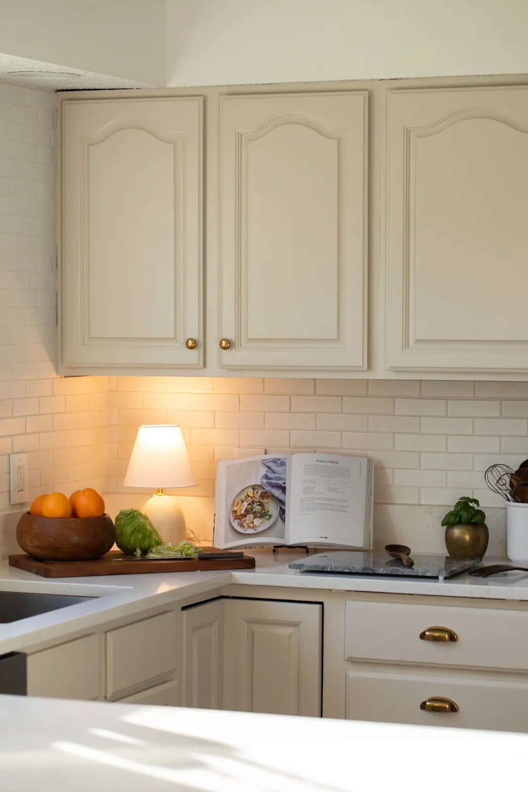
Pale Oak by Benjamin Moore (LRV 68.64) is my top pick for light taupe. It’s almost an off-white but with warmth. You’ll notice subtle pinkish-violet undertones that prevent it from looking flat.
Here’s the thing about Pale Oak. It changes throughout the day. Morning light brings out the violet hints. Evening light makes it feel more beige.
Taupe Of The Morning by Sherwin-Williams (LRV 65) provides cozy warmth without being too bold. The pink and violet undertones are minimal. This makes it easier to work with if you’re nervous about color.
Edgecomb Gray by Benjamin Moore (LRV 63) rounds out the light options. It’s the safest choice with minimal undertones. Think of it as a taupe with training wheels.
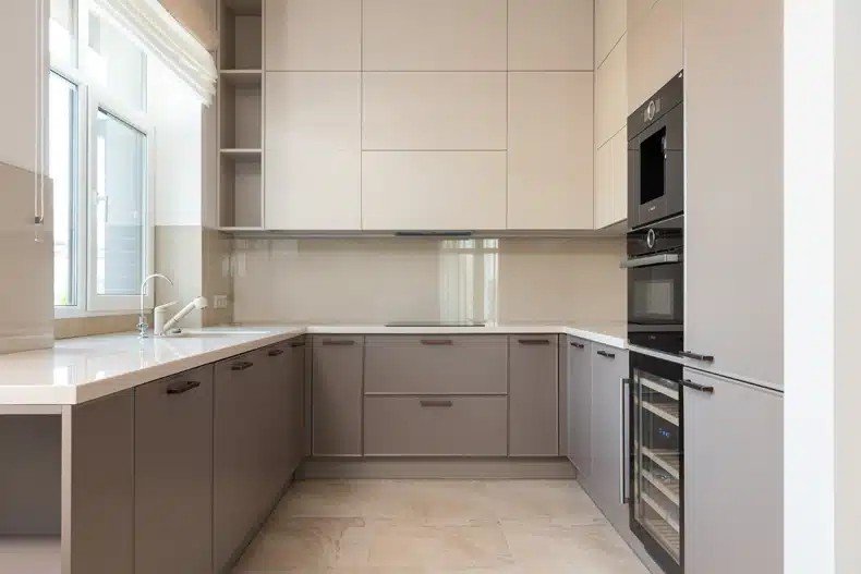
Medium to Rich Warm Taupe Colors (LRV 42-62)
Want more drama? Go darker.
Medium to rich taupes create statement kitchens. They add depth and character that light colors can’t match.
Perfect Greige by Sherwin-Williams (LRV 42) is the warmest option I recommend. Red undertones and brown hints make it incredibly inviting. But be careful. This color needs good lighting to avoid looking muddy.
Smokey Taupe by Benjamin Moore (LRV 54.53) sits right in the middle range. It’s warm and cozy without being too dark. I classify this as medium dark, perfect for larger kitchens.
Now, here’s where it gets interesting. Stone Hearth by Benjamin Moore (CC-490) goes deep and rich. The subtle purple undertone adds sophistication. This color works best with white countertops.
Ranchwood by Benjamin Moore (CC-500) brings classic warm taupe vibes. The beige and red elements give it a timeless feel. This is the color your grandma would have chosen, but in the best way possible.
Modern Gray by Sherwin-Williams (LRV 62) closes out our list. It’s a soft taupe with passive undertones-easy to live with and pairs well with almost everything.
Warm Taupe Cabinets in Different Kitchen Styles
Warm taupe is versatile and works well in any kitchen style. That’s what makes it so special.
I’ve installed taupe cabinets in ultra-modern homes and century-old farmhouses. The key is matching your cabinet style to your home’s personality.
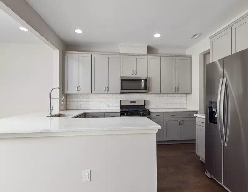
Modern Kitchen Applications
Clean lines are everything in modern kitchens.
Flat-panel warm taupe cabinets give you that sleek look without the coldness of white or gray. No fancy details. No decorative molding. Just smooth, simple surfaces.
Here’s what I love about modern taupe kitchens: They feel warm but still sophisticated.
Stainless steel appliances are a natural match. The cool metal balances the warm cabinet color perfectly. Add a bold backsplash, and you’ve got a kitchen that feels current but not trendy.
Think geometric tiles in white or black. Glass subway tile works great, too. The key is keeping everything else simple so your taupe cabinets can be the star.
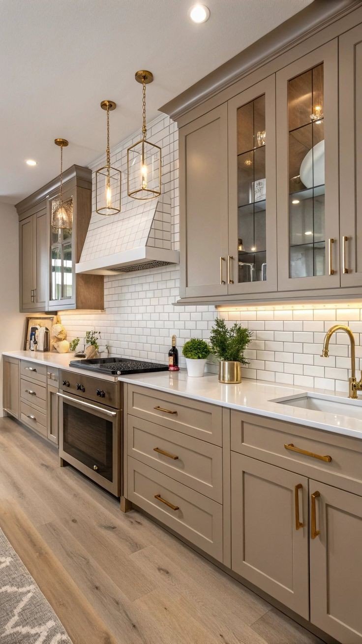
Traditional Kitchen Designs
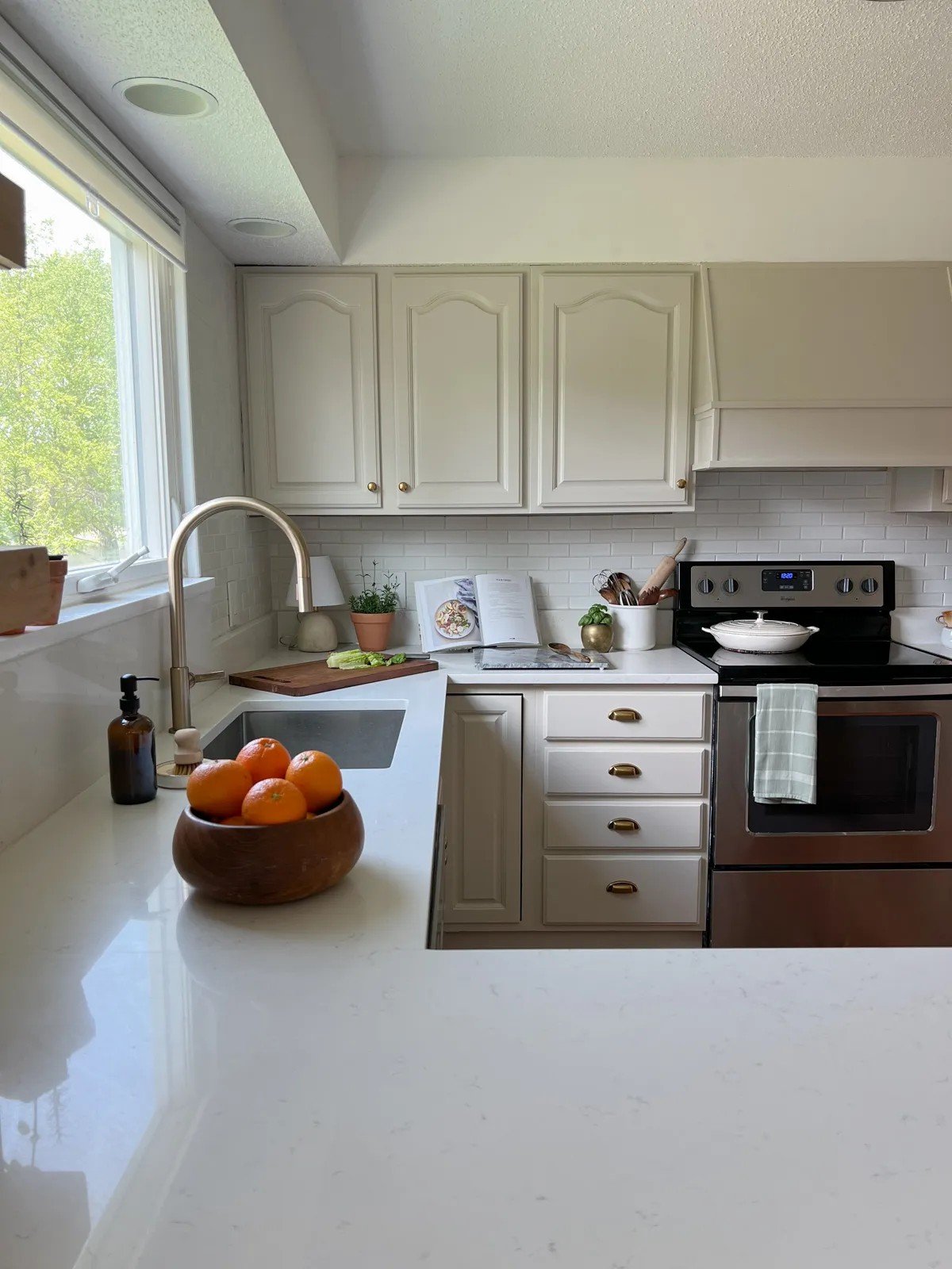
Traditional kitchens call for more details. Raised-panel warm taupe cabinets bring that classic elegance.
The panels add depth and shadow. Decorative molding provides the finishing touches that make a kitchen feel complete.
Marble countertops are the perfect partner here. White marble with gray veining complements the taupe beautifully. Carrara marble is my go-to choice.
Classic hardware seals the deal. Think brushed brass or oil-rubbed bronze. Cabinet knobs and pulls with traditional shapes add that timeless feeling.
But here’s what makes it work. The warm taupe keeps everything from feeling too formal or stuffy.
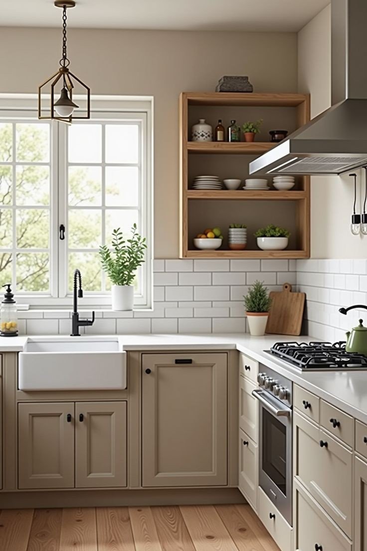
Farmhouse and Rustic Styles
Farmhouse kitchens are all about character.
Distressed warm taupe cabinets with weathered finishes give you that lived-in look. The imperfections tell a story. They make your kitchen feel like it has a history.
Vintage-inspired hardware is crucial here. The cup pulls in aged brass work perfectly. Bin pulls on drawers add that authentic farmhouse touch.
Natural wood elements tie everything together. Think butcher block countertops or open wood shelving. The wood adds texture that plays beautifully with taupe.
I always add at least one reclaimed wood element. A wood beam or a rustic island top. It makes the whole kitchen feel more authentic.
The best part? Warm taupe cabinets age gracefully in farmhouse kitchens. They look better with time, not worse.
Pairing Warm Taupe Cabinets with Countertops
Your countertop choice can make or break your taupe kitchen.
I’ve seen beautiful taupe cabinets ruined by the wrong countertop. I’ve also seen average cabinets elevated by the perfect stone choice.
The secret? Understanding how different materials interact with taupe’s warm undertones.
Natural Stone and Marble Combinations
Stone and taupe are natural partners.
Granite brings the texture and visual interest that flat cabinet fronts need. The natural patterns create movement without competing with your cabinet color. Plus, granite’s durability makes it perfect for busy kitchens.
Quartz provides a sophisticated look with minimal maintenance. The engineered patterns are more predictable than natural stone. This works great if you want consistency across your kitchen island and perimeter counters.
But here’s my favorite combination. Marble with warm taupe cabinets creates pure harmony.
White marble with gray veining complements the taupe’s undertones perfectly. The stone’s natural warmth complements the cabinet’s color instead of competing with it.
Carrara marble is my go-to choice. The subtle veining adds interest without being overwhelming. Calacatta marble works, too, if you want bolder patterns.
Here’s what happens with stone countertops: They bring out the best in taupe’s warm undertones. The natural materials work together to create that organic, comfortable feeling.
Wood and Bold Contrast Options
Want something different? Try wood countertops.
Butcher block adds a rustic, inviting vibe that pairs beautifully with warm taupe. The natural wood grain creates texture and warmth. Perfect for farmhouse or casual kitchen styles.
Walnut countertops bring rich, dark tones that make taupe cabinets stand out. The contrast is striking but not harsh.
But sometimes you want drama. Black countertops create profound depth against warm taupe cabinets.
Absolute black granite or black quartz makes your taupe cabinets the star. The dark surface grounds the lighter cabinet color. This combination feels modern and sophisticated.
Here’s the surprising choice: White countertops with warm taupe cabinets.
White quartz or marble creates a bright, airy feel. The light countertop reflects more light around your kitchen. This works exceptionally well in smaller spaces or kitchens with limited natural light.
The white and taupe combination feels fresh but not stark. It’s softer than white cabinets with white countertops, but brighter than darker combinations.
Backsplash Ideas for Warm Taupe Kitchen Cabinets
Your backsplash ties everything together.
I’ve seen gorgeous taupe kitchens fall flat because of poor backsplash choices. The right backsplash enhances your cabinet color. The wrong one fights against it.
Here’s how to get it right.
Natural Stone and Wood Backsplashes
Natural materials love warm taupe cabinets.
Stone backsplashes enhance the earthy tones already present in your taupe color. Think travertine, limestone, or natural marble tiles. These materials share the same warm undertones as your cabinets.
Here’s what I see happening: The stone and taupe work together to create one cohesive look. Your kitchen feels organic, not assembled from random parts.
Wood backsplashes are making a comeback, too. Reclaimed wood planks add texture and warmth to any space. They work exceptionally well behind your range or as an accent wall.
However, be cautious when using wood near water sources. Seal it properly or stick it to areas away from your sink.
The beauty of natural materials? They age gracefully with your taupe cabinets. Everything gets better with time instead of looking dated.
Bold and Neutral Statement Options
Sometimes, you want more visual punch.
Mosaic designs create visual interest without overwhelming your taupe cabinets. Glass mosaics reflect light and add sparkle. Stone mosaics bring texture and depth.
The key is choosing mosaics in colors that complement taupe. Cream, beige, and soft gray work beautifully. Subtle blues or greens can add just the right amount of color.
But here’s the classic choice that never fails-white tile backsplashes with warm taupe cabinets.
White subway tile creates that clean, timeless look. It brightens your kitchen without competing with your cabinet color. The white reflects light, making your space feel larger.
Larger white tiles work, too. Consider using 4×12 or 6×12 rectangles for a more modern look.
Here’s the balance you’re looking for: Your backsplash should either blend seamlessly with your taupe cabinets or create intentional contrast. Avoid backsplashes that are similar but not quite a match.
Statement backsplashes work when they’re the focal point. Subtle backsplashes work when they let your cabinets take center stage.
Either approach can be beautiful. Just pick one and commit to it.
Warm Hardware Selection for Warm Taupe Cabinets
Hardware makes or breaks the look of your cabinet.
I’ve watched homeowners spend thousands on beautiful taupe cabinets and then ruin them with cheap or wrong-colored hardware. Don’t make that mistake.
The proper hardware enhances your taupe’s warm undertones. The wrong hardware fights against them.
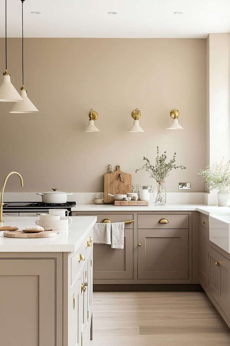
Brass and Gold Hardware
Brass is having a significant moment right now.
The warm metal tones create sophisticated combinations with taupe’s neutral undertones. Your cabinets and hardware work together rather than competing.
But here’s what most people get wrong. Not all brass finishes are the same.
Brushed brass feels modern and current. Antique brass adds character and depth. Unlacquered brass develops a natural patina over time.
Gold hardware elevates the look. It adds luxury and visual appeal that basic finishes can’t match. Champagne gold works exceptionally well with lighter taupe shades.
Here’s the secret to making it work: Coordinate your hardware with other warm metals in your kitchen.
Your light fixtures should match or complement your cabinet hardware. Think brass pendant lights over your island. Gold-toned faucets tie everything together.
Even small decorative accessories matter. Brass bowls, gold picture frames, warm metal canisters. These details make your whole kitchen feel intentional.
Oil-Rubbed Bronze Options
Oil-rubbed bronze is perfect for traditional kitchens.
The dark, rich finish enhances rustic and farmhouse styles beautifully. It adds that aged, lived-in feeling that makes kitchens feel like home.
Here’s why I love oil-rubbed bronze with warm taupe: Both finishes have that classic, timeless quality. They age gracefully together.
The bronze’s warm undertones complement the taupe’s earthy base. Your cabinets and hardware seem to belong together, not like they were chosen separately.
Oil-rubbed bronze supports vintage-inspired design perfectly. Consider cup pulls for cabinets and bin pulls for drawers. Traditional knob shapes add authentic character.
But don’t stop at cabinet hardware. Your faucet, light fixtures, and even switch plates should coordinate.
Here’s what happens when you get it right: Your whole kitchen feels cohesive and thoughtfully designed. Every element supports the others.
The bronze develops more character over time. It gets richer and more beautiful with age, just like your taupe cabinets.
Color Coordination and Wall Pairings
Selecting the right wall color is crucial.
I’ve seen beautiful taupe cabinets disappear into muddy-looking walls. The wrong wall color makes everything blend in the worst way.
Here’s how to make your taupe cabinets stand out.
Wall Color Pairings
Light, warm taupe cabinets need contrast to shine.
Chantilly Lace by Benjamin Moore is my go-to wall color for light taupe cabinets. The 20+ LRV difference creates enough contrast to define your cabinets without being harsh.
Here’s why this works so well: Your cabinets become the focal point instead of fading into the background. The white walls make your taupe feel intentional, not accidental.
Medium and dark warm taupe cabinets are different animals.
They need crisp, clean walls to balance their richness. Pure White or Snowbound by Sherwin-Williams both work beautifully.
These whites have enough strength to hold their own against darker taupe. They won’t look dingy or yellow next to your cabinets.
The key is the LRV difference. You need at least 20 points between your cabinet and wall colors. This creates a visual separation, making both colors appear more distinct.
Complementary Color Schemes
Want to add more personality? Try these combinations.
Soft whites and muted creams create that monochromatic look that feels sophisticated but not boring. Think cream walls with light taupe cabinets. The subtle contrast adds depth without drama.
But here’s where it gets interesting. Deep blues create a sophisticated contrast with a warm taupe.
Navy blue walls make taupe cabinets feel warm and inviting. The cool blue balances the warm cabinet undertones perfectly. This combination works exceptionally well in larger kitchens.
Muted greens offer natural harmony with taupe cabinets.
Sage green or soft olive creates that organic, earthy feeling. Both colors share undertones that complement taupe beautifully.
Here’s what I tell my clients: Test your colors in different lighting before committing. Paint large samples on your walls and live with them for a few days to see how they look.
Morning light, afternoon sun, and evening artificial light all change how colors look together. What looks perfect at noon might look off at dinner time.
The goal is harmony, not matching. Your wall color should enhance your taupe cabinets, not compete with them.
Design Ideas and Styling Tips
Ready to take your taupe kitchen to the next level?
These styling tricks will make your space feel custom and complete. I use these techniques in every kitchen I design.
Two-tone and mixed-material applications
Two-tone kitchens are incredibly popular right now.
Pairing warm taupe with white creates that perfect balance of warmth and brightness. Use taupe on your lower cabinets and white on the uppers. This combination makes your kitchen feel larger and more open.
Navy blue with warm taupe is my secret weapon combination.
Navy Island with taupe perimeter cabinets creates a sophisticated focal point. The contrast is striking but not overwhelming. Your kitchen feels intentional and designed.
Here’s where mixed materials shine: Wood island combinations.
Picture warm taupe cabinets with a natural wood island top. The wood adds texture and warmth that makes the whole kitchen feel more inviting. Walnuts and cherries work exceptionally well.
Stone backsplash pairings add another layer of interest. The natural stone behind your range, paired with subway tile elsewhere, creates visual zones. Your kitchen feels more complex and thoughtful.
Open shelving integration is key for modern taupe kitchens.
Replace a few upper cabinets with floating shelves. This breaks up the cabinet mass, providing places to display beautiful dishes or plants.
Decorative Element Addition
Your kitchen needs personality beyond just cabinets and countertops.
Soft textiles bring warmth that hard surfaces can’t provide. Think linen dish towels, woven placemats, or a vintage rug. These elements make your kitchen feel lived-in and comfortable.
Plant life adds natural warmth that complements taupe perfectly.
Herbs on your windowsill serve double duty. They’re practical for cooking and visually appealing. Large plants in corners soften hard angles.
However, what truly makes a kitchen feel like home are art and personal touches.
Family photos, vintage cutting boards displayed on open shelves, or a collection of ceramic bowls. These personal elements tell your story.
I always advise clients to incorporate at least three personal touches into their kitchen. Maybe it’s your grandmother’s mixing bowls or artwork from your last vacation.
The goal is to make your kitchen feel like yours, not like a showroom. Warm taupe cabinets provide the perfect backdrop for your style to shine through.
Remember, your kitchen should reflect your actual lifestyle. Add the elements that make you smile every time you walk in.
Conclusion
Warm taupe kitchen cabinets offer the perfect balance of style and versatility for any home. From light Pale Oak to rich, Perfect Greige, you now have the knowledge to choose the right shade for your space.
Remember the key points: test samples in different lighting conditions, pair them with complementary materials, and add personal touches that make the space uniquely yours. Your kitchen should feel warm and welcoming, not like a cold showroom.
With the right taupe shade, coordinating colors, and thoughtful styling, you’ll create a kitchen that works beautifully for years to come.
What’s your favorite taupe combination from this guide? Please share your thoughts in the comments below, or explore our other kitchen design articles for more inspiration.
Your dream kitchen is closer than you think.
Frequently Asked Questions
What makes taupe “warm” versus cool?-
Warm taupe features brown, beige, and red undertones, creating a cozy and inviting atmosphere. Cool taupe leans toward gray undertones and feels more sterile. Look for subtle hints of pink, violet, or red in warm taupe colors, such as Perfect Greige or Pale Oak.
What countertops work best with warm taupe kitchen cabinets?-
White marble, granite, and quartz complement warm taupe beautifully. Wood countertops add rustic charm, while black surfaces create a dramatic contrast. The key is choosing materials that enhance taupe’s warm undertones rather than competing with them.
Should I choose a light or dark warm taupe for my kitchen?-
Light warm taupe (LRV 63+) works well in smaller kitchens or spaces with limited natural light. Medium to dark taupe (LRV 42-62) creates more drama and works best in larger kitchens with good lighting. Consider the size of your space and lighting when making a decision.
What wall colors pair well with warm taupe cabinets?-
For light taupe cabinets, use Chantilly Lace or a similar white with an LRV difference of 20 or more. Medium to dark taupe works with Pure White or Snowbound. You can also try soft blues for contrast or muted greens for natural harmony.
What hardware finishes complement warm taupe kitchen cabinets?-
Brass and gold hardware enhance the taupe’s warm undertones, adding a luxurious appeal. Oil-rubbed bronze works perfectly for traditional and farmhouse styles. Avoid chrome or cool-toned metals that clash with taupe’s warm base.