


Ever think of why some neutrals make a room feel bright and airy while others feel warm and cozy?
Choosing between Perfect Greige vs. Agreeable Gray can be tricky, especially when each shade reacts differently to light and space.
As someone who has spent years helping homeowners pick the right paint, I know how subtle undertones can completely change a room’s vibe.
In this guide, I’ll walk you through their tones, best applications, and how to pair them with furniture and décor.
By the end, you’ll feel confident about which greige fits your home and style perfectly.
Understanding Greige: A Neutral Base

Greige is a blend of gray and beige. It sits between cool gray and warm beige, which makes it a flexible neutral for many homes.
This mix allows it to work with both warm and cool design elements. Gray can feel cool, while beige looks warmer.
Greige balances these two tones, so it often works well on walls, cabinets, and open living spaces.
Lighting also affects how greige appears. In bright rooms, it may look lighter and warmer, while in low light, the gray tone can stand out more. Room size matters too.
Lighter greige helps small rooms feel open, while deeper greige adds depth to large spaces like living rooms and bedrooms.
Sherwin-Williams Agreeable Gray (SW 7029)

Agreeable Gray is a popular Sherwin-Williams greige. It offers a soft, warm balance that works well on walls, trim, or cabinets in many spaces.
Overview
Agreeable Gray is a light gray-beige with subtle green and beige undertones. Its Light Reflective Value of 60 allows it to reflect plenty of light, keeping rooms bright.
The tone is flexible and adapts well to different lighting, making it suitable for small or low-light areas.
Best Applications
This color works well in living rooms, bedrooms, and kitchens with natural light. It suits open layouts, providing a balanced backdrop for furniture and decor.
Agreeable Gray can be used on walls, trim, and cabinets for a soft, consistent look throughout a home.
Visual Appearance in Different Lighting
In north-facing rooms, Agreeable Gray may show faint green or gray hints. In south- or east-facing spaces, it maintains a warm neutral tone.
Its appearance shifts slightly with sunlight, helping create a comfortable and balanced atmosphere in any room.
Sherwin-Williams Perfect Greige (SW 6073)

Perfect Greige offers a warmer, deeper greige option. It brings a subtle taupe and pink undertone that works well in well-lit spaces, adding depth and a grounded feel to rooms.
Overview
Perfect Greige is a medium-toned taupe greige with soft pink and mauve undertones. Its LRV of 42 absorbs more light, giving rooms depth and a cozy feel.
The tone is warmer and more substantial than Agreeable Gray, making it ideal for spaces that need a comforting, grounded atmosphere.
Best Applications
This color suits well-lit living rooms, bedrooms, and feature walls. It works as an accent or main wall in larger spaces, creating a warm and inviting environment.
Perfect Greige pairs well with wood, metal, or neutral decor.
Visual Appearance in Different Lighting
In north-facing rooms, it keeps a warm feel. In south- or east-facing rooms, taupe and pink undertones show more.
It complements furniture, flooring, and other decor elements, adding depth and balance to the space.
Room-by-Room Application Suggestions
Choosing the right greige for each room can make a big difference in how the space feels. Both Agreeable Gray and Perfect Greige have strengths that suit different areas of the home.
Living Room
Agreeable Gray works well as a bright, neutral backdrop. It keeps the space open and balanced, letting furniture and decor stand out naturally.
Perfect Greige adds warmth and depth to living rooms. It can be used on a main wall or as an accent to create a cozy and grounded feel in larger spaces.
Kitchen
Agreeable Gray pairs nicely with cabinets, backsplashes, and countertops. Its neutral tone brightens the space and complements both light and dark finishes.
Perfect Greige adds warmth to kitchens with ample light. It works well for accent walls or cabinets, bringing a subtle taupe tone that balances wood and stone surfaces.
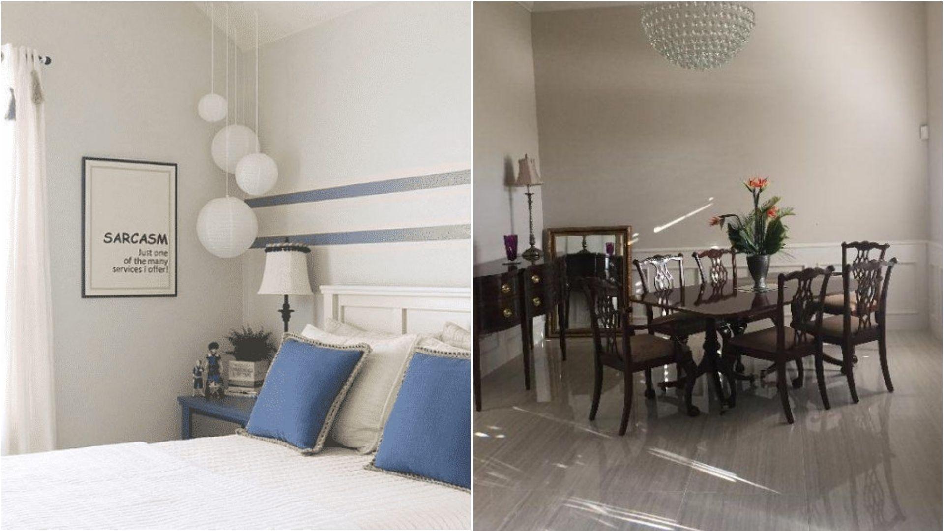
Bedroom
Agreeable Gray creates an airy, peaceful ambiance. It reflects light softly and helps make the room feel open and calm.
Perfect Greige gives bedrooms a warm, comforting feel. Its deeper tone adds coziness and works well with bedding and wood furniture.
Exterior Use
Agreeable Gray maintains a clean, neutral look in natural sunlight. It increases curb appeal with a balanced, bright finish.
Perfect Greige adds depth and warmth to exteriors. Sunlight highlights its taupe undertones, giving the home a welcoming and grounded appearance.
Side-by-Side Comparison: Perfect Greige vs. Agreeable Gray
This table highlights the key differences between Agreeable Gray and Perfect Greige and shows how each works best in a home.
| Feature | Agreeable Gray (SW 7029) | Perfect Greige (SW 6073) |
|---|---|---|
| Light Reflective Value | 60 – lighter, reflects more light | 42 – darker, adds depth |
| Undertones | Subtle green and beige | Pink and mauve taupe |
| Best For | Smaller rooms, bright or versatile spaces | Well-lit rooms, larger spaces, cozy areas |
| Mood | Modern, airy, neutral | Warm, grounded, inviting |
| Recommended Pairings | Whites, soft neutrals | Wood tones, bold accents |
Agreeable Gray brightens small or low-light rooms, while Perfect Greige adds warmth to larger spaces or accents. Together, they balance light and depth in a home.
Tips for Choosing Between the Two
Choosing the right greige can change the feel of a room.
- Consider the Light Reflective Value to see how much light the color reflects.
- Observe how the undertones change in different directions of light.
- Apply paint swatches on walls to test the color before committing.
- Pair the color with trims, furniture, and flooring for a balanced look.
- Choose the shade based on room size and the mood you want to create.
These tips help you decide which shade works best for your space and style.
Final Thoughts
Choosing between Perfect Greige vs Agreeable Gray depends on the space and the atmosphere you want.
Agreeable Gray brightens rooms and feels light and versatile, while Perfect Greige adds warmth, depth, and a grounded touch.
Consider lighting, undertones, and room size, and test swatches to see how each interacts with your furniture and decor.
Both colors offer flexible, reliable options for walls, trim, and cabinets, helping create a balanced and inviting home environment.
Experience the difference and choose the greige that suits your home best today!
Frequently Asked Questions
Can Perfect Greige Work With Cool-Toned Furniture?
Yes, it can balance cool tones, especially grays and blues, without looking too warm.
Is Agreeable Gray Suitable For Bathrooms?
Yes, its light and neutral tone works well in small or low-light bathrooms.
How Do These Colors Affect Room Temperature Perception?
Agreeable Gray can make a space feel airy and light, while Perfect Greige adds a warmer, cozier feel.
Can Either Color Be Used On Ceilings?
Agreeable Gray works better on ceilings due to its lighter tone; Perfect Greige may feel heavy overhead.
Which Color Pairs Best With Bold Accent Walls?
Perfect Greige complements bold colors like deep blues, greens, or rich reds, creating depth and balance.
